Gordon’s

← Back to our work

Gordon’s

The Grass is Greener with Custom Packaging  

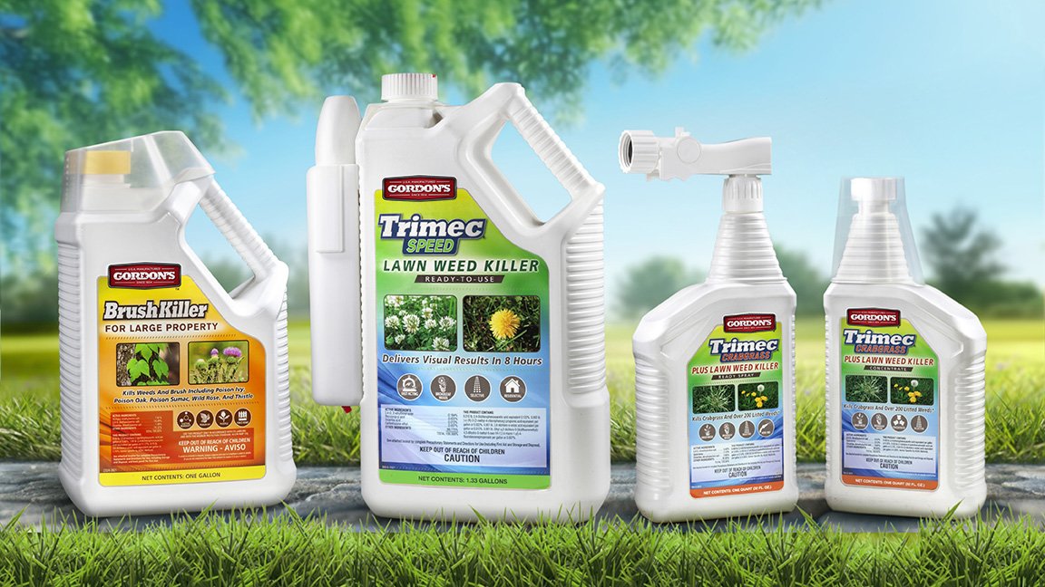
The most significant investment most people make is in their homes. Gordon’s helps people care for this investment with dependable, economical products for lawns and landscapes. When the company wanted custom packaging to improve the user experience, they turned to Studio One Eleven. Our team developed cohesive designs for the quart and gallon bottles, creating a unique and ownable visual language for the brand.

Each bottle needed to work across multiple products with different neck finishes and closures, including a dosing cap, trigger sprayer, garden hose sprayer, and wand attachment. The industrial designers and engineers worked to ensure each bottle fit all these components, mindful of ergonomics and cost and manufacturing parameters. The new bottles maintain the existing footprint for easy transition at retail.  

Happy Elephant Laundry

← Back to our work

Happy Elephant

Design Rooted in Nature 

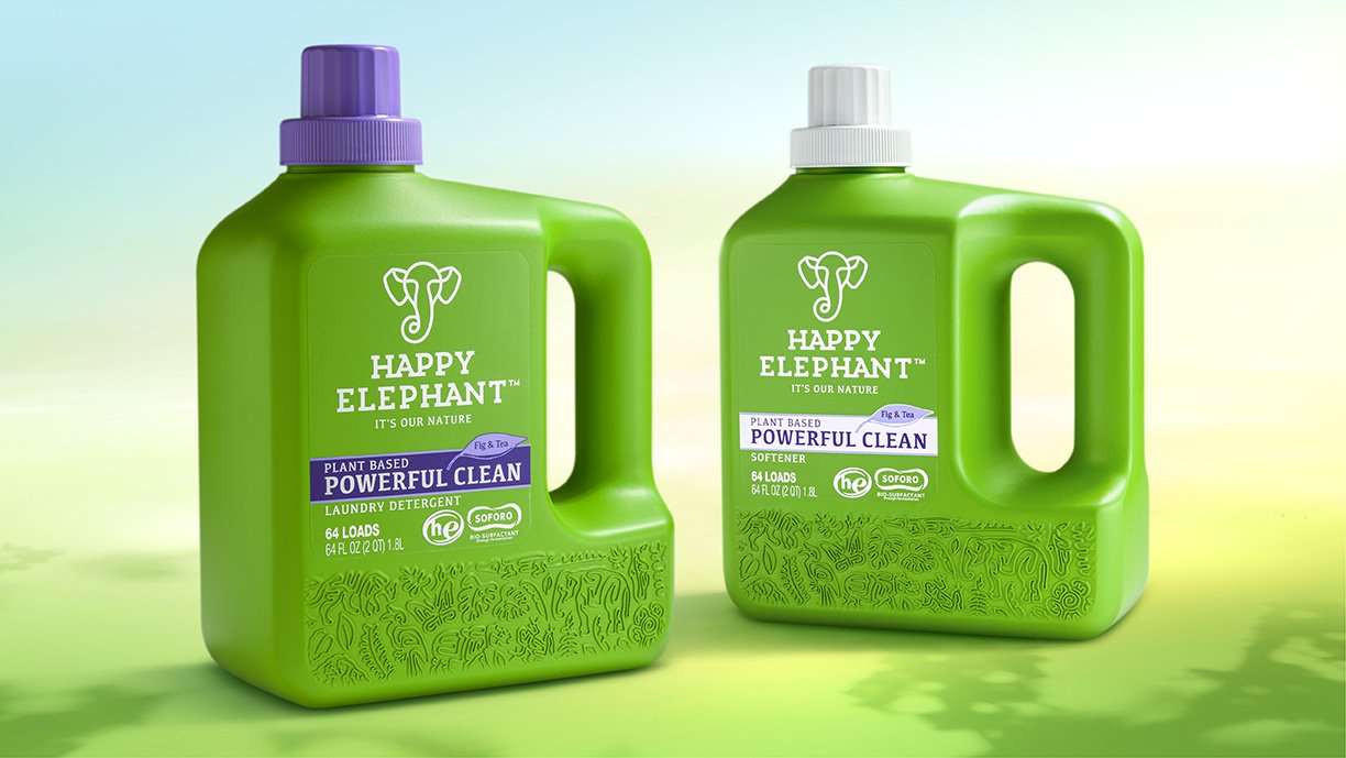
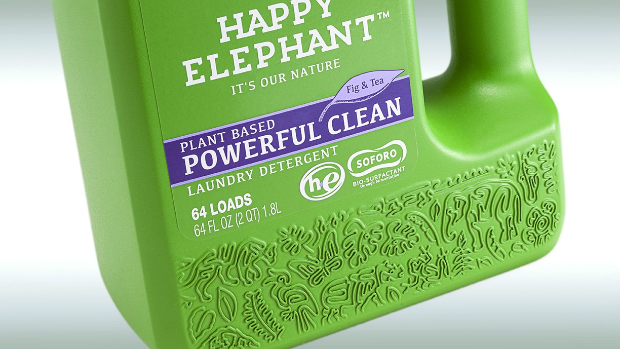
Happy Elephant’s name says it all. The brand was born out of a love of nature and its wildlife, namely the endangered pygmy elephants of Borneo. Their 100% botanical-based formulas are made with sustainable palm oil that doesn’t harm the tropical rainforests that the elephants and other creatures call home. When Happy Elephant introduced a new eco-friendly laundry detergent in the US, Studio One Eleven developed a custom 64oz. bottle that helps tell the brand’s story. Our designers created a square bottle with a unique silhouette that stands out from other laundry detergents on the shelf and online. We ensured the handle size, shape, and placement allow for optimum ergonomics and pourability. The bold green color and intricate pattern at the bottom of the bottle strengthen the package’s impact and reflect the brand’s environmental mission.

Branch Basics Detergent

← Back to our work

Branch Basics Detergent

Custom Packaging with a Laundry List of Benefits 

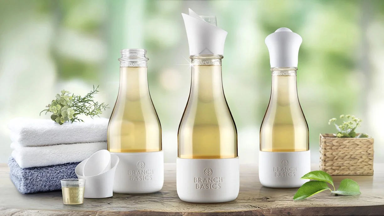
When Branch Basics decided to expand their premium portfolio of refillable packaging solutions with a new laundry detergent bottle, they returned to the trusted team at Studio One Eleven. Having already developed the company’s award-winning spray bottle package, our team knew just what to do for this new product. Our designers created a custom drain-back dispenser that perfectly complements the stock glass bottle supplied by Berlin Packaging. The shape, size, and silhouette seamlessly integrate with the bottle for a sleek aesthetic and optimized handling and dispensing. The Studio’s engineering team helped perfect the challenging pour spout shape, conducting several rounds of testing to ensure it was manufacturable and leak-proof. We incorporated a small dosing cap for added functionality and all-in-one convenience. The bottle’s custom silicone boot is an additional premium feature that provides protection for the glass bottle and maintains consistency with the brand’s other refill products. 

Zum Laundry

← Back to our work

Zum Laundry

Making Waves

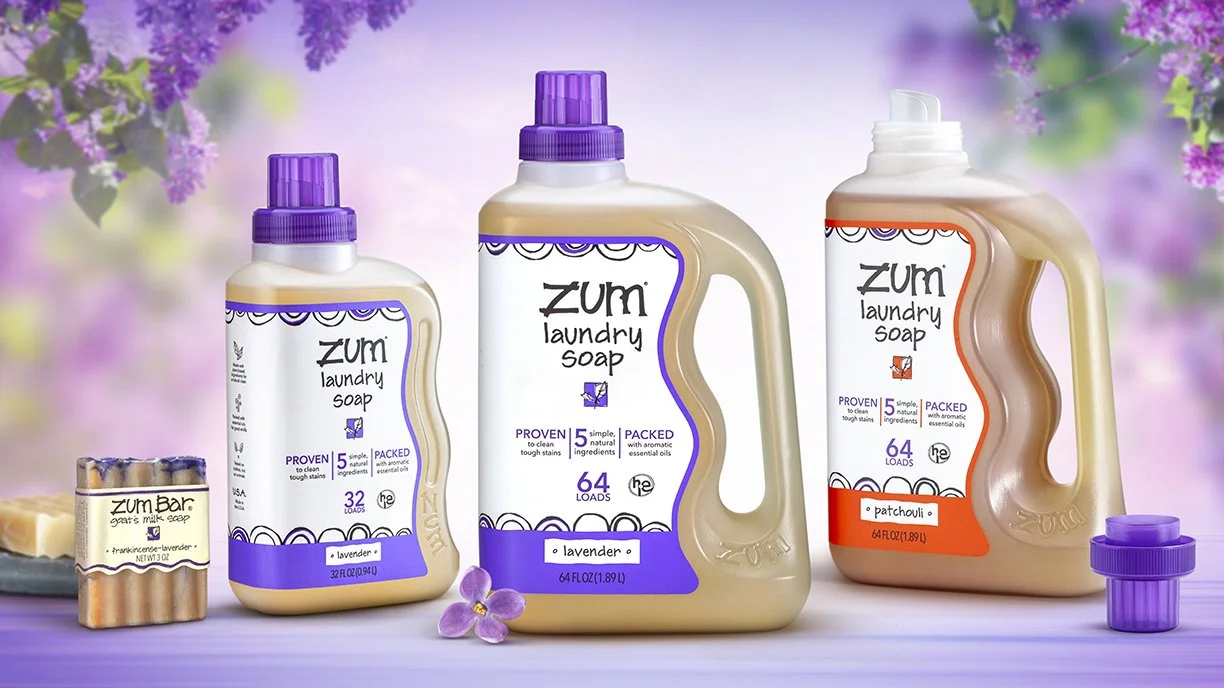
Indigo Wild’s Zum brand is known for their fabulous fragrances, quality ingredients, and whimsical personality. They wanted new packaging for their laundry bottles that improved the user experience, created stronger brand presence, and aligned with their fun image. So they partnered with the team at Studio One Eleven for a custom design that differentiates from the competition. Our designers took inspiration from the iconic wavy pattern of the brand’s signature bar soaps to create a unique bottle that builds brand equity and stands out at shelf. The team optimized the silhouette, scale, and placement of the waves to suit both the 64 oz. and 32 oz bottles. The new packaging is easier to measure and pour than the brand's previous bottle, and the custom shape establishes unique design language that can extend to future products for brand continuity.

Moxie

← Back to our work

Design that Shows its Moxie

Moxie_Hero_1a_Sm.jpg

Design that Shows its Moxie.

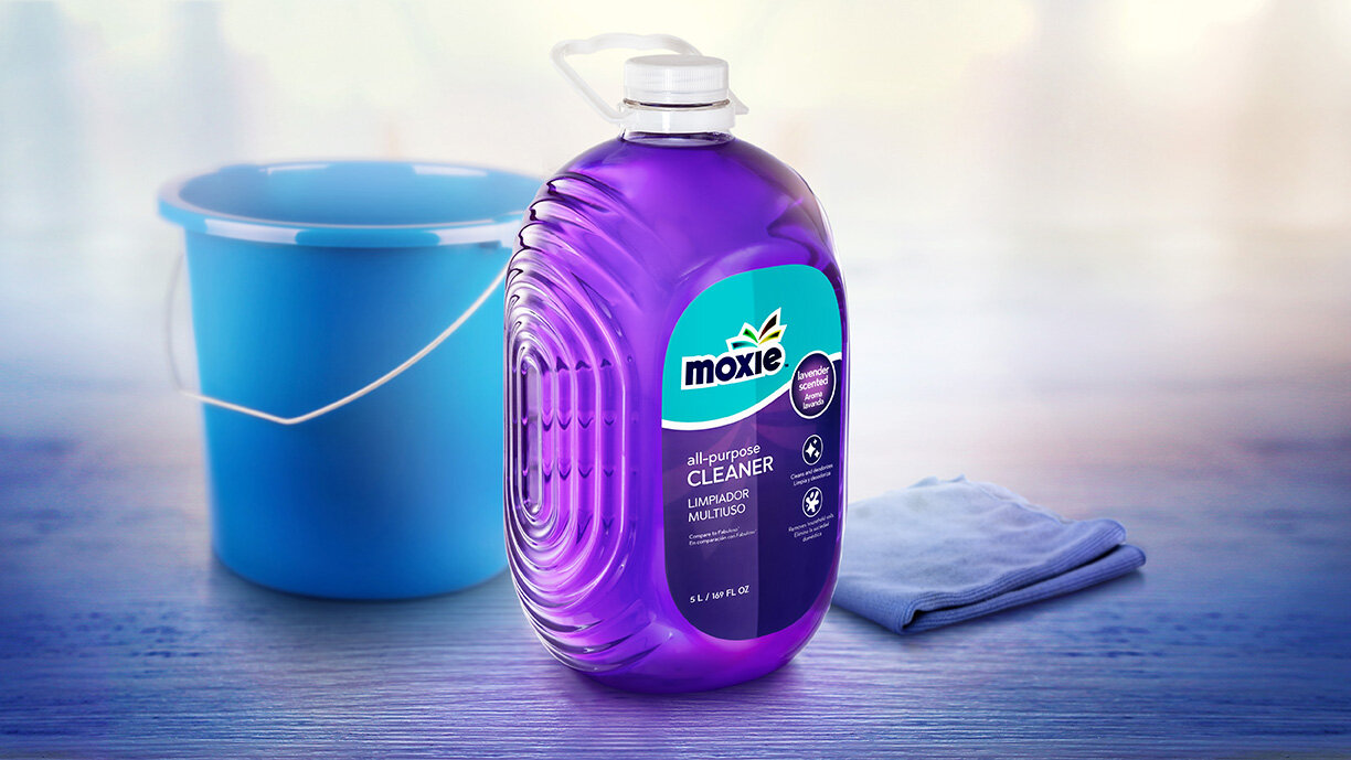
Moxie was a rapidly-growing new household essentials brand when they decided to introduce a line of multi-purpose cleaners. Sold exclusively at Lowe’s, the portfolio offers a range of high-performing products at a great value. The team at Studio One Eleven created a custom 169 oz. bottle that captures Moxie’s moxie. Our designers started with a simple ovular silhouette that differentiates from other multi-purpose cleaners while feeling approachable and engaging. Racetrack ribbing was incorporated on the sides of the package to add structural rigidity for the oversized bottle. The pattern of the ribs plays off the Moxie logo’s firework motif, unifying the bottle and label designs. Clear PET showcases the vibrantly colored liquid product inside, reinforcing that these cleaners are safe but effective.

Branch Basics

← Back to our work

Branch Basics

BranchBasic_LineUp_Sm.jpg

Not-So-Basic Design.

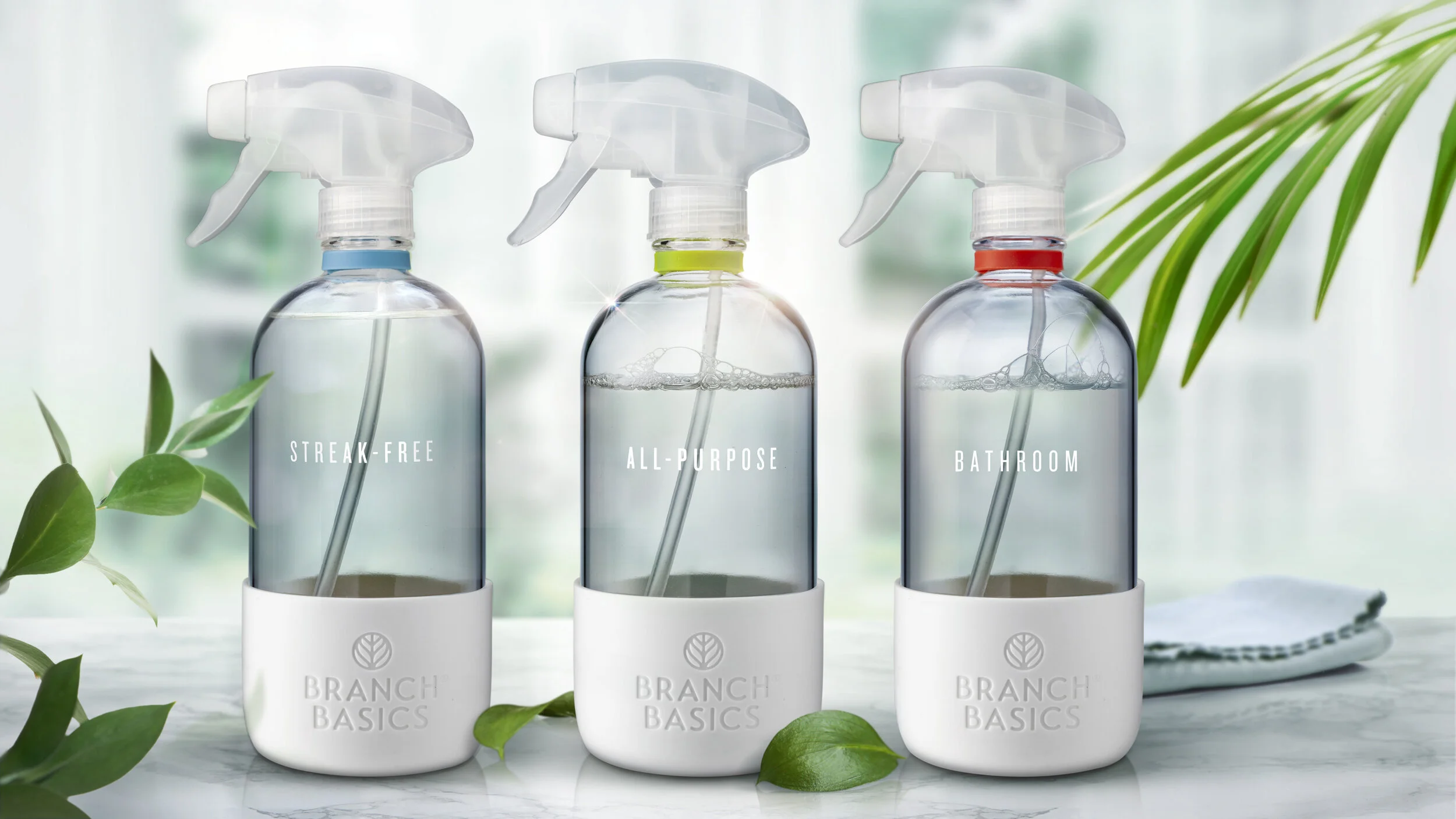
Branch Basics is on a mission to create healthier homes with environmentally-friendly products that use fewer toxins. When the company needed a bottle for their home cleaning line that fit their brand mission and was suitable for their high-quality products, they partnered with the team at Studio One Eleven. We found the perfect Boston round glass bottle that was sleek, simple, and aligned with the brand’s sustainability goals. The thick bottle and all-natural trigger sprayer are durable enough to handle everyday cleaning, and easy to handle and refill. The Studio team customized the stock bottle to create a more premium aesthetic and superior user experience. Ceramic printing was added to the bottle to communicate the different usage occasions, and a color-coded silicone neck ring was incorporated for easy differentiation between products. An embossed silicone sleeve at the base is a unique, high-quality feature that stands out in-home. The final Branch Basics package is anything but basic.

Rejuvenate Dual System Outdoor House Wash and Window Cleaner

← Back to our work

Rejuvenate Dual System Outdoor House Wash and Window Cleaner

thumb.jpg

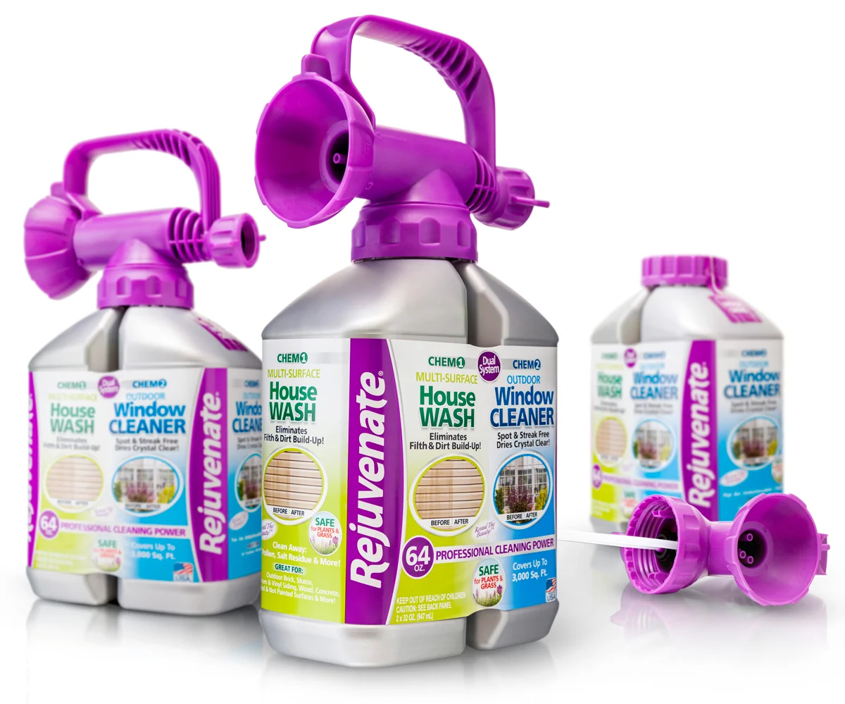
Skilled engineering for complex packaging requirements.

Rejuvenate_Hero.jpg

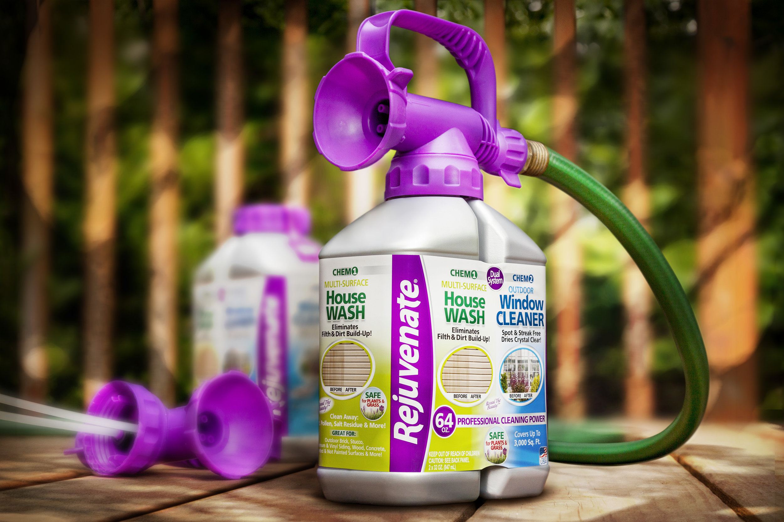
When long-time client For Life Products needed help developing a new-to-the-world packaging system they knew that Studio One Eleven was the right partner. At the time, Studio One Eleven's relationship with For Life spanned nearly a decade, beginning with the development of Rejuvenate’s brand identity and structural packaging form language and continuing over the years with a string of successful extensions.

For Life’s Rejuvenate Dual System Outdoor House Wash and Window Cleaner represents a revolutionary leap as the first product of its kind in the home cleaning space. Users enjoy the convenience of effortlessly switching between house wash and window wash applications without disconnecting & reconnecting separate packages. A GREENGUARD-certified sustainable non-toxic offering, the new packaging system contains enough concentrated formula to mix 20-gallons of cleaning solution via its two chambered / twin orifice HDPE bottle united by a single threaded finish. 

Switching between the two formulas is as easy as rotating the sprayer nozzle on the new, custom-made patented sprayer and handle that Studio One Eleven designed, engineered and purpose-built for this unique application.

Because For Life’s products are sold across multiple channels our life cycle analysis was especially critical. To ensure product protection and integrity in eCommerce applications, the system ships with a specially-designed plus and threaded closure that was accounted for in the product’s architecture. From conceptual development to fulfillment we worked closely with our manufacturing partners to achieve groundbreaking blow-molding and flow dynamics outcomes. 

The Rejuvenate Dual System Outdoor House Wash and Window Cleaner launched successfully with QVC with expansion plans to big box retailers.   
 

Charlie’s Soap

← Back to our work

Charlie’s Soap

Charlie'sSoap_Hero_72.jpg

Charlie’s New Package Design Gets an A+

before-after.jpg

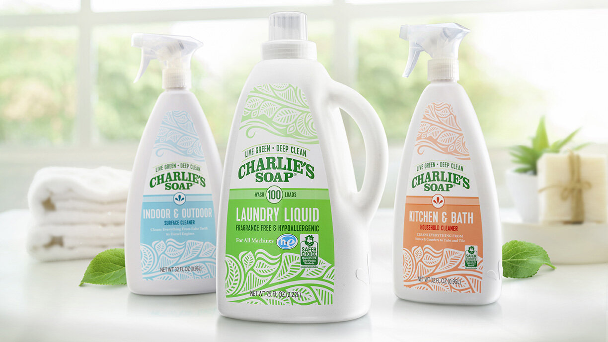
Charlie’s Soap has seen tremendous growth over its 40 year history, starting out as an industrial textile cleaner to become a full line of all-natural laundry and household cleaners.  When the brand was ready to expand nationwide, they partnered with the team at Studio One Eleven to create unique packaging with broad appeal.  Our industrial designers started by creating a one-of-a-kind laundry bottle with a clean, simple silhouette and rare handle overhang that pushes the boundaries of convention to really stand out in-store.  The sleek A-shape is both impactful and practical, adapting easily to a variety of sizes in the brand’s portfolio including 16oz and 32 oz. spray bottles.  The tapered configuration and small neck make these packages easy to hold, while creating negative space on shelf for added effect.  The Studio’s graphic designers created new labels that reflect the brand’s “Live Green, Deep Clean” brand positioning and light-hearted personality.  A fresh, pastel color palette, whimsical leaf imagery, and strong but simple brandmark suggest a safe but effective clean.  The final design is a breath of fresh air.

“It was very easy to work with Berlin. We enjoyed the fact that we’ve been working with Berlin for quite awhile - and it made the transition to a new packaging development style much much easier. It was very turnkey”
— Taylor Sutherland, President of Charlie’s Soap

Household Chemical

Libman FREEDOM! Hardwood Floor Cleaner

← Back to our work

Libman FREEDOM! Hardwood Floor Cleaner

LibmanFloorCleaner_Hero_1_Sm.jpg

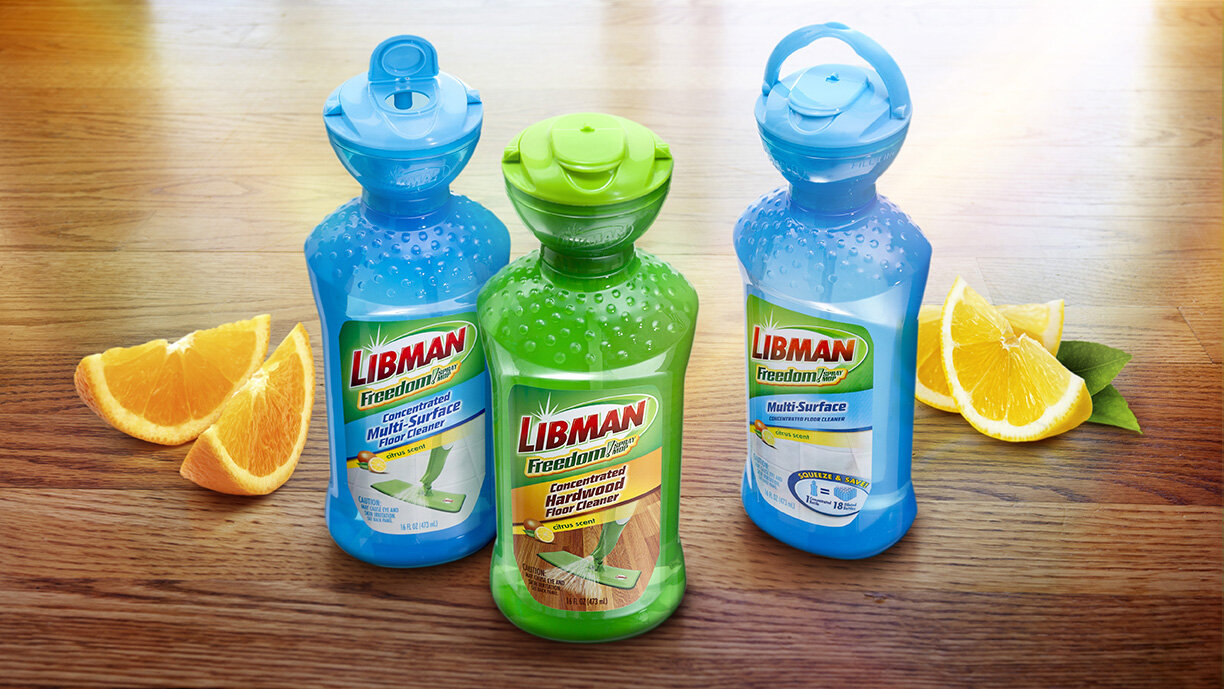
Award-winning package with patented dosing closure.

As part of an initiative to add floor cleaning products to its line of mops and brooms, The Libman Company, home of America’s favorite mop, was looking to introduce a concentrated floor cleaner for use with its FREEDOM Spray Mop. The product needed to be dispensed in 1 oz portions and poured into a bottle attached to the mop for dilution with water. The goals were to design a package that could:

  • Easily and accurately measure each 1 oz dose

  • Transfer each dose to the broom bottle without spillage

  • Avoid the use of loss-prone removable dosing caps

  • Maintain the Libman brand identity

 
Libman worked with Berlin Packaging's Studio One Eleven and Berlin Global Packaging divisions to achieve these goals. The team designed and delivered a custom dosing device that would fit on a bottle with a standard neck finish. Unlike other dosing systems that require a custom preform and fitment insertion, this solution is totally flexible. 
 
Studio One Eleven continued its creative push by designing a 16 oz, PET custom oval bottle, which helped ensure a powerful shelf impression.
 
Finally, by carefully managing the development and production process, the design allowed for best usage of internal and external production resources, resulting in a custom solution that was cost-effective. The Libman Company was very pleased with the design and development of the package since it helped get their new chemical line into major retailers.


This award-winning package hit the big screen in Libman's ad campaign. 


Goo Gone Sprays and Gels

← Back to our work

Broadening Appeal with Consumer-Focused Packaging

googone-1.jpg

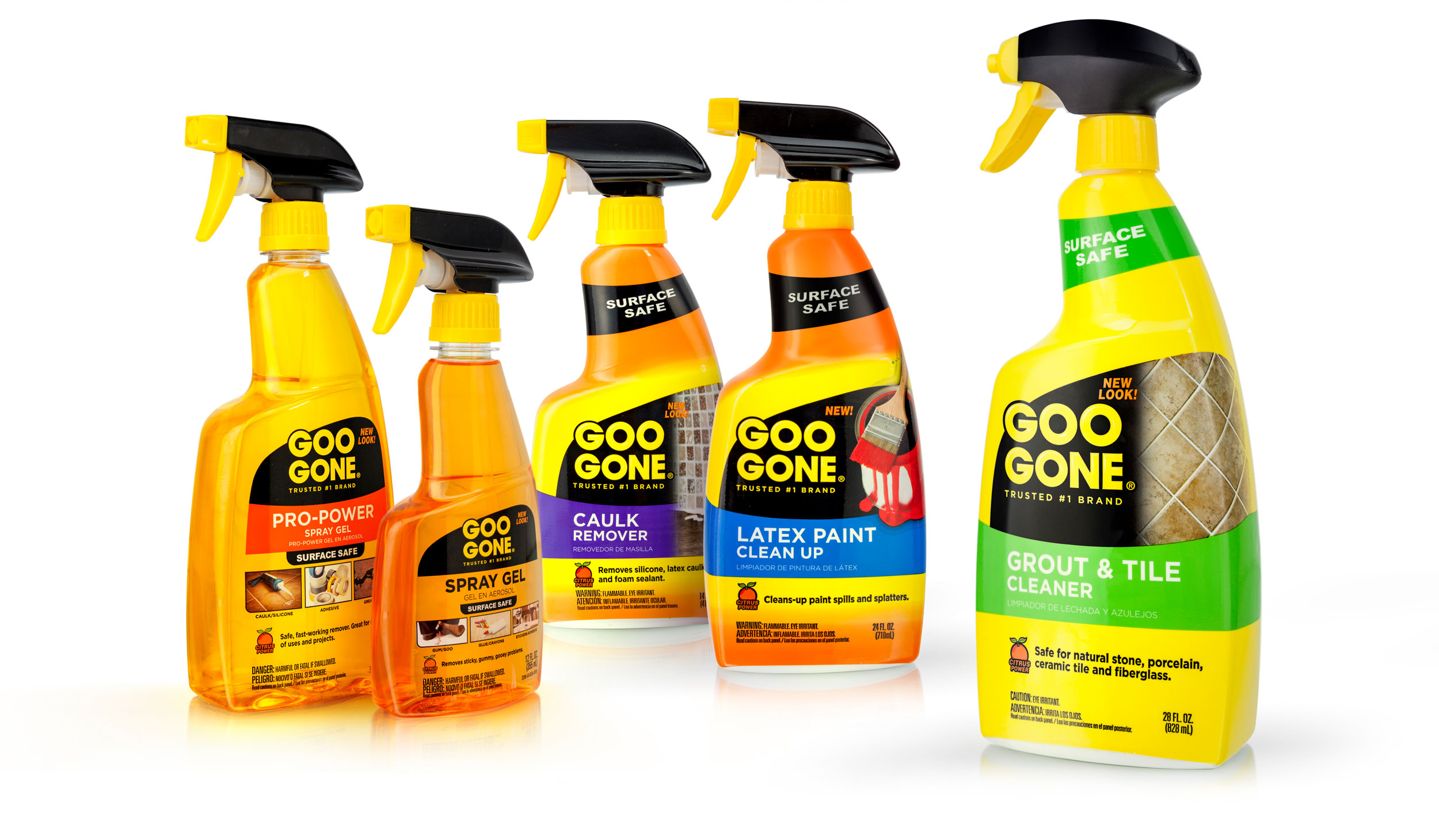
For many years Goo Gone was seen as a "task use" product by professionals. The Goo Gone team wanted to expand the product appeal to everyday users and home owners by making their packaging friendlier and more approachable, while still maintaining the emphasis on their superior formula, unmatched performance, and brand trustworthiness.

Studio One Eleven was tasked with developing packaging that was structurally sound and user-friendly and designing graphics that highlighted each product’s specific function, while maintaining a unified look.   

The result, a line of sleek HDPE trigger bottles with ergonomic hand-feel and a more graphics-friendly presentation. The Goo Gone packaging conveys a portfolio of products that effortlessly cleans up stains and sticky messes and pledges to return any surface to its original condition. The new packaging is not only visually appealing, but also provides a seamless user experience to deliver on the brand's promise.

Household Chemical

Wet & Forget

← Back to our work

Wet & Forget


A new way to spray.

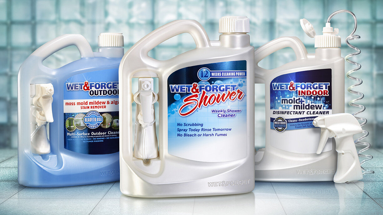
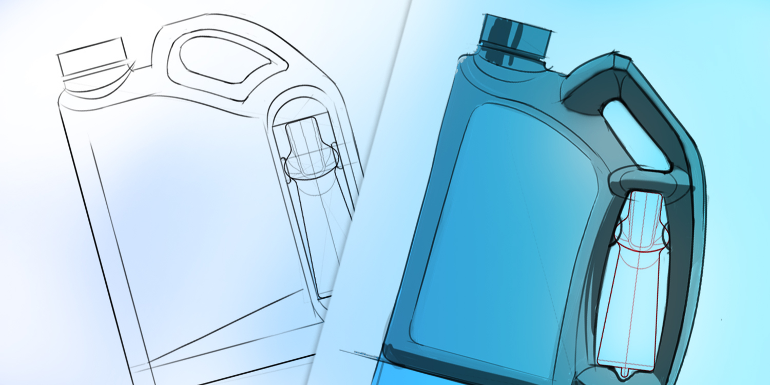
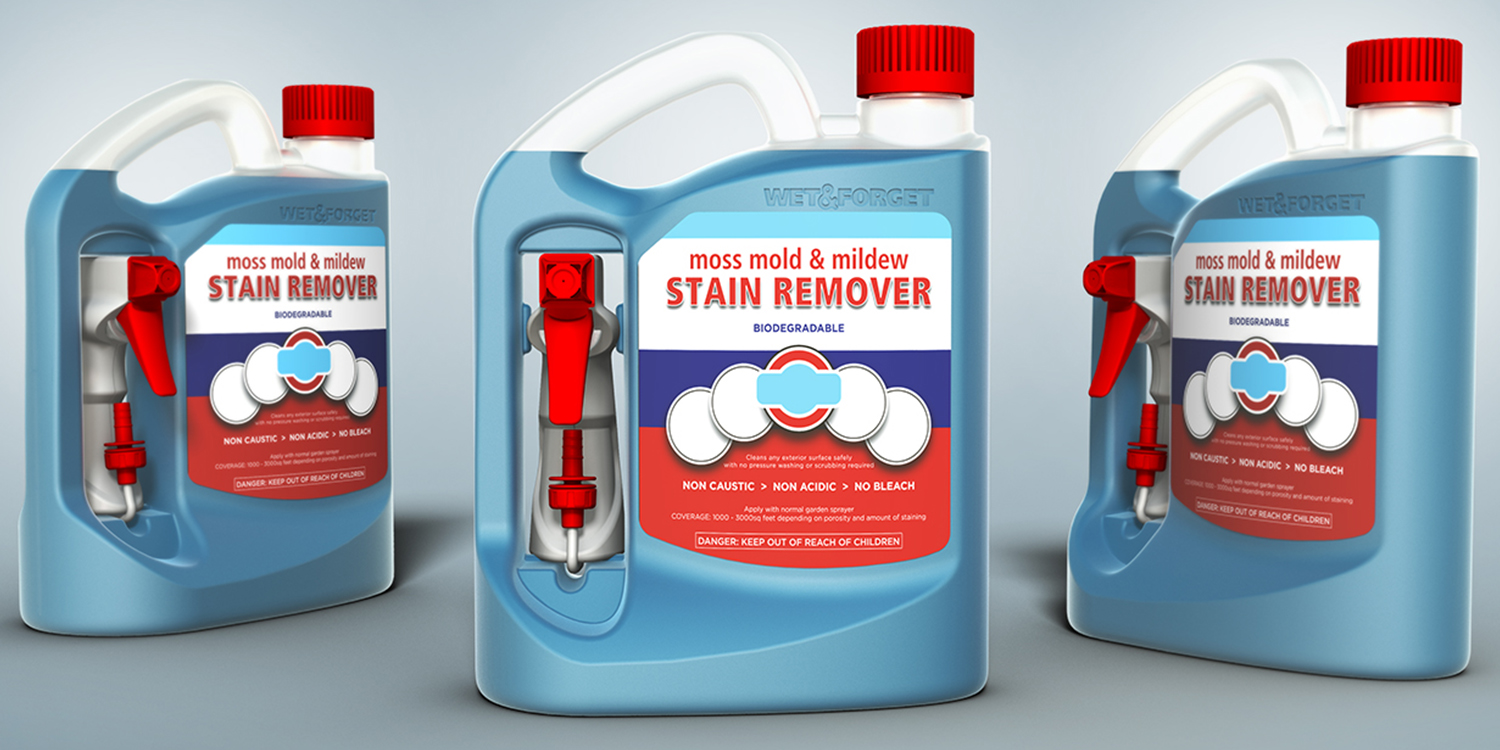
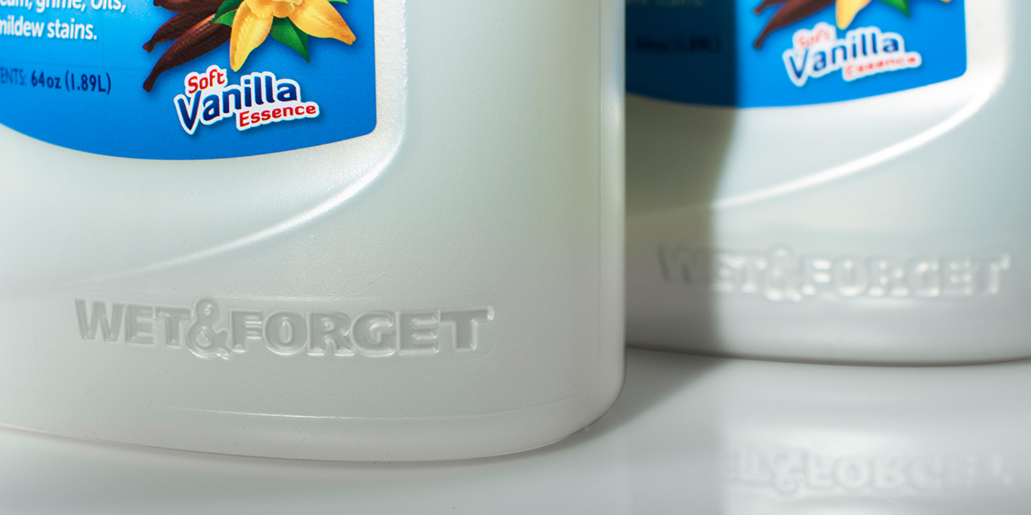
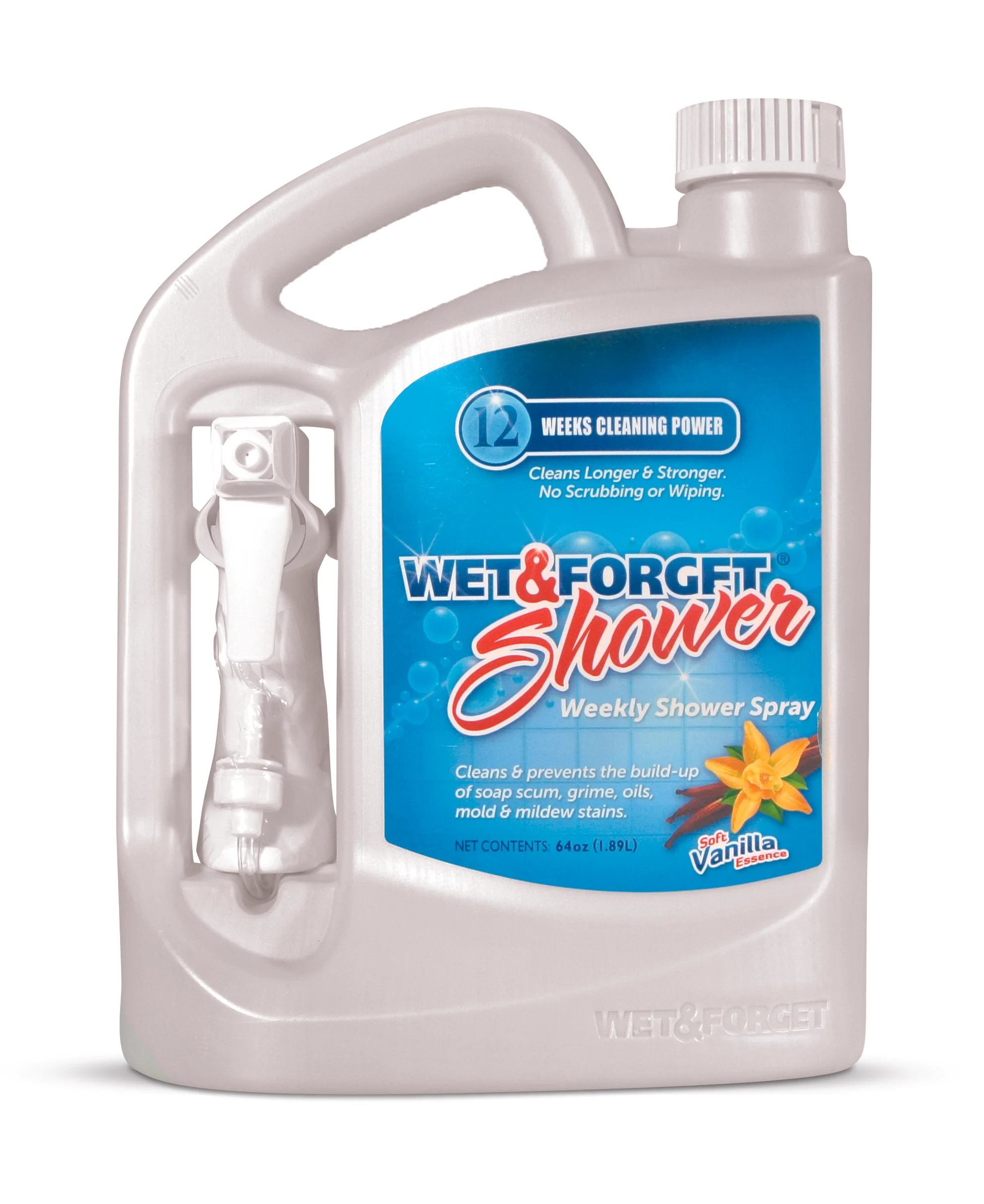
Wet & Forget partnered with Berlin Packaging to create a custom 64 oz HDPE package for this once-a-week, no-scrub shower spray.

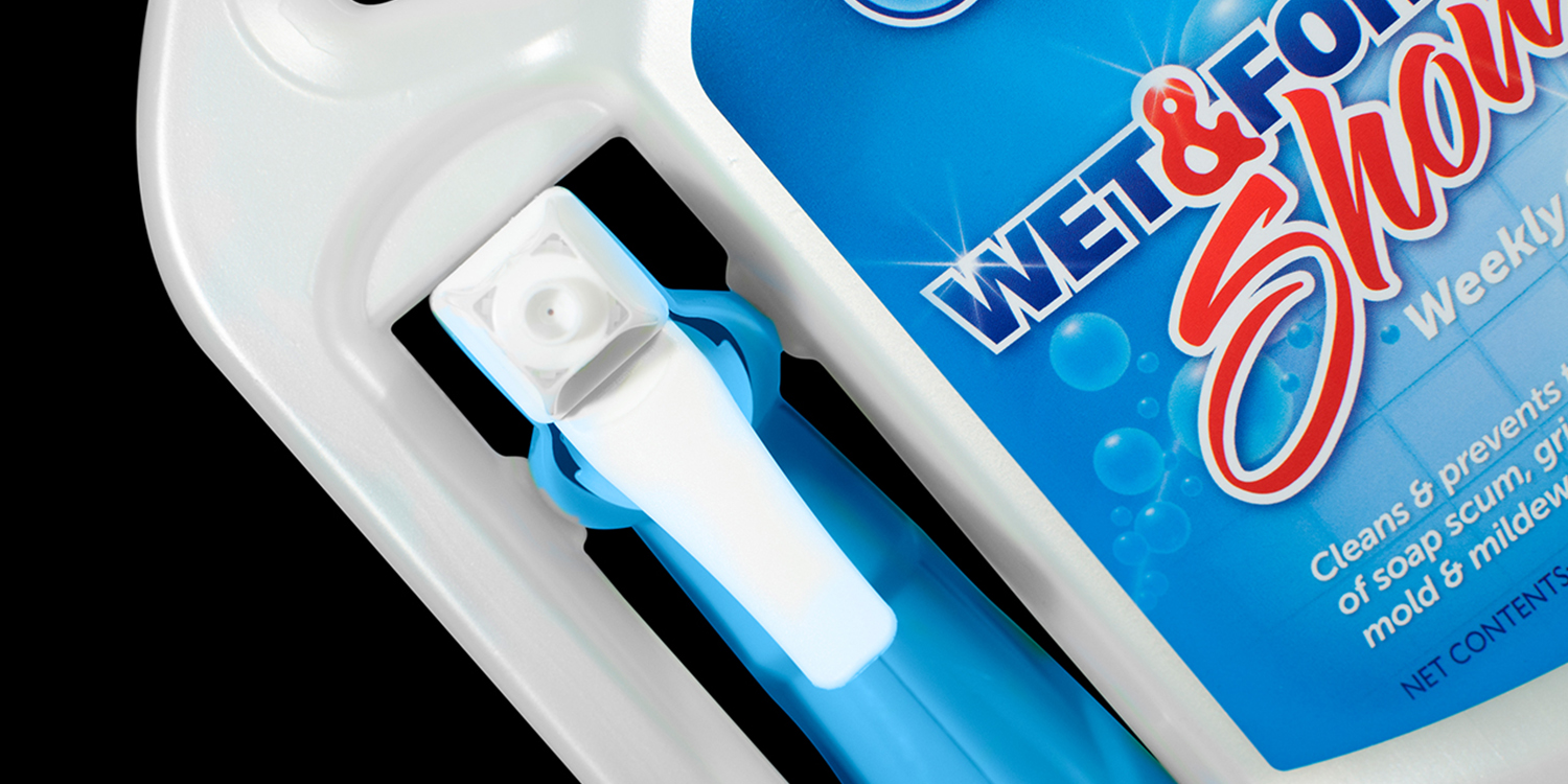
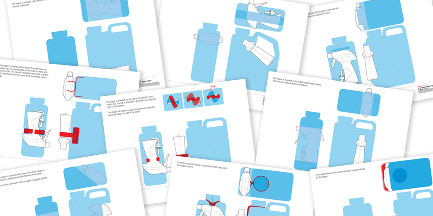
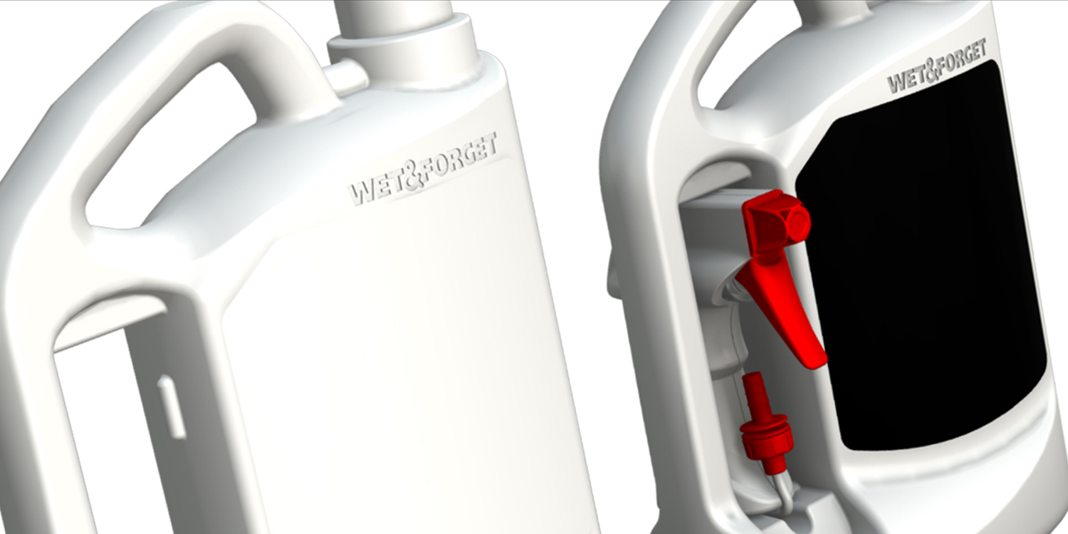
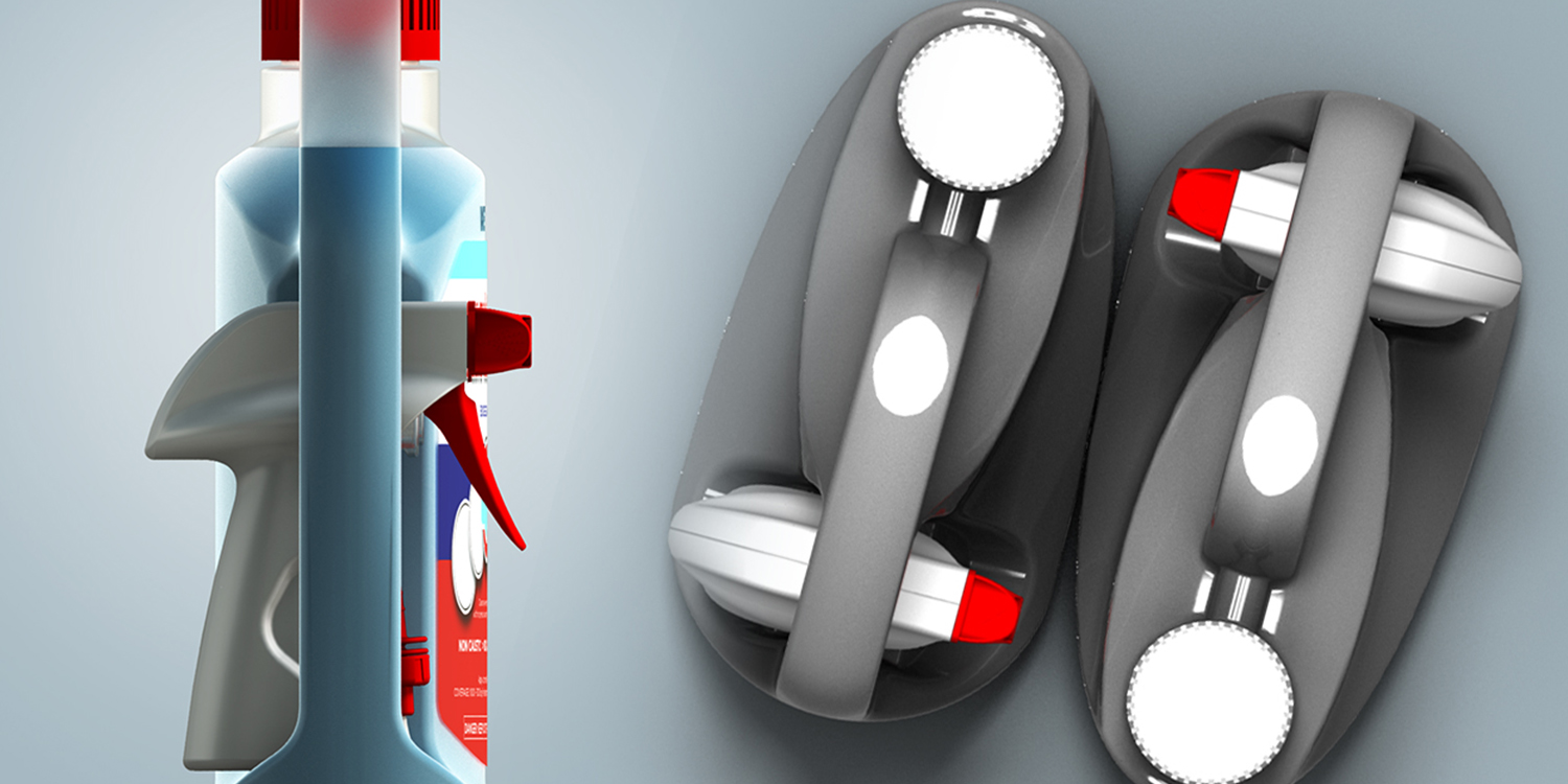
The package was designed to accommodate a category-first remote trigger sprayer that delivers more product than other cleaners, hits high spots without difficult lifting, and even sprays upside down. With no off-the-shelf solution available, Studio One Eleven designed a two-handled bottle that enables consumers to pick up the bottle with one hand and spray with the other while also allowing for easy ergonomic replacement of the sprayer after use.

The 64 oz economy size provides three months of cleaning power in one bottle, providing an environmentally friendly alternative to daily shower cleaners requiring eight 32 oz bottles for the same time period. The label is synthetic and laminated to withstand the wet shower environment. The unique bottle shape and size also draw the eye amid a sea of smaller packages, helping to drive sales.

The National Association of Container Distributors (NACD) and the North American Retail Hardware Association (NRHA) have already recognized this award-winning package.


Boulder Clean Laundry Detergent

← Back to our work

Boulder Clean Laundry Detergent

BoulderClean_Family_3 2.jpg

Fulfilling a brand's promise.

boulderhero.jpg

Boulder Clean believes in commanding market share through packaging, as well as product formulations. Every Boulder Clean package is expected to perform aesthetically, ergonomically, and environmentally, as part of the company’s brand position.

Studio One Eleven articulated this vision with the development of their laundry care line. The clear HDPE bottles, proudly displaying the raised signature B logo, provide an overall natural and calming effect, projecting a ‘what you see is what you get’ honesty.

The pioneering two-piece clear polypropylene drainback solution incorporates a snap-on dosage cup. Unlike typical "top-hat" designs, the bell-shaped profile transitions pleasingly into the shoulder of the bottle.  The threaded finish uniquely allows the cap to be removed for refilling.

Beyond aesthetics, the large 100 oz bottle and the 230 oz suitcase style packages were designed to be comfortable for carrying and suitably positioned for optimal pouring, and since Boulder Clean products are sold in part via e-commerce, they can withstand rough handling during shipment—even while upside down.   

Honest Company Dish Soap

A total of three SKUs were redesigned for Honest Company’s botanical-sounding dish soap varieties: Lemon Verbena, White Grapefruit, and Lavender. The new design and the move to a higher-capacity bottle has allowed Honest’s dish soap to add value and increase competitiveness in its market segment. 

Morton Pool Salt

← Back to our work

Morton Pool Salt

Thinking Outside of the Bag.

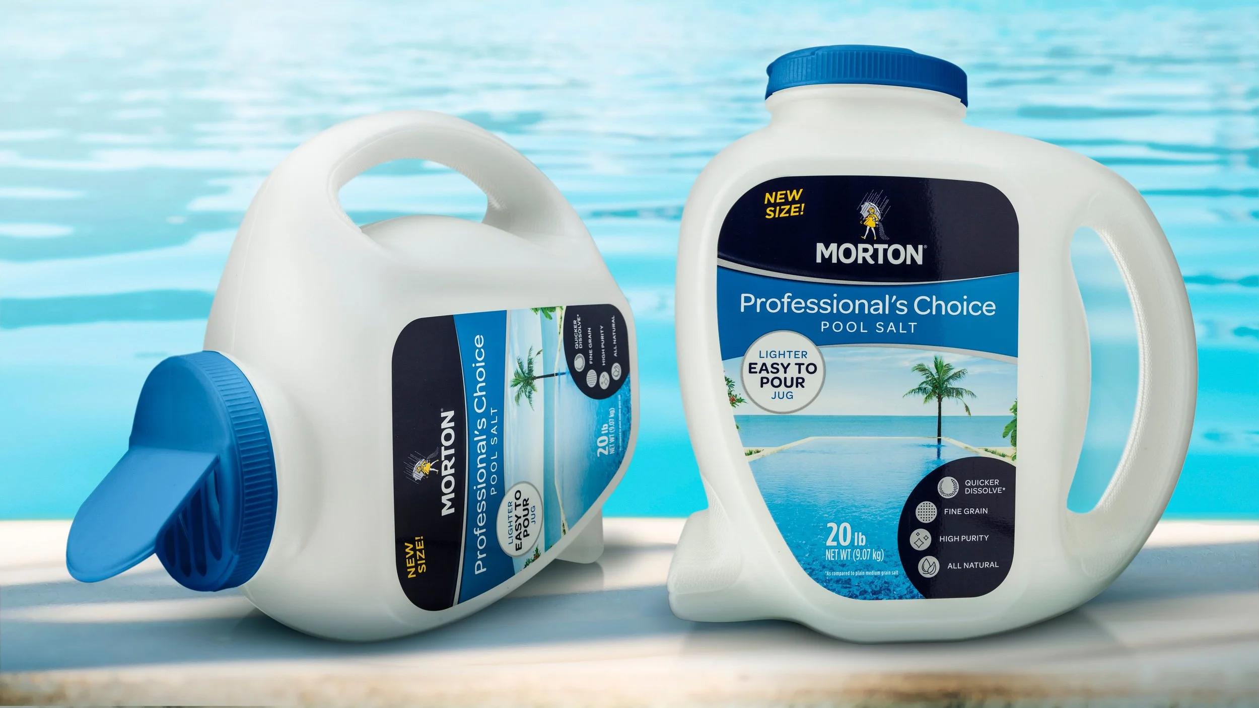
From lugging a floppy 40lb bag off the store shelf, to struggling with opening, dispensing and resealing, using pool salt in old-school packaging is in every respect an experiential ‘fail’. 

The team at Studio One Eleven helped Morton’s Salt think outside the bag to create a better consumer experience in every touchpoint spanning store shelf to the pool house. Our designers developed a smaller, lighter-weight 20lb rigid plastic jug that has better shelf presence and improved handling. Unlike traditional large-ware handles that impose a compromise between ease of transportation and dispensing, our oversized ‘steering wheel’ handle makes the container easy to carry AND pour, while both a horizontal and vertical jug orientation allows consumers to choose the most comfortable way for to dispense and store product. An oversized flip-top lid makes for easy opening and positive closure engagement, preventing moisture and spillage. The new design creates a truly premium experience that is worth its weight in salt!

Household Chemical

Rejuvenate Cleaning Products

← Back to our work

Rejuvenate Cleaning Products

Rejuvanate_Hero_1_Sm.jpg

For Life Products completely redesigned a full family of its Rejuvenate products for cleaning and restoring household surfaces. The catalyst for the package refresh was a category buyer at Home Depot, who had suggested that the line's shelf impression (and, by extension, sales velocity) could be improved by eliminating the hodgepodge of stock bottles and by revamping the labels to aid consumers in product selection.

In response, For Life partnered with Berlin Packaging, its Studio One Eleven design division, and its E3 Consulting service to overhaul the Rejuvenate brand strategy. The Studio team worked along side For Life's creative team to:

  • Develop a custom bottle design aesthetic scaled to 16 to 32 oz sizes featuring a flat front to maximize the primary display panel space, an off-center neck for an even pour and efficient packout, swappable neck finishes to accommodate flip-top closures and trigger sprayers, and an embossed emblem at the lower left corner reinforcing the products' speedy results.

  • Create a new color and iconography-based communication system that explains the benefits of using individual Rejuvenate SKUs as part of the overall Rejuvenate system, promoting the purchase of multiple SKUs and engendering loyalty via an improvement in product performance.

  • Establish a new brand and color scheme with silver bottles and purple closures.

  • Design a wraparound/peel-off label that facilitates color-coding by product application (floor, cabinet, furniture, countertop, etc.), ‘before and after’ images showing product benefits, provisions for both English and Spanish instructions, and QR codes that allow consumers to access informational videos designed to educate and inform on Rejuvenate's benefits.

  • Solve both bottle and label manufacturing challenges, including producing a shiny silver bottle in HDPE.

  • Assist the label applicator in the customization of their equipment to apply the 3-sided wraparound label to the uniquely contoured bottle.

Within weeks after the new packages hit store shelves at Home Depot, sales began climbing and new distribution opportunities opened up both in the US and abroad.


Honest Company Laundry Detergent

← Back to our work

Honest Company Laundry Detergent

HonestLaundry_Hero.jpg

Wowing millennials with award-winning design.

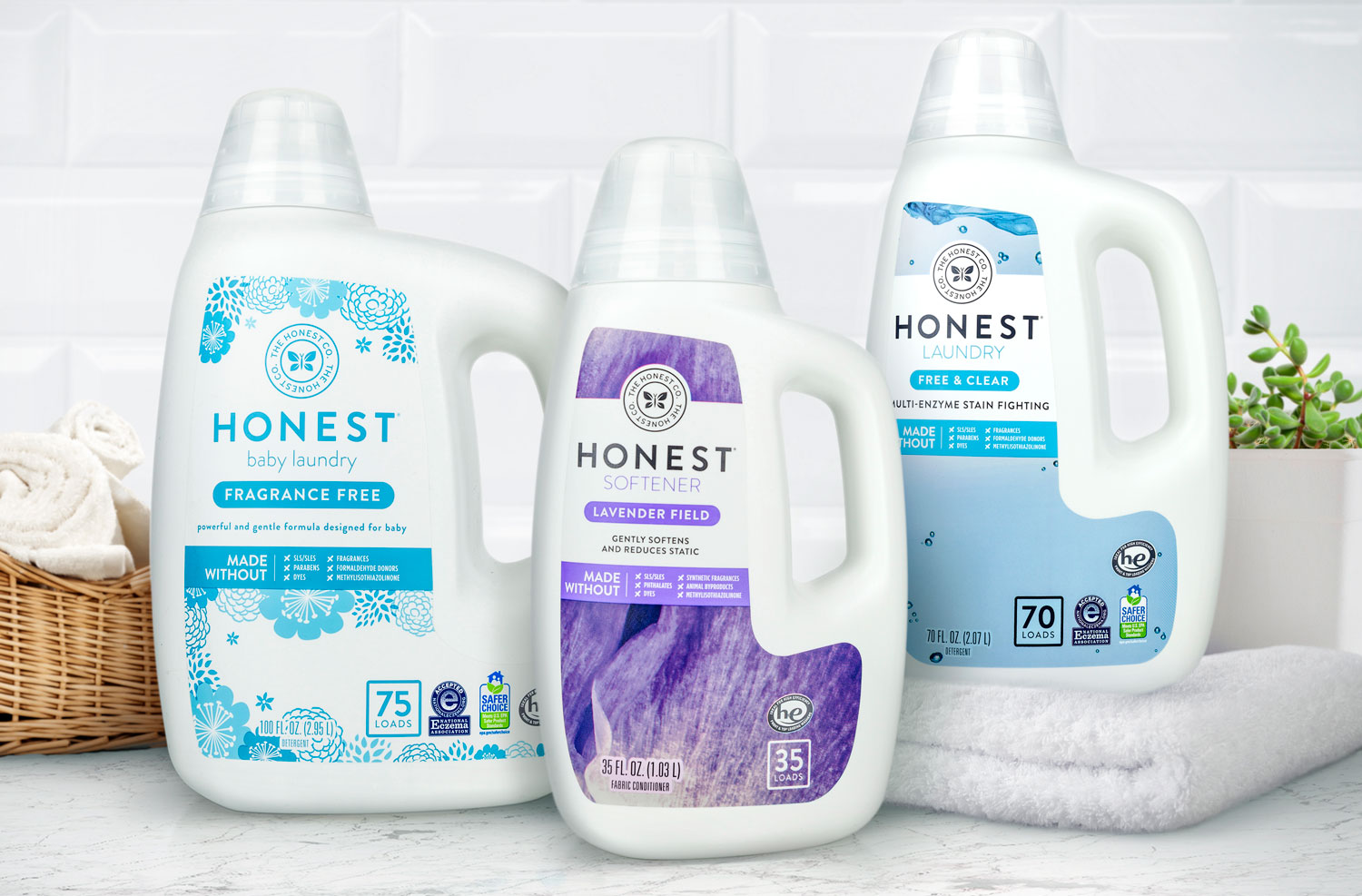
From the initial ideation sessions to the final testing, Studio One Eleven and the Honest Company worked together to create a premium package where form followed function. Liking the basic structure of an existing Califia Farms’ Almond Milk bottle, The Honest Company wanted a packaging solution for their new baby fabric softener. When the leaking challenges arose with their existing 70 oz. detergent bottle, the project focus shifted to a redesign of the entire fabric care line for the burgeoning e-commerce environment. After multiple collaborative sessions and revisions, a custom shape and closure was determined for the whole family

The new package has a robust custom-designed dosing cap closure that can survive impacts and drops. The inventive structure employs a thick liner to minimize the assembly gap while ensuring a robust seal, unscrewing threads for secured assembly, and ribs to create sealing surface to meet design intent. The closure sits flush on the bottle for a seamless marriage of the two components. It can be easily removed, yet still assembles back on after multiple usages to maintain a sturdy seal. A secondary challenge was detergent glugging from the old stock spout. The new custom spout has a longer cut out that increases airflow to negate this and to provide controlled pouring.

Beyond the dispensing and closure mechanisms, the new bottles have a softer and rounder shoulder to improve top load. In addition, the robust and comfortable handle helps for easy one-handed gripping and pouring.  

The Honest Company Laundry Line was the recipient of the prestigious Best in Class Award for the Rebrand-Non Food Category in The 2018 PAC Global Leadership Awards and a winner of Graphic Design USA’s 2018 American Package Design Award.


Household Chemical

Weiman Hardwood Products

← Back to our work

Weiman Hardwood Products

Friendly form and fresh graphics.

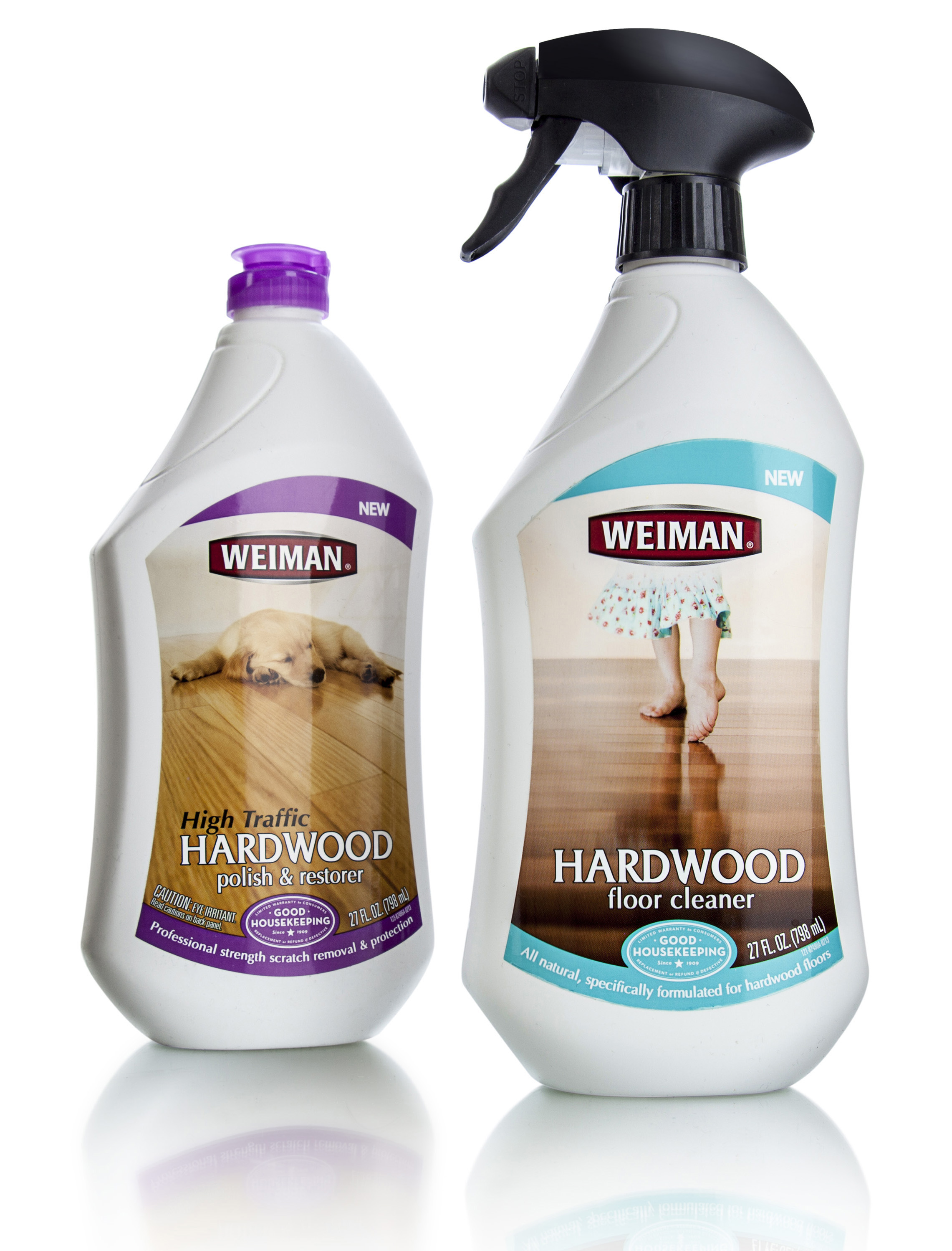
Weiman Products is a family owned business that specializes in household cleaning products. In business since 1941, Weiman's surface cleaning products and polishes are sold through Walmart, Target, and many other nationwide supermarkets, hardware stores, and home improvement centers. In developing a line of all-natural, plant-derived cleaning solutions that contains no harsh petrochemicals, ammonia, VOC's or phosphates, Weiman wanted a way to clearly communicate the 'healthy home' benefits without diminishing their core message of effective cleaning.

Studio One Eleven developed a matrix of custom structures and benefit-driven branding architectures. While options spanned a broad range of materials and forms, they all shared characteristics such as soft, friendly forms and imagery that promotes the idea of the home as a nest.

The structure and color-coded branding architecture make the new line easy to shop while differentiating the product from a crowded competitive field.


Roebic

← Back to our work

Roebic

RoebicHero_1_Sm.jpg

Brand Revitalization Done Right.

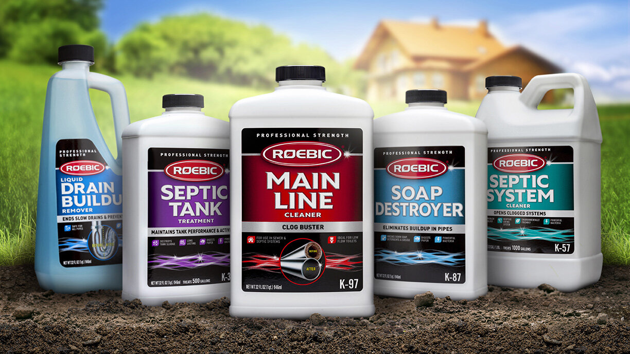
Roebic labs has a sixty-year history of quality and reliability as the original septic care brand that delivers professional strength results.  They wanted to update their packaging with a modern new look that respects their heritage, while attracting younger consumers.  The design team at Studio One Eleven knew just how to achieve that perfect balance.  They created a fresh, clean design that maintains the brand’s existing red logo, anchoring it on a new black background with sparkling silver accents to communicate trusted efficacy.  A consistent architecture ties the line together at shelf, while prominent usage illustrations and color-coding allow for easy shoppability.  What’s old is new again with this impactful modern design.