Award-winning package with patented dosing closure.
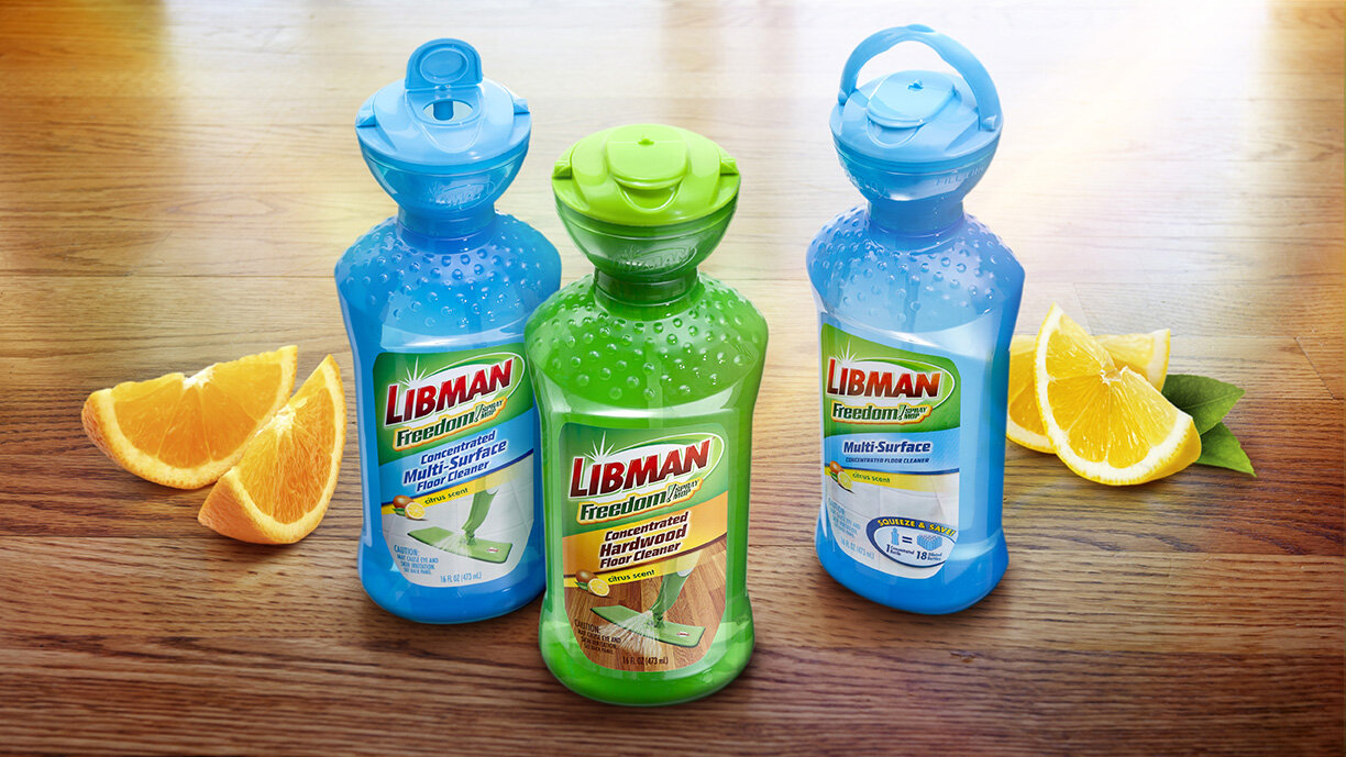
As part of an initiative to add floor cleaning products to its line of mops and brooms, The Libman Company, home of America’s favorite mop, was looking to introduce a concentrated floor cleaner for use with its FREEDOM Spray Mop. The product needed to be dispensed in 1 oz portions and poured into a bottle attached to the mop for dilution with water. The goals were to design a package that could:
Easily and accurately measure each 1 oz dose
Transfer each dose to the broom bottle without spillage
Avoid the use of loss-prone removable dosing caps
Maintain the Libman brand identity
Libman worked with Berlin Packaging's Studio One Eleven and Berlin Global Packaging divisions to achieve these goals. The team designed and delivered a custom dosing device that would fit on a bottle with a standard neck finish. Unlike other dosing systems that require a custom preform and fitment insertion, this solution is totally flexible.
Studio One Eleven continued its creative push by designing a 16 oz, PET custom oval bottle, which helped ensure a powerful shelf impression.
Finally, by carefully managing the development and production process, the design allowed for best usage of internal and external production resources, resulting in a custom solution that was cost-effective. The Libman Company was very pleased with the design and development of the package since it helped get their new chemical line into major retailers.
This award-winning package hit the big screen in Libman's ad campaign.
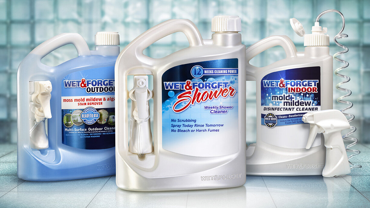
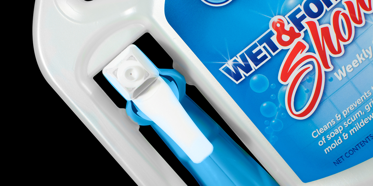
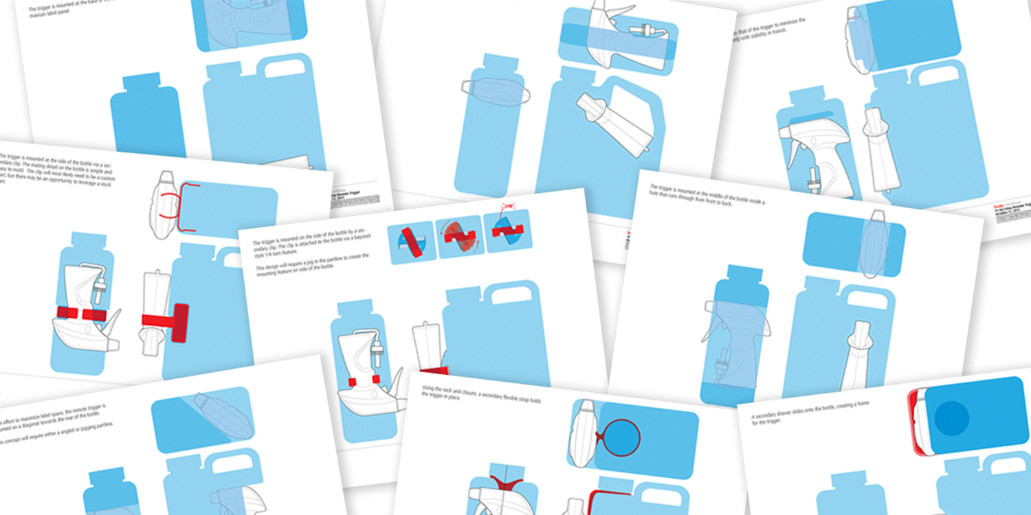
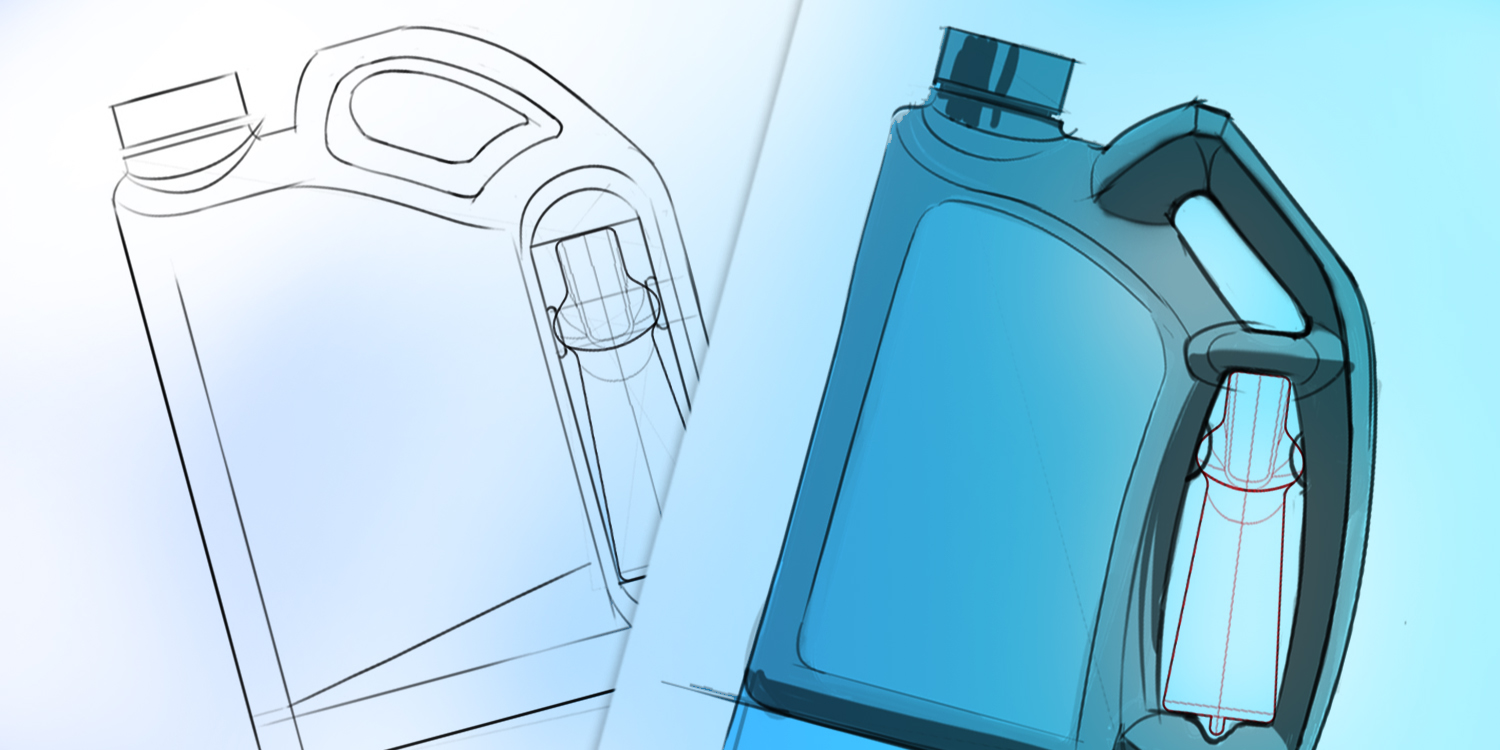
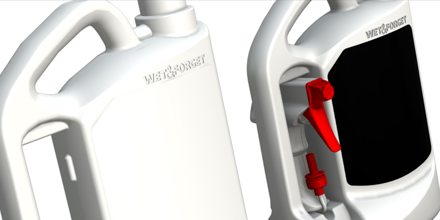
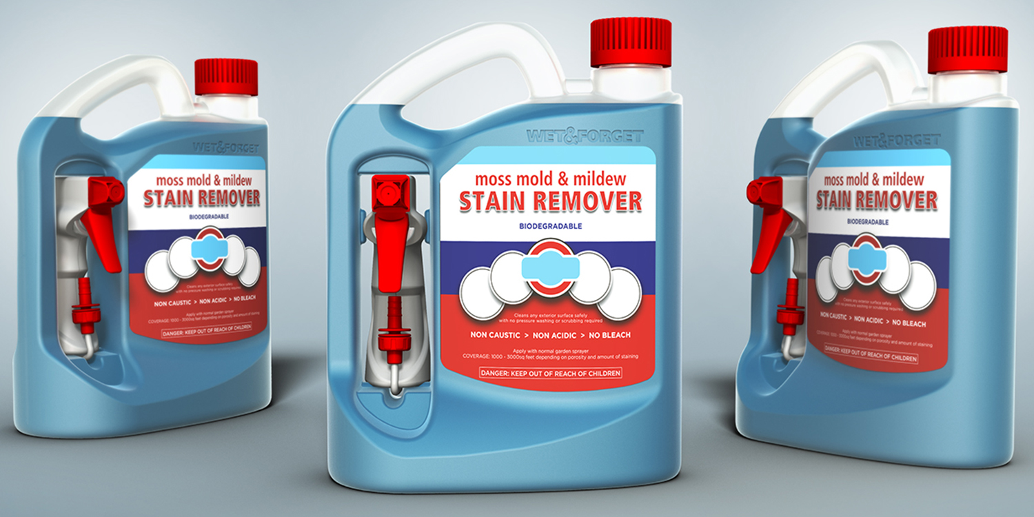
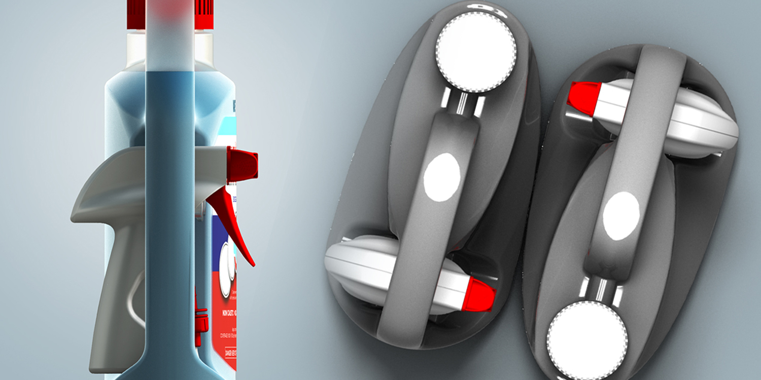
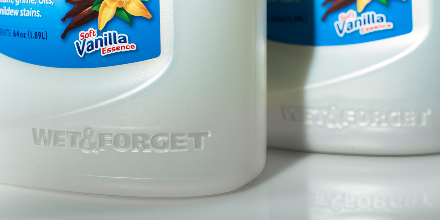
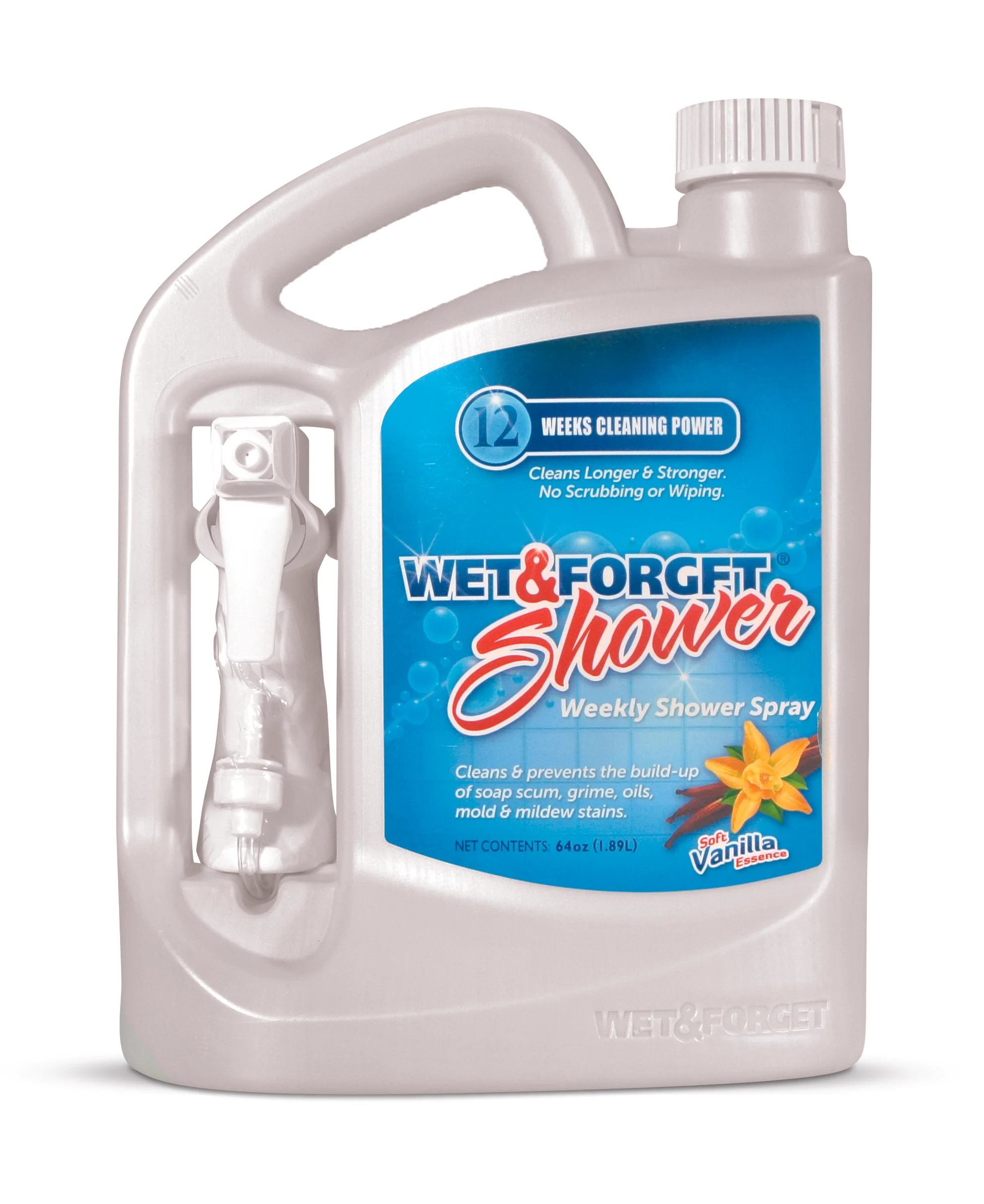
Wet & Forget partnered with Berlin Packaging to create a custom 64 oz HDPE package for this once-a-week, no-scrub shower spray.
The package was designed to accommodate a category-first remote trigger sprayer that delivers more product than other cleaners, hits high spots without difficult lifting, and even sprays upside down. With no off-the-shelf solution available, Studio One Eleven designed a two-handled bottle that enables consumers to pick up the bottle with one hand and spray with the other while also allowing for easy ergonomic replacement of the sprayer after use.
The 64 oz economy size provides three months of cleaning power in one bottle, providing an environmentally friendly alternative to daily shower cleaners requiring eight 32 oz bottles for the same time period. The label is synthetic and laminated to withstand the wet shower environment. The unique bottle shape and size also draw the eye amid a sea of smaller packages, helping to drive sales.
The National Association of Container Distributors (NACD) and the North American Retail Hardware Association (NRHA) have already recognized this award-winning package.
For Life Products completely redesigned a full family of its Rejuvenate products for cleaning and restoring household surfaces. The catalyst for the package refresh was a category buyer at Home Depot, who had suggested that the line's shelf impression (and, by extension, sales velocity) could be improved by eliminating the hodgepodge of stock bottles and by revamping the labels to aid consumers in product selection.
In response, For Life partnered with Berlin Packaging, its Studio One Eleven design division, and its E3 Consulting service to overhaul the Rejuvenate brand strategy. The Studio team worked along side For Life's creative team to:
Develop a custom bottle design aesthetic scaled to 16 to 32 oz sizes featuring a flat front to maximize the primary display panel space, an off-center neck for an even pour and efficient packout, swappable neck finishes to accommodate flip-top closures and trigger sprayers, and an embossed emblem at the lower left corner reinforcing the products' speedy results.
Create a new color and iconography-based communication system that explains the benefits of using individual Rejuvenate SKUs as part of the overall Rejuvenate system, promoting the purchase of multiple SKUs and engendering loyalty via an improvement in product performance.
Establish a new brand and color scheme with silver bottles and purple closures.
Design a wraparound/peel-off label that facilitates color-coding by product application (floor, cabinet, furniture, countertop, etc.), ‘before and after’ images showing product benefits, provisions for both English and Spanish instructions, and QR codes that allow consumers to access informational videos designed to educate and inform on Rejuvenate's benefits.
Solve both bottle and label manufacturing challenges, including producing a shiny silver bottle in HDPE.
Assist the label applicator in the customization of their equipment to apply the 3-sided wraparound label to the uniquely contoured bottle.
Within weeks after the new packages hit store shelves at Home Depot, sales began climbing and new distribution opportunities opened up both in the US and abroad.
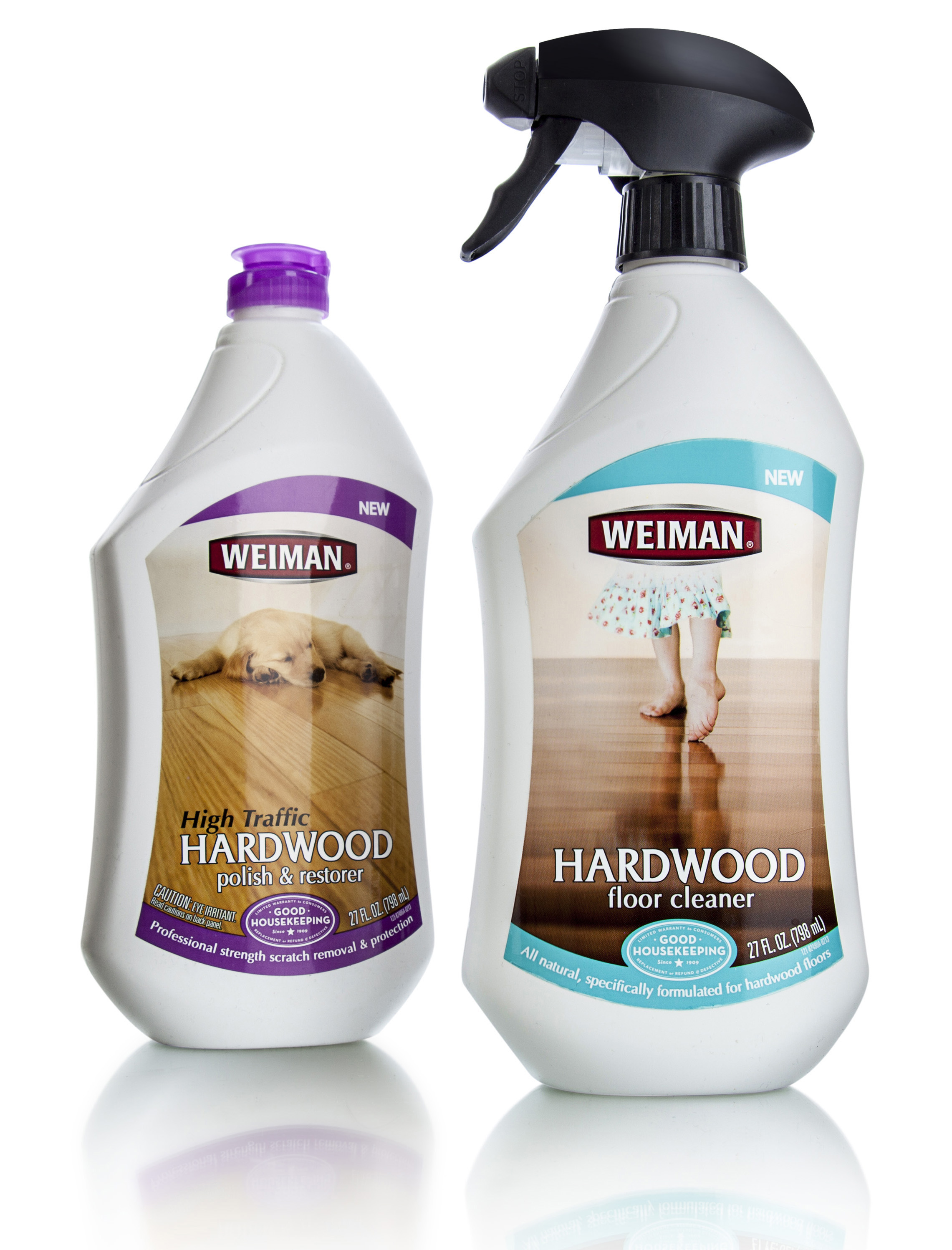
Weiman Products is a family owned business that specializes in household cleaning products. In business since 1941, Weiman's surface cleaning products and polishes are sold through Walmart, Target, and many other nationwide supermarkets, hardware stores, and home improvement centers. In developing a line of all-natural, plant-derived cleaning solutions that contains no harsh petrochemicals, ammonia, VOC's or phosphates, Weiman wanted a way to clearly communicate the 'healthy home' benefits without diminishing their core message of effective cleaning.
Studio One Eleven developed a matrix of custom structures and benefit-driven branding architectures. While options spanned a broad range of materials and forms, they all shared characteristics such as soft, friendly forms and imagery that promotes the idea of the home as a nest.
The structure and color-coded branding architecture make the new line easy to shop while differentiating the product from a crowded competitive field.