Contact Us | 1.800.2.BERLIN
Roebic
Brand Revitalization Done Right.
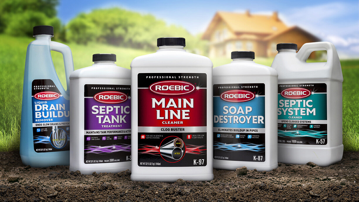
Roebic labs has a sixty-year history of quality and reliability as the original septic care brand that delivers professional strength results. They wanted to update their packaging with a modern new look that respects their heritage, while attracting younger consumers. The design team at Studio One Eleven knew just how to achieve that perfect balance. They created a fresh, clean design that maintains the brand’s existing red logo, anchoring it on a new black background with sparkling silver accents to communicate trusted efficacy. A consistent architecture ties the line together at shelf, while prominent usage illustrations and color-coding allow for easy shoppability. What’s old is new again with this impactful modern design.


