DS Laboratories

← Back to our work

DS Laboratories

DS Laboratories

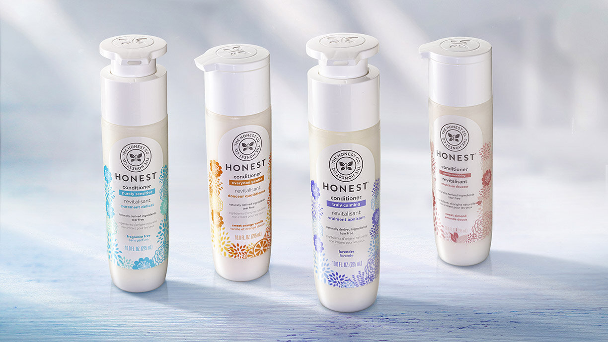
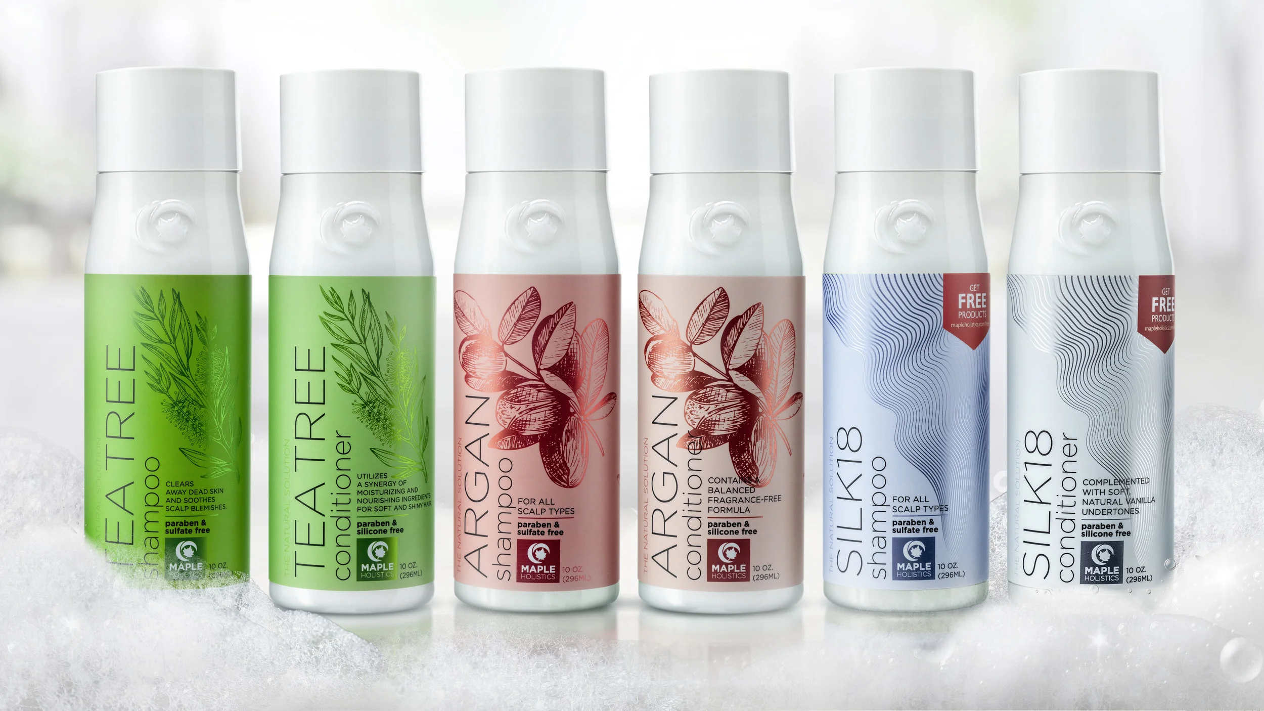
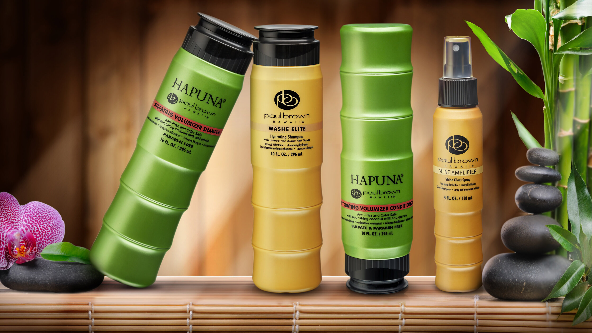
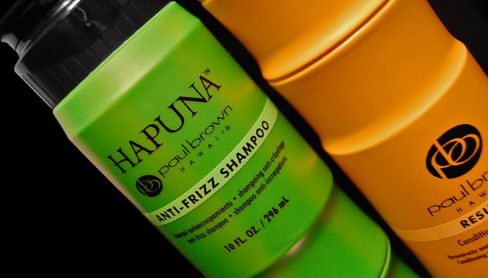
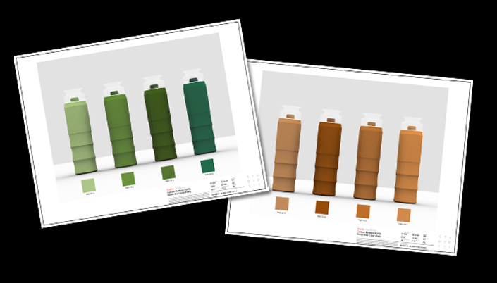
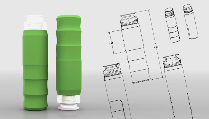
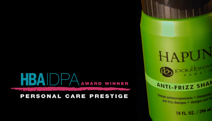
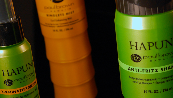
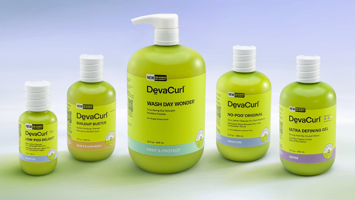
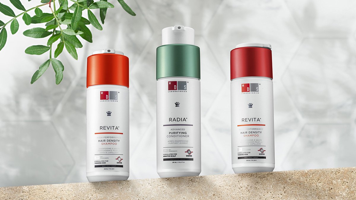
DS Laboratories is leading the way in science-backed hair care and skin care. Their future-forward, clinical-grade products are trusted for their proven efficacy and are recommended by top dermatologists. When the company wanted innovative and effective packaging for a trio of premium hair products that needed to survive e-commerce shipping and distribution, the Studio One Eleven-designed MODA™pump was the perfect solution. The MODA™ is designed exclusively for Berlin Packaging customers and is a stock-available pump that passes the rigors of ISTA-6 OB protocols for up to 500mL bottles. In addition to meeting e-commerce needs, the pump has a modern aesthetic and a locking pump actuator that reduces product waste. The Studio customized this stock component for DS Labs with their logo, adding brand equity and premiumization. Our designers also customized the companion MODA bottle with a controlled neck finish, and a cross-functional Berlin Packaging team of experts helped certify the final system to ISTA-6 OB. The versatile packaging system is e-commerce indicated for a variety of formulas, including shampoo, conditioners, and body washes.  

Great Oral Health

← Back to our work

Great Oral Health

A Healthy Dose of Design

Great Oral Health was born of founder Dr. Paul O’Malley’s belief that a healthy mouth is the gateway to a healthy life. When the brand wanted a new package design that better communicated the dentist’s holistic approach and expertise, they came to Studio One Eleven for help. Our designers created a fresh, modern, impactful design system that speaks to Dr. O’Malley’s knowledge and dedication to oral and total body wellness. The white and blue color palette feels clean and restorative, speaking to the brand’s promise of a healthy mouth. The new logo alludes to Dr. O’Malley’s medical credentials, and his signature provides added reassurance. Silver accents suggest efficacy and reinforce that this is a premium product. 

Kenra

← Back to our work

Kenra

Sleek and Unique Brand Design.

Kenra Professional approached the team at Studio One Eleven to update the packaging for their core hair care portfolio. They wanted a design that reflected the brand values of simplicity and balance while differentiating from their platinum line. To create a unique, premium package, we took inspiration from wine bottle silhouettes and designed a sleek design with a round base, soft curves, and an elongated neck that integrates smoothly with the custom caps. We developed a 1-liter and 10-ounce bottle for a cohesive hair care collection that captures the brand essence of modern simplicity. And for the brand's Sugar Beach shampoo and conditioner, we used 100% recycled ocean-bound plastic as an eco-friendly solution.

Bliss Lotion

← Back to our work

Bliss Lotion

Blissfull & Beautiful.

Bliss was already an established premium skin care brand when they decided to introduce a new line of high-quality body care products. This required packaging that maintained the essence of their skin care bottles while standing out as special and unique in the body care aisle. The design team at Studio One Eleven started by creating custom packaging for the body lotion products. We developed a rounded rectangle silhouette that reflects the brand’s soft aesthetic and subtly harkens back to the skin care line. We ensured the design provided substantial billboard space for messaging, with large, beveled front and back panels. The bottles are molded in the brand’s signature blue color, and the Bliss logo is embossed on both sides for additional brand recognition. The custom packaging established visual language for the body care portfolio that can be extended to future products.

Bliss Body Wash

← Back to our work

Bliss Body Wash

Blissfull & Beautiful.

Following the successful launch of their lotions, Bliss wanted to expand their body care portfolio with a new line of body washes. They returned to their partners at Studio One Eleven for custom packaging that stands out from the competition and strengthens their equity. To maintain brand continuity, the Studio team leveraged the visual language they developed for the custom Bliss body lotion packaging, including a rounded rectangle silhouette, beveled front and back panels, embossed branding, and custom blue color. The bottle feels comfortable in hand, and a flip-top closure allows for easy dispensing. The Bliss brand's cohesive packaging is pure bliss.

Pravana Hair Care

← Back to our work

Pravana Hair Care

Coloring Outside the Lines

Pravana is a company that definitely colors outside the lines with their bold and creative hair care products.  They are on a mission to change the beauty industry one strand at a time, so when the company received feedback from stylists that the packaging for their Pure Light lightening products was too cumbersome, they worked with Studio One Eleven to find a solution that improved the user experience and revolutionized the category.   


Traditional hair color powders come in large, bulky tubs that can be hard to store and even harder to handle.  They typically include a scoop which can get buried at the bottom, creating an unpleasant, wasteful mess.  The Studio’s design team created a new, unique package with simplified pour-and-measure dispensing that saves both time and space.  The designers started by creating a tall, thin bottle that is easier to grip than a bulky tub and takes up less room.  Next they added a one-of-a-kind cap with built-in funnel for an accurate, mess-free pour.  A second overcap acts as a dosing cup, allowing for quick one-step measuring.  To provide options that appeal to all stylists, the bottle’s opening is still wide enough for a scoop, creating a package that truly does double duty. 


Peter Thomas Roth Skin Care

← Back to our work

Peter Thomas Roth Skin Care

Designed from Head to Heel

Peter Thomas Roth skincare was inspired by the founder’s Hungarian roots, blending old-school Hungarian philosophies with 21st century skin care technologies to create effective solutions that deliver amazing results. The brand’s packaging pays homage to this heritage with apothecary-style silhouettes that reflect the care and quality that goes into each of their products. When the company was having trouble aligning their 30mL and 50mL skin care bottles with the brand’s signature aesthetic, they worked with Studio One Eleven to find a solution that met both their design vision and manufacturing requirements.

One of the key design features needed for the glass bottles was a thick heel. The Studio’s engineers worked closely with the glass suppliers to determine the maximum thickness allowed, while still being able to successfully mold the bottles in production. The rest of the package was then designed to fit the brand’s apothecary style, meet volume requirements, and accommodate a large enough label size to fit all the graphics and copy. Once the bottle designs were finalized, the Studio team created machined acrylic prototypes with labels to help facilitate final approvals with the Peter Thomas Roth team. The result is a well-heeled design fit for this premium brand.

Image MD Skincare

← Back to our work

Image MD Skincare

Capturing a scientific approach to beauty in a premium package.

A premium skincare line rooted in science, associated with a board-certified plastic surgeon and used in over 52 countries, IMAGE Skincare turned to Studio One Eleven to develop packaging and branding that is distinctly different from the standard offerings.

For the IMAGE Skincare MD line, Dr. Marc Ronert, the company’s clinical director, wanted to re-brand his professional line to convey a more medical and premium aesthetic. To capture the importance of the scientific approach to the formulations, a beaker icon appears on the primary package. The secondary packaging carries a subtle spot varnish beaker icon which runs on two sides to add dynamics and interest.

The graphical emphasis on the MD appears across the entire line by adding an intentional blue background, as the color symbolizes trust, loyalty, confidence, intelligence, faith and is considered beneficial to the mind and body with its calming effect.

The clean and centered communication with a clear typeface speaks to the precision and honesty of the line. In an industry complicated by unnecessary chemicals, IMAGE Skincare set out to create products powered by smart botanicals and high percentages of safe, proven active ingredients.

The MD product portfolio consists of white, blue and gray structures to add clean and medicinal vibrancy and help consumers browse the variety of SKUs. With premium dispensing mechanisms and thick-walled structures, the entire line inspires confidence.


The Honest Company

← Back to our work

The Honest Company

HonestShampoo_BBSMWEB.jpg

10 oz. Bath and Body pump for shampoo + body wash and conditioner.

The Honest Company is dedicated to helping people live a happy and healthy life. Founded in 2012, the mission-driven company provides 100+ safe, effective, and delightful products across a wide range of consumer categories, including baby, personal care, home care, and vitamins & supplements, to a passionate community of consumers united by values and style.

Honest’s goal for the new shampoo + body wash and conditioner products were to be completely ergonomic and user-friendly, as they would be used within the setting of the home bath environment and around children. Both packages were designed to deliver the product fill into the hand extremely easily and efficiently -- as well as have a secure locking mechanism for safety -- in order to produce an ultimately positive consumer experience.

Studio One Eleven designed packaging for these products that completely delivers the intended positive user-friendly experience: they are easy to grab, easy to hold, easy to pump, and safe to use in environments where children are present and engaged in bathing. Visually, the packaging offers a pleasing aesthetic and delivers the sleek simplicity that is at the core of the brand; it’s uncluttered and clean, yet facilitates use of the product with great ease and efficiency.

The packaging for these two products was a complete custom design, including the HDPE bottle, the polypropylene top, and collar, pump actuator, spring and locking mechanism. The cylindrical bottle was designed to be easily grabbed and securely held. It’s topped with a square-shouldered pump actuator, the flat, round crown of which is embossed with the Honest logo butterfly, echoing the butterfly branding on the in-house-designed label.

Softsoap

← Back to our work

Softsoap

Global Design that’s On Trend.

Colgate-Palmolive’s Softsoap body wash was a global brand with strong equity but an outdated package. To give the brand a new unique, innovative, premium package design the team at Studio One Eleven looked to the future. We started by studying international trends in personal care to identify new insights and unique perspectives. Our designer-engineers then translated those learnings into a breakthrough package structure that marries ergonomics and aesthetics. We created an ownable curved shape that stands out at shelf while feeling great in hand. After uncovering flecked metallic as a trend, we incorporated that into a plastic cap that integrates seamlessly with the bottle. Our team worked with Colgate-Palmolive throughout the engineering process to ensure that our one-of-a-kind bottle was manufacturable. The final result is great design on a global scale.

Maple Holistics

← Back to our work

Maple Holistics

How do you stand out on the virtual shelf?

Maple Holistics’ line of oil-infused, hair-care products was already one of Amazon’s top sellers when they asked Studio One Eleven for a total packaging overhaul. They asked for a better bottle, a uniform aesthetic that would build brand awareness and affinity and of course, shelf presence.

But how do you stand out on a virtual shelf?

Start by thinking like an online shopper. Specifically, understand and address how and why online shoppers select oil-infused personal care products - They focus on ingredients.

With all of this in mind, our designers set out to not only exceed Maple Holistics’ requirements but to improve trial rates in the virtual storefront. We designed a custom bottle that is easy to grip in the shower, embossed with the client’s brand mark. Next, we created a sleek and elegant label design for that boldly highlights each SKU’s featured oil, ensuring that in a virtual line-up of other infused products, ours showcases what matters most to shoppers.

We also highlighted the Maple Holistics logo with foil stamping and prominent and consistent placement to help build brand equity. In response to our user research we proportioned the bottle and cap so the bottles could easily stand upside-down in the shower, allowing consumer to get every drop of product.

With these enhancements Maple Holistics continues to perform brilliantly online, but don’t be surprised if you start noticing them on brick and mortar shelves too.

Personal Care

Paul Brown Hawaii

← Back to our work

Paul Brown Hawaii Styling Products


Our intensive discussions with Studio One Eleven about our industry, target market, branding direction, and marketing strategy were a crucial part of the initial relationship. Studio One Eleven really took into account what our packaging needs were and where we wanted to be.
— Marketing Director of Paul Brown Hawaii

Bamboo-shaped bottles for a tropical twist.

Paul Brown Hawaii's Hapuna Keratin Retexurizer Stylist Caddy earned a Personal Care Prestige Award at the HBA International Package Design Awards. The judges based their decision on originality, design concept, creative use of new marketing materials, components and decorating processes, as well as technical competency and effective brand messaging.

More importantly, Studio One Eleven helped create traction for the new product line. The Studio's involvement started when Paul Brown Hawaii requested a package that exuded 'tropical luxury.' Within 24 hours of receiving the brief, Studio One Eleven submitted a solution and initiated a series of color tests. While its structural design group finalized the development of new bamboo-themed bottles, the Studio's visual branding team created a new Paul Brown Hawaii Hapuna logotype and a brand communication system that spans cleansing, conditioning, and styling products. 

The client's marketing team was impressed. 'Rebranding an entire line is much more difficult and restrictive when an image has already been established. We had to be very careful that we did not alienate our current consumer, yet still attract new consumers, broadening our niche. The new packages deliver our marketing message clearly and elegantly, along with the emotional image that we wanted to convey to our customers. It's a beautiful, upscale salon design that motivates consumers to purchase.'


Image - The Max

← Back to our work

Image - The Max

ImageTheMax_BB.jpg

Image is Everything with Beautiful Design.

Image Skincare has a large portfolio of quality brands, so when they approached the Studio to create packaging for their high-end line, The Max, we knew the design needed to stand out. Our graphic designers chose metallic silver to elevate the brand with a luxe look that reflects its premium positioning. A combination of matte and glossy elements add dimension and allow the brandmark and “swoosh” icon to truly shine. Simple, minimal typography supports the elegant brand design. Image is everything with this beautiful package.

Honest Hand Soap

← Back to our work

Honest Hand Soap

HonestHandSoap_BB_In.jpg

Clean Design for a Clean Brand.

After Studio One Eleven successfully designed a beautiful dish soap package for The Honest Company, they asked us to give them a hand again with their new Hand Soap collection. The dish soap design had a soft and subtle oval shape for easy squeezability with a round aesthetic. We took the same simple, clean silhouette and adapted it to the 12 oz. hand soap and 9 oz. foaming hand soap bottles. The final design has a proud shoulder with gentle curves, allowing for easy shrink-wrapping to complement the seamless label graphics.  The clean design goes hand-in-hand with the clean brand.

Personal Care

Patricks Hair Care

← Back to our work

Patricks Grooming Products


Ultra-premium packaging from the ground up.

At $60 per SKU and up, the Patricks line of men's grooming products required ultra-premium packaging to support the brand's ultra-premium positioning. Studio One Eleven devised a design. The resulting elegant, rectilinear, aluminum-accented, 100% custom package forms – inspired by elements from both personal electronics and automotive design – not only contrast dramatically with the category's ubiquitous circular jars and tubes but also deliver a unique sensory experience for both the hand and the ear.

The front edge and base of the injection-molded polypropylene package are fused with thick plate aluminum to create a machine aesthetic. The minimalist Patricks logotype is debossed on the cover, reinforcing the hard-goods image, while labels are laser-etched directly onto both aluminum surfaces with a tightly structured communication architecture that facilitates product selection. A thin rubber gasket seamlessly integrates into the aluminum base to prevent slippage in wet areas, protect bathroom surfaces, and create an audible solidity when putting the package down. The front edge functions as the closure latch, swinging forward to free the lid and reveal a well containing the product.

Within just two months of launch, this obsessive attention to detail helped the Patricks brand earn coverage in GQ magazine, placement in luxury goods retailer Mr. Porter, and one reviewer’s praise describing it as one of 'the finest grooming products known to man.'


Illuma

← Back to our work

Illuma

Iluma Skincare_3_BB.jpg

Brand Design that Truly Shines.

When Image Skincare was launching their new brightening line, the team at Studio One Eleven was a one-stop brand design shop, from strategy through execution. We started with brand name development, creating “Iluma” to communicate the product benefit of bright, illuminated skin in a way that is both unique and intuitive. Our team of graphic designers then brought the brand to life with glowing packaging that utilizes pearlescent and metallic elements to reinforce high shine and vibrant beauty. An icon of radiating swirls, along with rich premium purple, become ownable, recognizable brand equity elements that tie the line together. We completed the project with final ready-to-print production artwork for all SKUs.  The results is brand design that truly shines.

Personal Care

Kenra Platinium

← Back to our work

Kenra Professional’s Platinum

Kenra_3_BBSM.jpg

NACD Packaging Award: Silver

Premium packaging for a Platinum brand.

Luxury and timeless elegance are conveyed in the latest package innovations for Kenra Professional's Platinum haircare line, sold in salons and upscale cosmetic retail chains. For its new Blow-Dry Foam, our Studio designed a custom oblong bottle with reverse taper that was mated with a stock foamer/applicator and a clear polypropylene cap with chrome neck finish that echoes the company's other Platinum products.

For its Texture Powder, Kenra rejected a number of stock package alternatives in favor of a custom 50 ml polyethylene oval bottle—the first in the category to depart from a stock round solution. To further convey a premium look, designers recommended a graceful downward curve on the bottle top; the metalized silver cap, which hides the sifter fitment, matches the bottle's signature curve. A hot-stamped chrome logo reinforces the brand equity, while a three-panel rear label was specially engineered to accommodate the compound curve of the container. Since finalizing the package, Kenra has initiated a patent on the design in order to protect its future Platinum offerings.

Kenra Platinum was the Silver award winner at the 2015 NACD Packaging Awards. 

Deva Curl

← Back to our work

Deva Curl

Eco-Friendly Packaging with a Twist.

DevaCurl wanted a packaging update that was premium and modern, while staying true to the brand’s strong equity. They also wanted to address consumers’ growing demand for eco-friendly products by making their packaging portfolio more sustainable. Studio One Eleven developed the perfect packaging with a special twist. Based on the client’s direction, we created new bottles that leverage DevaCurl’s signature green and incorporate 50% recycled ocean-bound HDPE. A matte finish, emphasizing the product’s softness and touch-ability, is applied in-mold to ensure the bottles remain recyclable. The custom curly disc top cap - made with 100% PCR plastic - reflects the brand’s positioning and provides differentiation at shelf.

Personal Care

J.R. Watkins Handsoap

← Back to our work

J.R. Watkins Hand Soap


Creating a natural, evolutionary look.

J.R. Watkins is America's original natural apothecary manufacturer, founded in 1868 and based in Winona, MN. The brand's visual language has changed little in 135+ years and is instantly recognizable to a loyal base of consumers.

Knowing how important to brand equity is for its brand, Watkins engaged Studio One Eleven to develop a next-generation foaming soap package that is a natural evolution of the line.

We employed familiar elements such as Watkins' recognizable apothecary neck and shoulder, and the company's 'Trial Mark' device hearkening back to the days when products were sold door to door.

Watkins was thrilled with the result, and consumers have rewarded them with incremental sales success.

Nu Skin ageLOC me

← Back to our work

Nu Skin ageLOC Me

New meaning for the term combination skin.

Faces are like fingerprints: No two are the same. It took the vision of Nu Skin Enterprises, along with the help of Studio One Eleven and a team of innovative development partners, to acknowledge this simple fact — and in so doing, create a product that is destined to alter the way skincare products are marketed and used.

Nu Skin approached Studio One Eleven with a novel idea: a luxurious skincare system called ageLOC me, built around a collection of multiple day creams, night creams and custom serums specifically formulated by Nu Skin for the ageLOC me line.

Studio One Eleven designed PETG cartridges housed in a multilayer COEX bag filled under vacuum to preserve the product inside and ensure the best possible restitution rate. Each bottle has its own pump, actuated by motorized cams in the device based on time of day. The pump designated for the three various formulated serum bottles is activated in order to pipe product into a static mixer tray, which is then dispensed as a “super formula.”

Throughout the ageLOC me design process, Studio One Eleven served as the facilitator for the team of development partners designing the consumable packaging. Separately, the studio also developed a three-compartment travel container that will allow consumers to dispense and carry their customized formulas (day cream, night cream and serum) when away from home.

Designing, testing, coordinating and manufacturing this complex system, however, was just the beginning. Nu Skin’s products are sold via a global network of independent sales representatives. Once ageLOC me went into production, the sheer magnitude of SKUs, combined with Nu Skin’s worldwide consumer base, would require a supply, logistics and warehousing effort unlike anything else in the industry.

As remarkable as the ageLOC me effort has been, perhaps the most notable aspect has been the business relationship between Studio One Eleven and Nu Skin. Thanks to its entrepreneurial “aligned interest” philosophy, Studio One Eleven performed its services at absolutely no cost to Nu Skin, in exchange for Nu Skin’s long-term packaging business.