Contact Us | 1.800.2.BERLIN
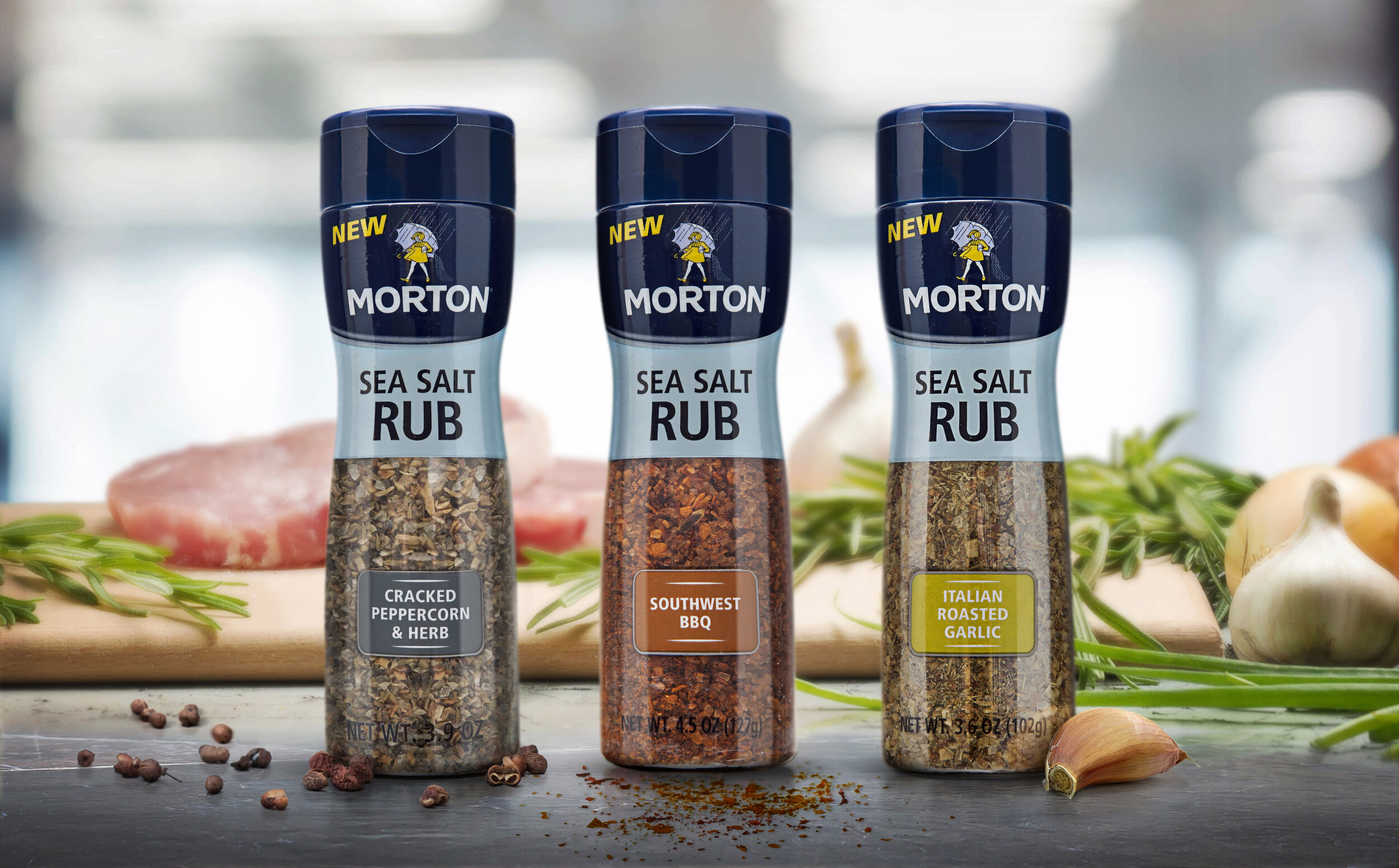
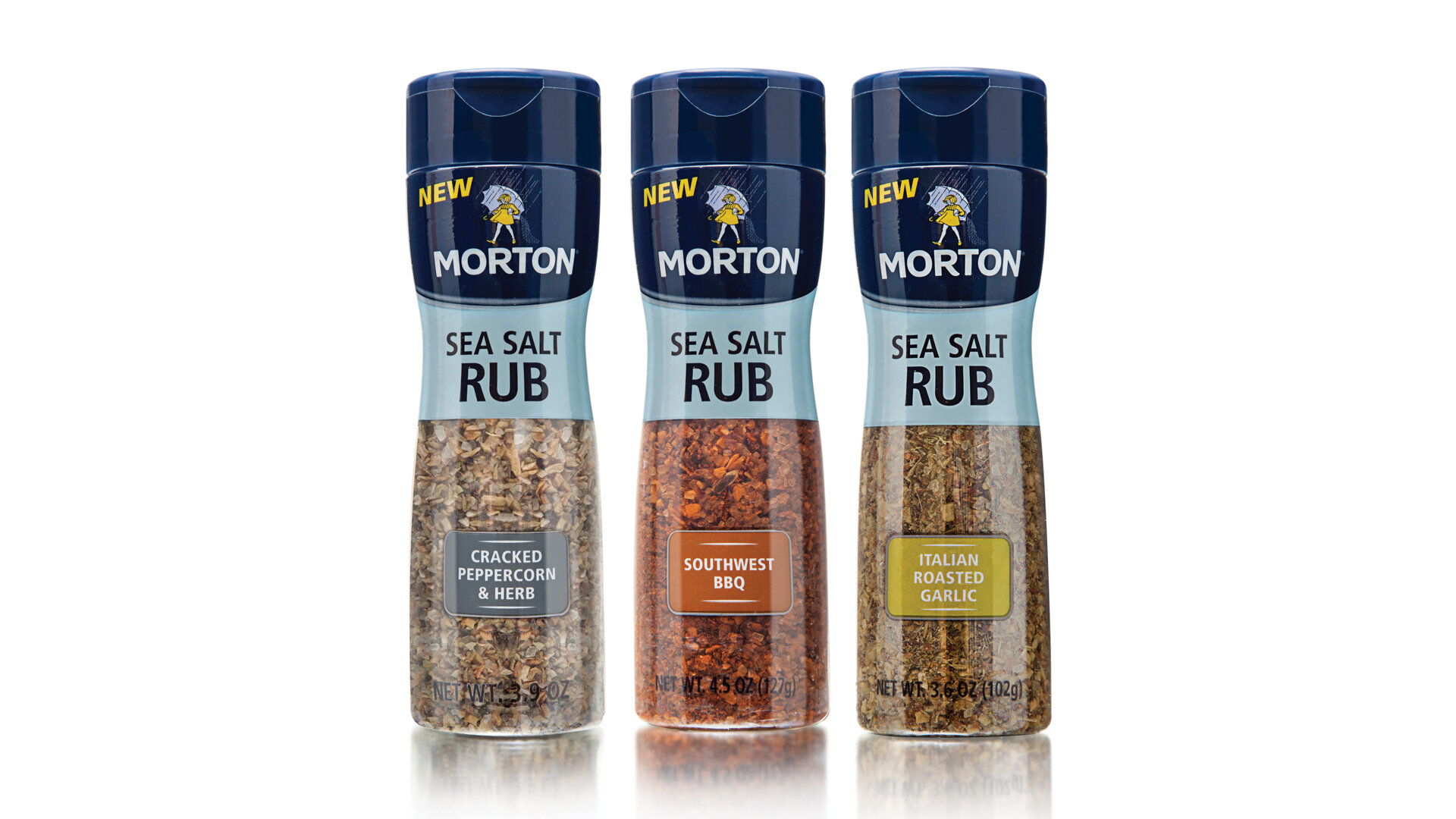
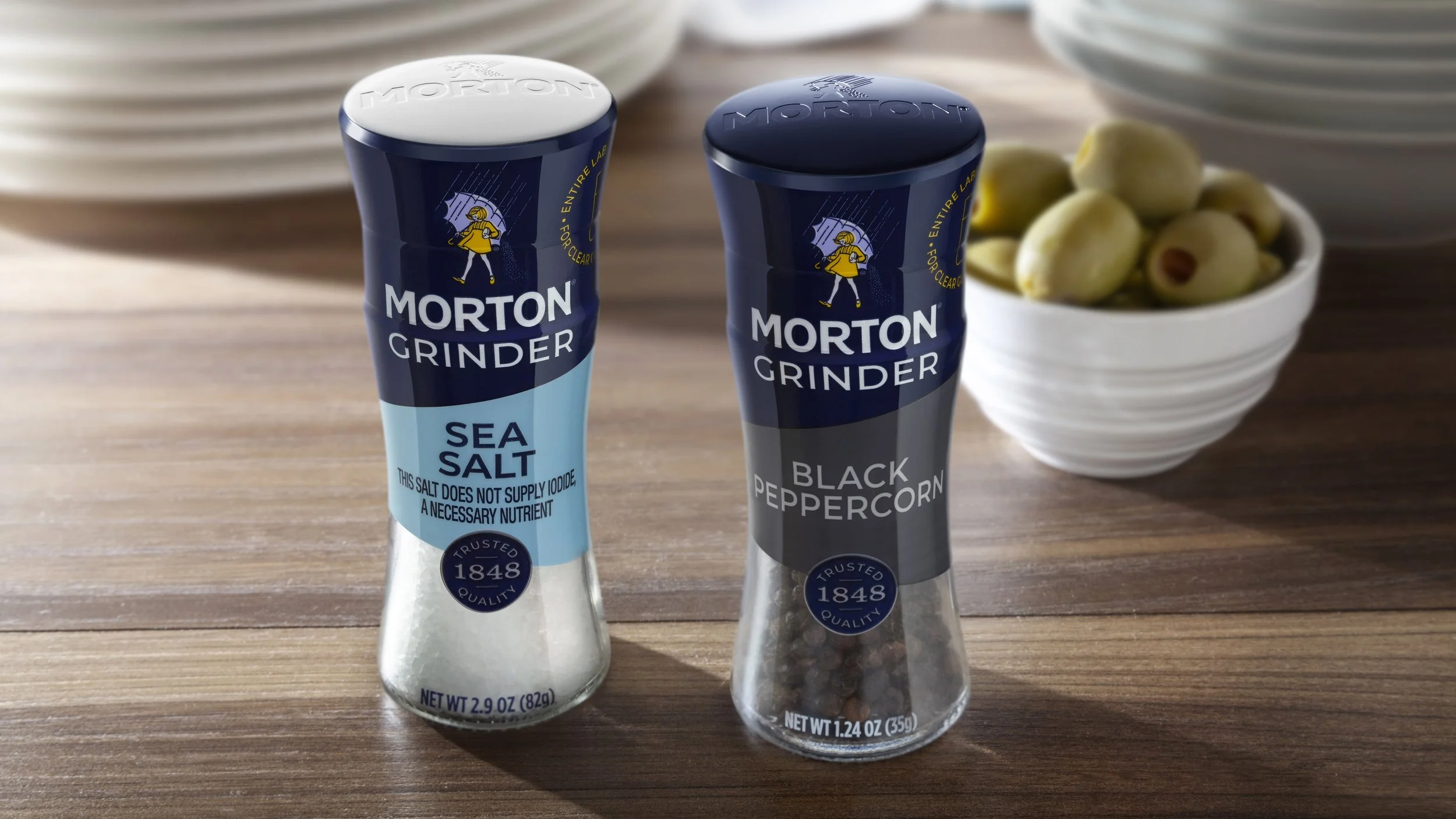
Morton Refillable Grinder
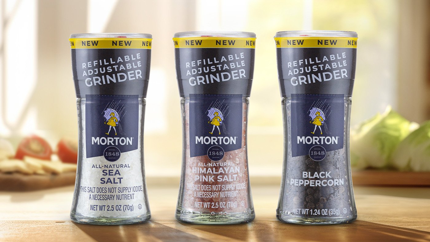
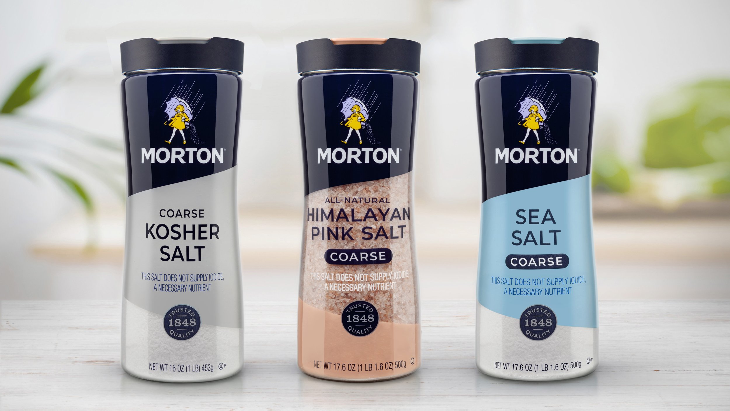
Sustainability with Style
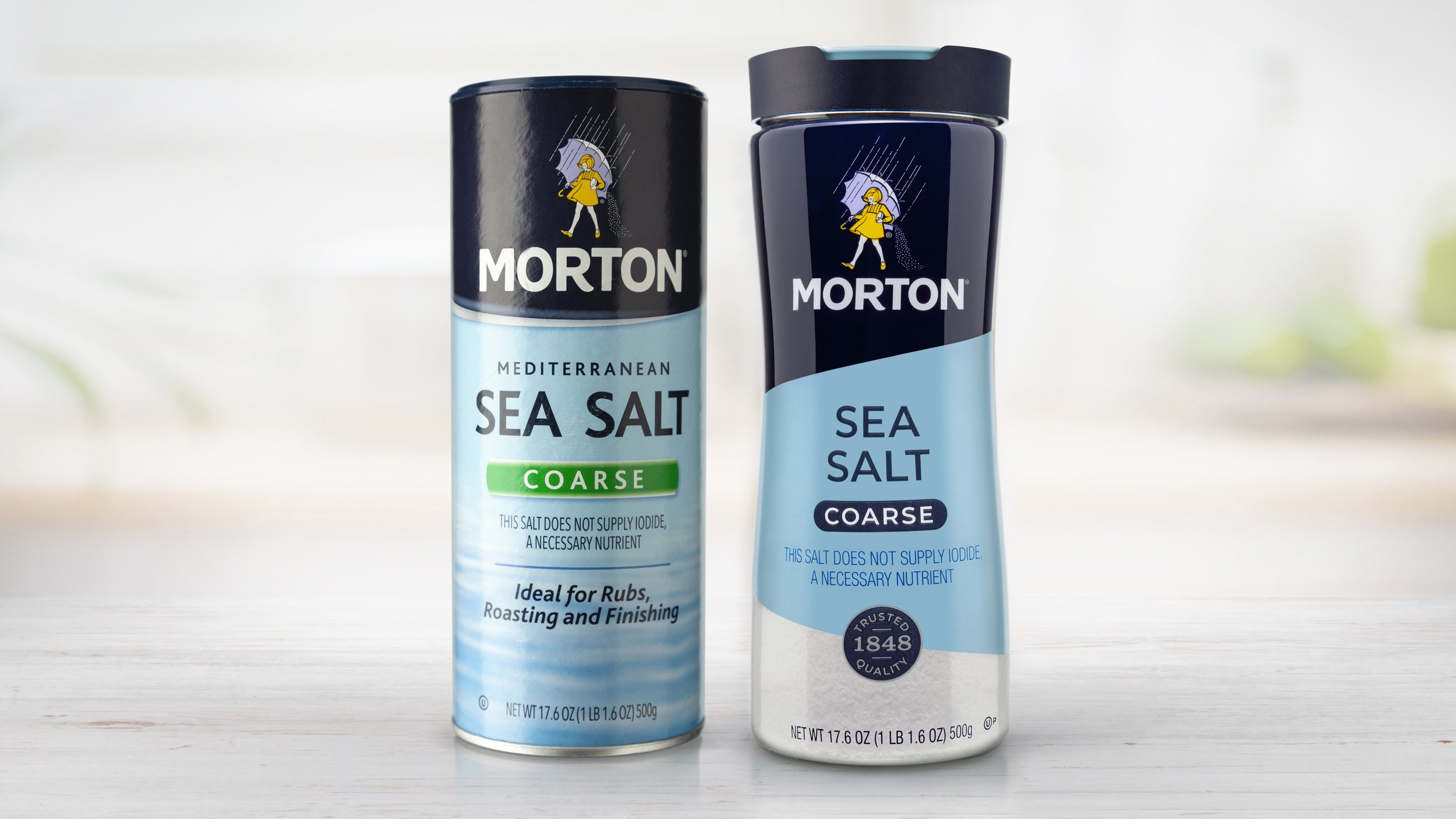
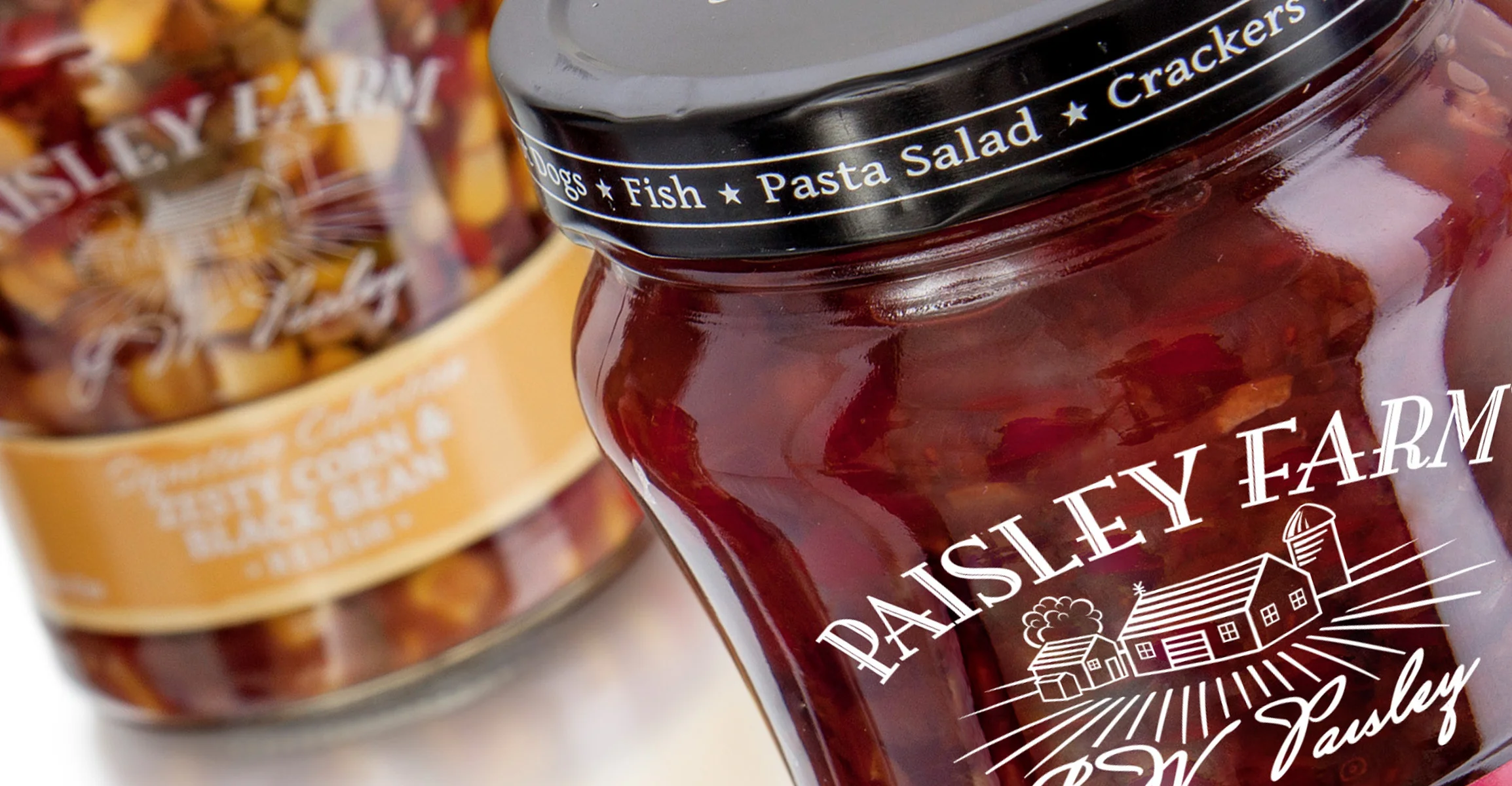
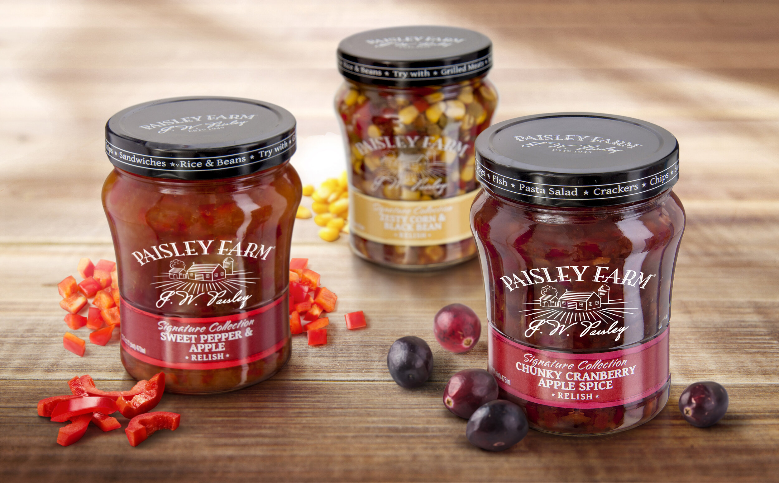
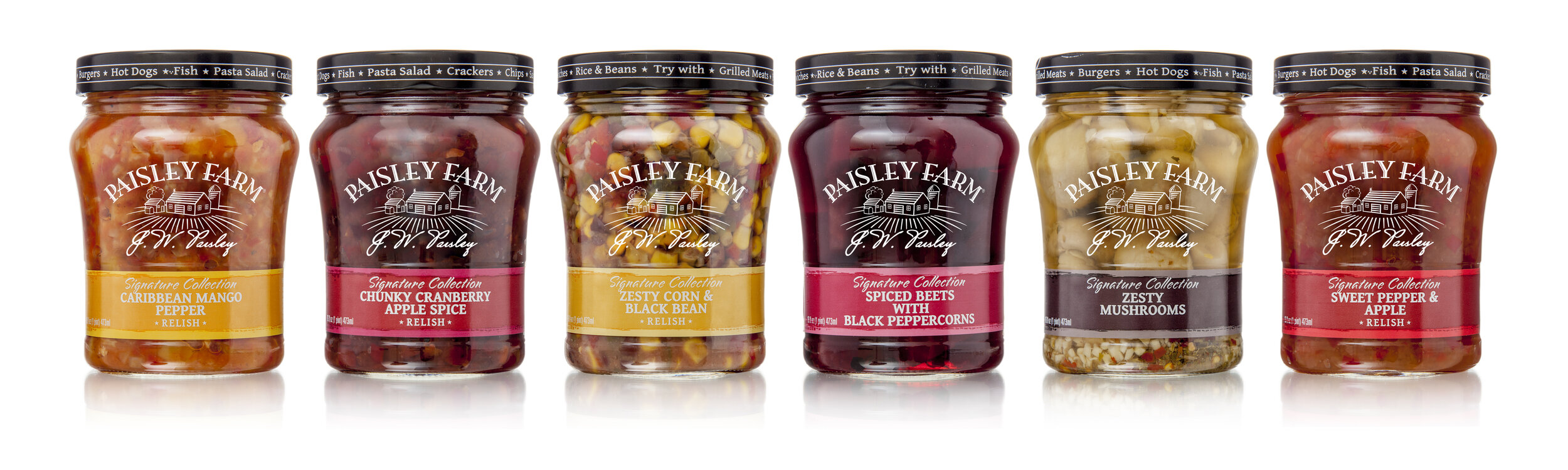
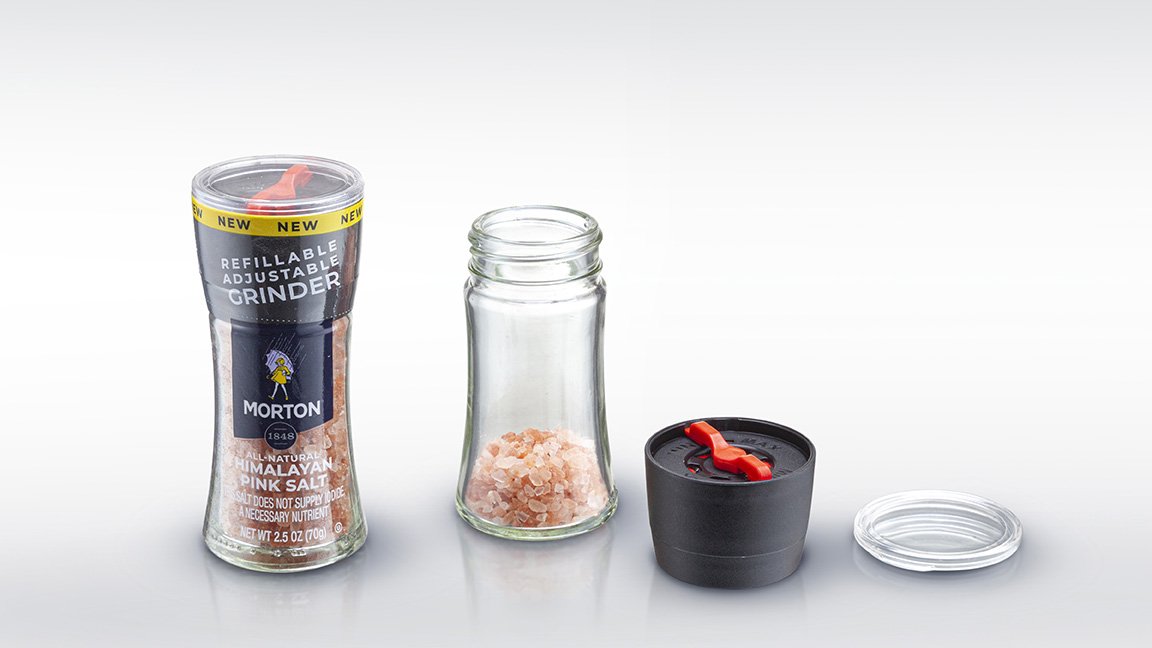
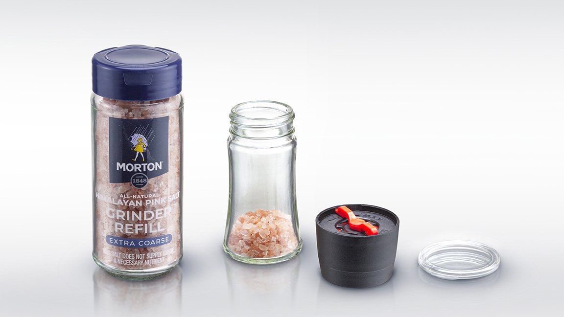
Throughout the decades, Morton Salt has continually innovated with their products and packaging to keep up with the latest trends. The brand's new adjustable and refillable glass salt and peppercorn grinders meet consumers’ growing demand for more sustainable solutions. For this latest product, Morton Salt worked once again with their partners at Studio One Eleven. We developed a custom bottle that has a premium look and feel, with a sleek, waisted silhouette that differentiates the packaging from the competition and maintains the brand’s visual language.
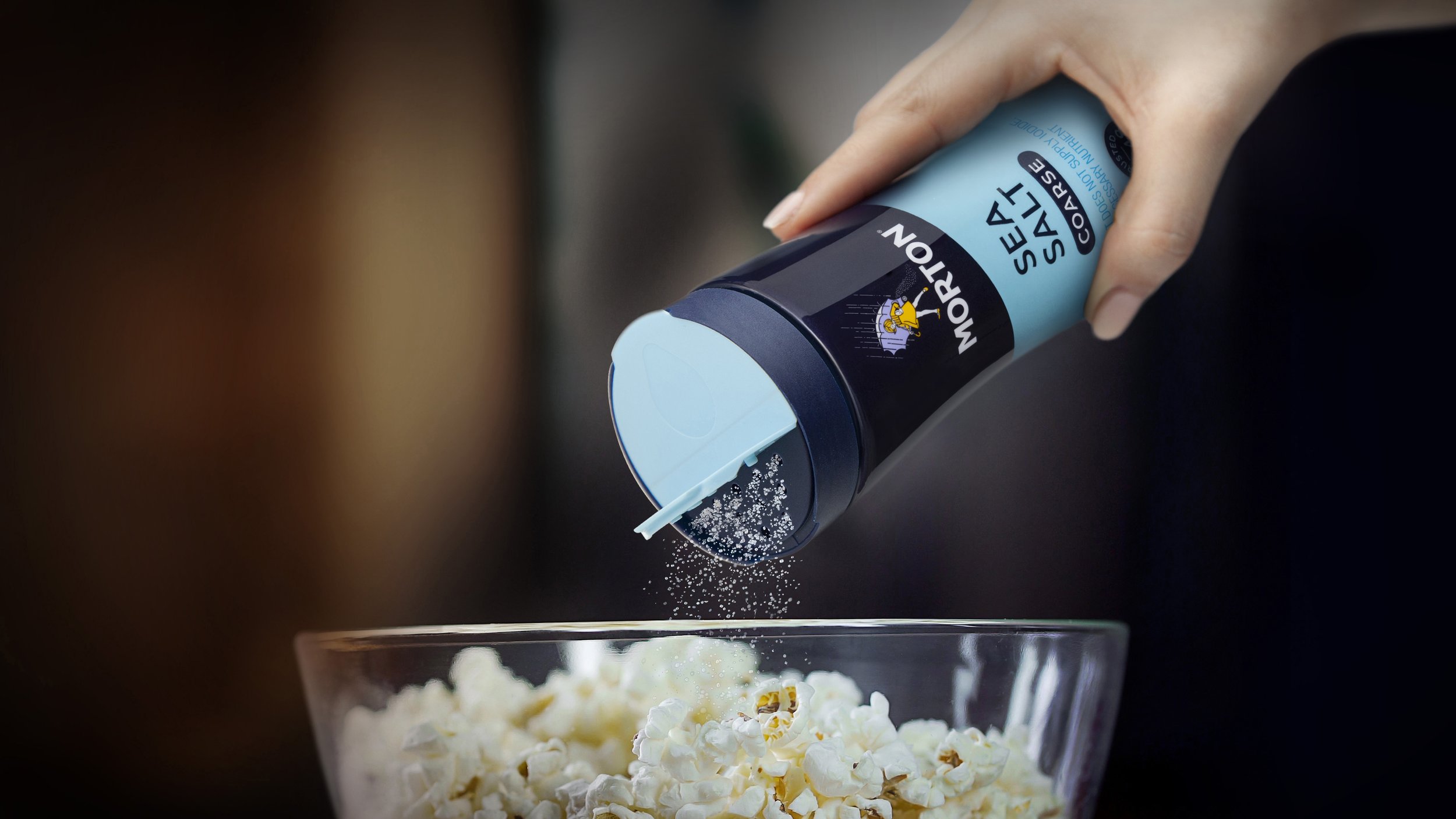
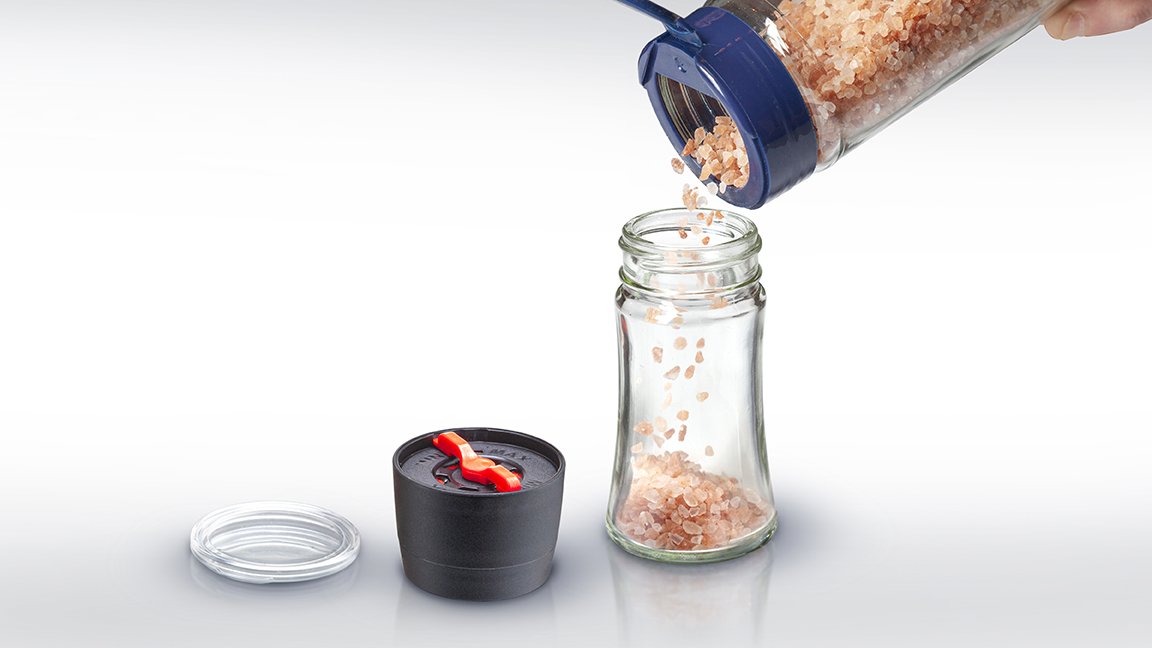
The bottle integrates seamlessly with the grinder, allowing for a full shrink wrap label that maximizes branding and shelf impact. The shrink sleeve is perforated for easy removal, showcasing the beautiful glass bottle worthy of sitting out on the kitchen counter or dining table. More than just a beautiful bottle, the package elevates the user experience with its ergonomic shape that sits comfortably in the hand. The adjustable grinder accommodates two or more settings, providing flexibility and versatility for home chefs and diners alike.