Branding

Food

Paisley Farms

← Back to our work

Paisley Farms


Preserves the farm-fresh look with rebranded custom jars.

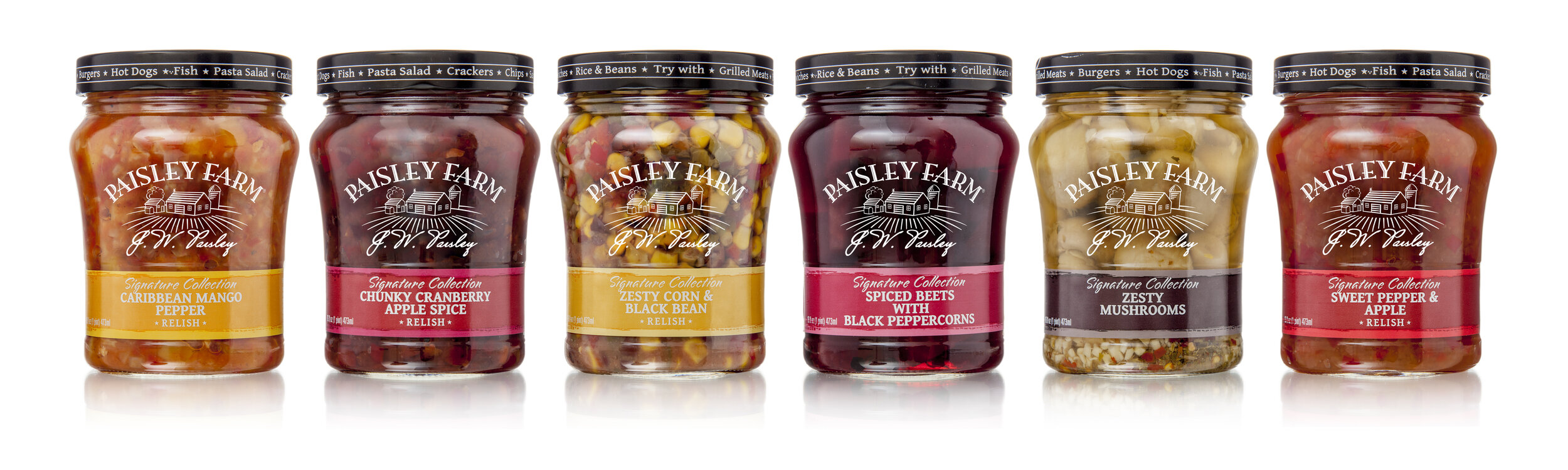
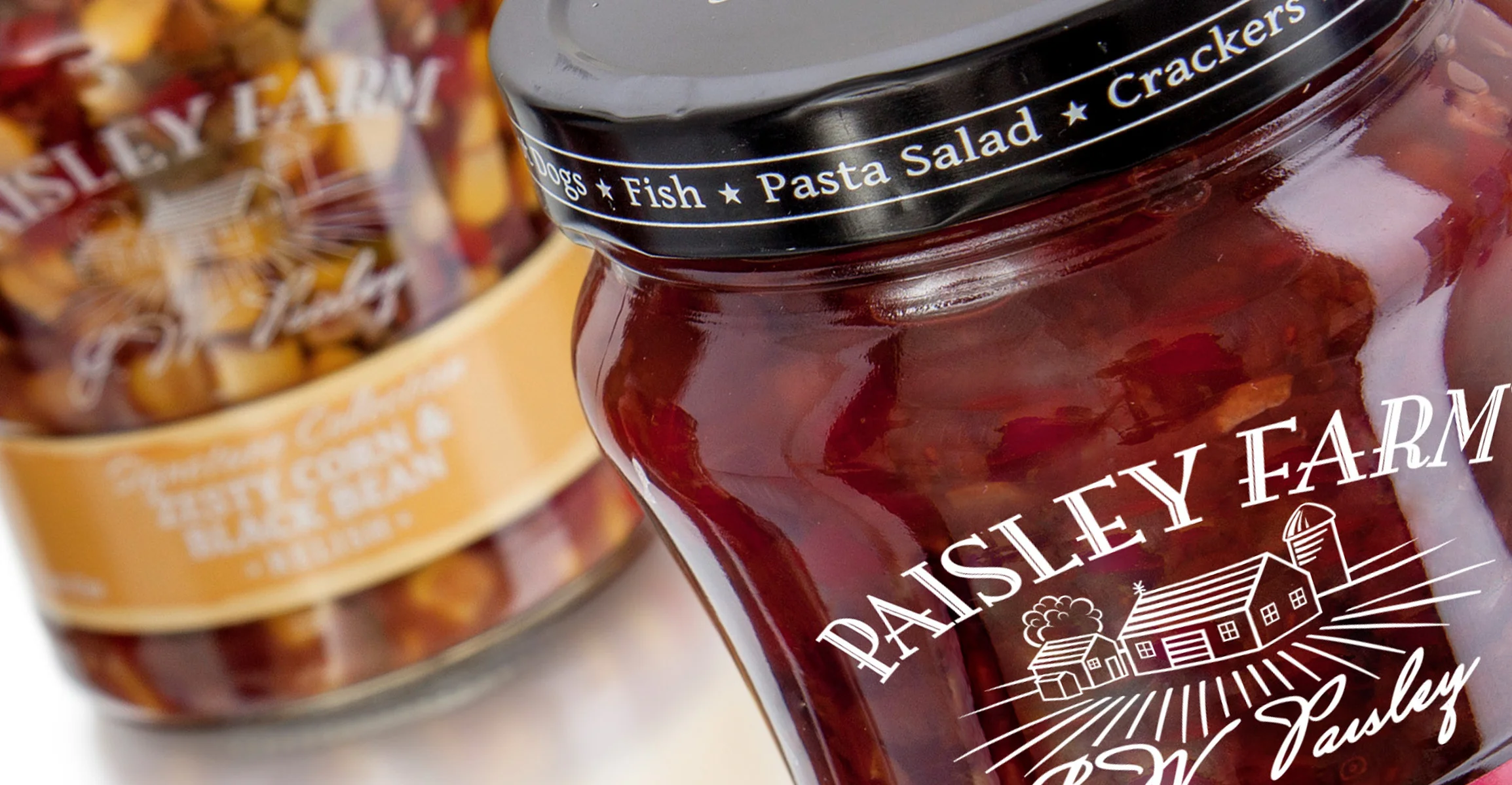
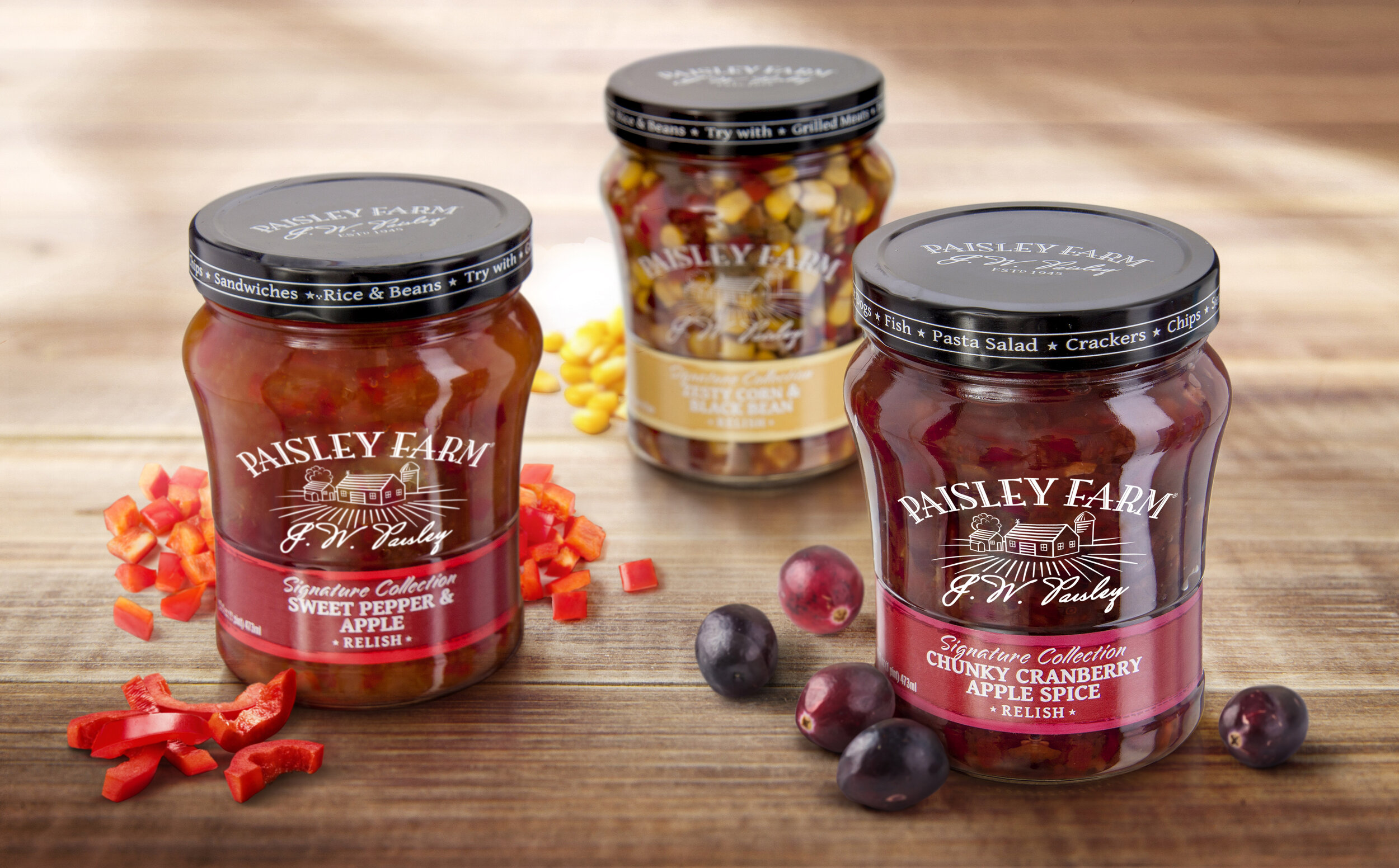
Studio One Eleven's glass jar brings a farm-fresh, small-batch feel to Paisley Farms' Signature Collection of pickled vegetables and relishes, via both the jar structure and minimal labeling that promotes visibility of the contents of each SKU through the glass. The package – suggesting a product you might buy at the local farmers market – is helping to expand distribution from club stores to grocery stores.

The slightly tapered jar, gentle shoulder, base detail, and deep-skirted stock 82 mm lug closure conjure up associations with home canning. The white silk-screened Paisley Farms brandmark on the face of the bottle, including a farm scene graphic and cursive J.W. Paisley signature, as well as white positioning text on the back of the jar communicate key information without obscuring the jar contents.

A high-gloss pressure-sensitive label fits unobtrusively into a debossed label panel near the base, leaving the contents of each jar clearly visible through the top two-thirds of the glass. The deep skirt of the closure offers additional message space that carries usage suggestions for each item (e.g., 'Try with Grilled Meats * Fish * Pasta Salad'), while the top of the cap is lithographed with the company logo to help build the brand identity.


116303 PaisleyFarm_Jars.jpg

Food

Grandma Hoerner's

← Back to our work

Grandma Hoerner's Preserves

A classic look for century-old recipes.

These matching custom 10 and 19 oz glass jars replaced uninspired Mason jar-style containers. Studio One Eleven designed premium packaging that blends modern rectilinear structures with pedestal-like detailing at the shoulder and base to impart a heritage look suiting Grandma Hoerner's century-old recipes. The slight broadening of the jar at the top and bottom also creates a recessed label panel area that protects the three-sided label from damage as the jar is handled.

Studio One Eleven incorporated extra-large brand embossments on one side of each jar – the GH initials on the smaller preserves jar and the full Grandma Hoerner name on the larger applesauce jar. The detail bolsters the impression of a product with a special provenance. The company logo, label design, and communication hierarchy were also updated to modernize the products for contemporary tastes without losing the heritage positioning. The wraparound label delivers the real estate required to tell the product story, complete with the connection to Grandma Hoerner's cooking.

The package update has helped increase shelf space in the highly competitive fruit and jelly categories. The new square and rectangular bottle structures are also minimizing shipping costs by enabling more product to fit on each pallet.