Berlin Packaging Scores Gold For Fourth Consecutive Year At 2014 NACD Packaging Awards

← Back to the headlines

Berlin Packaging Scores Gold For Fourth Consecutive Year At 2014 NACD Packaging Awards

Global Packaging Leader Also Sweeps Household Chemical & Automotive Category with Gold, Silver and Bronze Awards at April 10 Ceremony in Fort Lauderdale

Berlin Packaging, a leading full-service supplier of plastic, glass, and metal containers and closures, announced today that its packaging solutions had a strong showing at the 2014 NACD (National Association of Container Distributors) Packaging Awards ceremony. The company’s seven awards—three Gold, two Silver and two Bronze—were among the highest number won by any supplier.

“Once again, the Berlin Packaging team demonstrated the creativity and problem-solving acumen that place us at the forefront of the industry,” said Andrew T. Berlin, Chairman and CEO of Berlin Packaging. “We are delighted to be recognized for our efforts by the NACD committee. But we’re even more proud of how our packaging helps our customers succeed in the marketplace. We aim to boost the bottom lines of our customers, and packaging innovation is one of many ways we go about achieving this goal.”

The NACD Packaging Awards is a national competition recognizing compelling packaging released during the previous year. In addition to rivaling its company-record three Gold awards from last year, Berlin Packaging also swept the Household Chemical & Automotive category, winning Gold, Silver and Bronze, and took both Gold and Silver in the Food category. Specific results included:

E6000 Spray Adhesive

Gold, General Industrial

Changed the expectations for spray adhesives used for craft and home improvement products. Berlin created an hourglass-shaped PET container appropriate for customer Eclectic’s pioneering solvent-free adhesive. The product, which met Eclectic’s request for a “female-friendly” bottle well suited for smaller hands, also earned a Gold Packaging Design Award from the North American Retail Hardware Association.


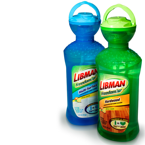
Libman Freedom Floor Cleaner

Gold, Household Chemical & Automotive

Delivers both innovation and convenience to busy consumers through a translucent measuring bowl atop the bottle. Eliminating the manual pumping that conventional pump bottles require, users simply squeeze the liquid cleaner into the dosing bowl. Once the chamber is full, the consumer flips the cap open and pours the correct amount of cleaner into Libman’s FREEDOM mop, where it is diluted with water.


Morton Sea Salt

Gold, Food

In a first for grocery-store salt and pepper grinders, is designed to sit on the dinner table like upscale giftware with no conspicuous brand label. The package features a custom white or black snap-on overcap with a non-removable grinder beneath. Embossed with the Morton name and logo, the overcap is designed to maintain the sleek silhouette of the product.


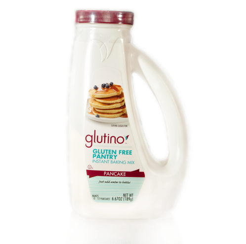
Glutino Instant Pancake Mix

Silver, Food

A custom package accommodating Glutino’s gluten-free, single-use, just-add-water-to-the-bottle pancake mix. The package was engineered to let the batter flow freely when the mix is combined with water. The result is an easy pour, no waste or mess package with none of the clogging that plagues Glutino’s competitors.


Polaris 2 Cycle Engine Oil

Silver, Household Chemical & Automotive

Mirrors Polaris’ snowmobiles and ATVs, which look like they’re in perpetual motion. The angular silhouette, extensive geometric surface detailing, and footed structure suggest a vehicle undercarriage. An extra-large handle grip, stippled inside to provide traction, allows consumers to pour the product while wearing a mitten or glove.
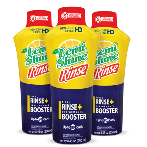

LemiShine Rinse

Bronze, Household Chemical & Automotive

Not only makes a bold premium statement on the shelf, but it also allows direct-squeeze dispensing. The unusual tapered oval silhouette with broad shoulder and narrow base lets this dishwasher detergent additive stand out in its category, while the snap-top closure includes a silicone valve that prevents leaking when the bottle is turned upside down for dispensing.


OFF! Pet Insect Repellents

Bronze, Pet & Vet; also honored for Best Use of Stock

SC Johnson’s first line of Off! insect repellents for pets, were creatively configured to achieve a family look familiar to users of the brand’s made-for-human products. Emulating the clean lines of other Off! products, each package utilizes custom canary-yellow PET or full-body shrink sleeve for uniformity, while pressure-sensitive labels highlight key product features such as the lack of harsh chemicals.


The 2014 NACD Packaging Awards were held April 10, 2014, in Fort Lauderdale, Florida.

Debossed Custom Closure Depicts 'One World' - Packaging World

← Back to the headlines

Debossed Custom Closure Depicts 'One World' - Packaging World

USANA Health Sciences’ rebranding effort includes the design and manufacture of a custom container closure debossed with the company’s new ‘one world’ logo.

~Square_Usana.png

USANA Health Sciences of Salt Lake City is a direct-sales company that offers vitamin and mineral supplements as well as products for low-glycemic weight loss, skin and hair care, and energy. To mark its 20th anniversary in 2012, the organization undertook a corporate rebranding project that included the design of a new brand logo and packaging, to refresh its outdated look and position USANA as a global company.

“We wanted a completely new approach,” explains John Cordova, Executive Director of Brand Management for USANA. “The previous packaging made our premium product seem very dated.”

According to Jon Jeffery, District Manager for Berlin Packaging—the organization responsible for the packaging project—USANA wanted the new design to convey “its wish to prolong life, unify mankind, and fight global hunger.”

To create the new identity, packaging, and visual language for its brand, USANA worked with Australian design firm Cato Partners. Cato’s vision centered around a spherical logo with white silhouettes of dynamic human forms against a background in shades of blue. The goal was to deboss this design onto a custom closure that would adorn all of USANA’s product containers.

Notes Jeffery, “The design resonated with USANA and its consumers, but there were manufacturing challenges.” To address these challenges, Berlin worked with its Studio One Eleven Design division, its Berlin Global Packaging Sourcing Team, and injection molder Mold-Rite Plastics to produce a custom closure in USANA’s tight time frame at a cost comparable with its existing packaging.

Dynamic new logo

USANA was founded in 1992 by microbiologist, immunologist, and pioneer in infectious disease diagnosis Dr. Myron Wentz, who, since the untimely death of his father at age 57, had dreamed of a world free from pain, suffering, and disease. Dr. Wentz founded USANA to provide people all over the world with the most advanced supplements science can produce. Because of his vision, USANA is dedicated to continuous product innovation, stringent manufacturing processes, ongoing scientific research, and the production of exceptional products.

The ‘one world’ logo designed by Cato was inspired by these ideas. Says Cordova, “When Ken Cato was asked about the new logo, his response was, ‘The key to USANA’s new identity comes from Dr. Wentz’ own words. In the development work, we found his words to be potent and absolutely relevant to the evolution of the overall concept. The idea of the USANA family as the healthiest family on earth, combined with the idea of a world free of disease, becomes evident when you see the trademark.’”

As mentioned, the primary brand logo presents active human figures against a background of several shades of blue. Variations of this symbol are then used with different colors for each of the brand’s “body benefit categories” in its Optimizer line, including Digestive Health, Total Body Health, Bone and Joint Health, Heart Health, Brain and Nerve Health, and others. For example, products in the Brain and Nerve Health category use a central silhouette of a human head, with a background of red; Bone and Joint health shows a figure running, with a background of grey blue. There is even a customized version for its Usanimals children’s vitamin product, which uses a white background and silhouettes of animals, including a monkey, an elephant, and a dolphin, in bright colors of magenta, orange, and green.

The central logo is repeated on the secondary cartons, printed with a glossy finish. For the primary container, Cato specified a white, straight-wall high-density polyethylene bottle with a custom polypropylene cap sitting flush to the container. The entire cap was designed to carry the debossed logo, with raised areas exhibiting a polished finish, and debossed areas having a matte finish.

Everything just came together for this project; the team that was organized was well thought out. The people who came together made this happen... The project came off flawlessly, it really did.
— Jon Jeffery, District Manager at Berlin Packaging

In December 2011, USANA approached Berlin Packaging with the new package design—and with an extremely tight time line for finished, molded packaging. The supplements company wanted to have the new packages ready for use in June 2012, so that it could begin filling products in the new container for its August 2012 distributor convention.

As Jeffery relates, a modified stock container from Alpha Packaging was chosen for the  container body. The closure, however, involved challenges relating to engineering a custom closure that could be produced at the required cycle time and at a reasonable cost within the time frame requested by USANA.

Keeping custom closure costs down

Berlin began work on the USANA closure project by engaging engineers in its Studio One Eleven Design group and its Berlin Global Packaging division to tweak the design to accommodate certain project restrictions. “We had to watch the pricing for new molds,” says Jeffery. “New molds on a closure can sometimes cost anywhere from $75,000 up to $250,000, depending on cavitation.”

Part of the solution involved designing horizontal lines on the side of the closure so that it would release properly from the mold during the injection-molding process. This allowed the part to be produced at industry-standard speeds. Cost was also reduced by keeping the depth of the closure to 0.05 in. “When you do that, you are able to create cores or cavities over an existing core. That keeps the mold cost down and enables you to have a custom-looking package,” says Jeffery.

Mold-Rite was selected as the closure manufacturer, as the company has its own tool-build capabilities in-house and specializes in what it calls modular mold design. Explains Troy Rinke, Vice President of Sales for Mold-Rite, “We have over 1,200 molds in-house. We build tools knowing that we can take a stock part and create a custom look by using existing manifold systems and cores, and just changing the cavity plate.

“For USANA, we built a completely new cavity plate, but we were able to use existing cores and manifold systems, which helped expedite the process and meet the time lines they were looking for to get them to market faster.”

Mold-Rite manufactured five cap sizes for USANA to match five container sizes, ranging from 75 to 400 cc, on a new KraussMaffei injection press—one of eight new presses in the 500- to 700-ton class installed by the company in the last two years. In all, Mold-Rite operates 85 injection presses, ranging from 100 tons to 750 tons, at its three manufacturing facilities.

Due to the fine-tuning of the design, as well as Mold-Rite’s in-house tool-build capabilities, Berlin was able to deliver closures to USANA by its requested deadline. “From the time we were given the sign off on the closures, which I believe was in mid-April, we were able to create these closures and get them out to USANA in approximately 10 to 12 weeks,” says Jeffrey. “This type of process for a new custom closure typically takes from 20 to 24 weeks. So we cut the time in half, which was crucial for this company.”

The final piece in the project was to ensure that the closures could run on USANA’s existing capping equipment. Because the company stayed with the same diameter closures and because the cap offered enough area for gripping, introduction of the new closure into USANA’s packaging line in Salt Lake City was virtually seamless. The only adjustment needed, according to Jeffery, was with the induction seal equipment. “Because of the peaks and valleys we had designed for the closure, the induction sealer did not apply heat evenly down through the top of the bottle. We just had to tweak the machine to make sure we had constant heat over the area so that it applied the induction seal properly. It was a minor challenge that was resolved quickly.”

Commenting on the project, USANA’s Cordova says, “There was some concern about mixing custom with stock, but we were very happy with the outcome. We also saved ourselves a lot of heartache by deciding not to change the circumference of the bottles.

“Overall, the response from our distributors has been very good. Customers are happy with the new look and have embraced the new identity.”

Adds Jeffery, “Everything just came together for this project; the team that was organized was well thought out. The people who came together made this happen. It was a culmination of several different entities, including USANA and their marketing team in Australia, three different divisions of Berlin, and Mold-Rite. The project came off flawlessly, it really did."


Berlin Packaging Sets New Company Record At 2013 NACD Packaging Awards

← Back to the headlines

Berlin Packaging Sets New Company Record At 2013 NACD Packaging Awards

Berlin Packaging, a leading full-service supplier of plastic, glass, and metal containers and closures, today announced it was one of the most honored packaging companies at the 2013 NACD Packaging Awards ceremony, held April 19 in Austin, Texas.

Our goal every day is to bring forth solutions that appeal to consumers while elevating the reputation of our clients.
— Andrew T. Berlin, Chairman & CEO of Berlin Packaging

“2013 is off to a great start for Berlin, and having our creative work honored by this prestigious packaging competition certainly adds to our momentum,” said Andrew T. Berlin, Chairman and CEO of Berlin Packaging. “More important than this recognition, however, is that these nine winners point to the excellence our company achieves in creating designs that succeed in the marketplace. Our goal every day is to bring forth solutions that appeal to consumers while elevating the reputation of our clients.” 

The NACD Packaging Awards is a national competition recognizing the most innovative packaging released during the previous year. Three winners are selected (gold, silver and bronze) in each of nine categories.

Setting a new Berlin Packaging record, the company received three Gold, three Silver and three Bronze awards in six of nine categories, including:

Rich & Rare Reserve

Gold, Beverage

Produced by Sazerac, features a custom package that enhances the fastest-growing U.S.-bottled Canadian whisky product. The bottle features an upscale scalloped neck and wheat embossing, befitting its upper-shelf status. Its striking gold overcap and embossed bottle with hot stamped detail and registration were once unachievable on glass containers. The label is also double-sided for a richer look.


~Square_Amplifi.png

Amplifi

Gold, General Industrial

A custom HDPE package designed for Briggs & Stratton’s hose powering system. The innovative package is able to snap onto a spray gun, dispense concentrated cleaning solution, and detach after use for recapping. As a result, users benefit form a cleaning solution that doesn’t have to be measured, premixed or poured into a separate reservoir, simplifying the process of pressure-washing garden furniture, patios and other outside amenities.


Wet & Forget Shower

Gold, Household Chemical & Automotive

Uses another custom-designed package, which allows users to apply Wet & Forget’s once-a-week no-scrub shower spray more efficiently. It delivers more product than other cleaners, reaches high spots without difficult lifting, and even sprays upside down. Berlin’s Studio One Eleven design division created a two-handed bottle so consumers can hold the bottle with one hand and spray with the other. A synthetic label is laminated to withstand the wet shower environment.


~Square_UltraEliminex.png

Ultra Eliminex

Silver, Drug & Pharmaceutical

Achieved its goal of instilling a premium, differentiated look on store shelves. A product of BNG Enterprises, the metalized HDPE plastic was a breakthrough in that it created the dramatic look of aluminum while still meeting multiple production requirements.


~Square_HoneyBadger.png

Honey Badger BBQ Sauce

Silver, Food

Inspired by the famous “Randall’s Honey Badger” YouTube video seen over 59 million times. Because the company’s original design could not have been blow-molded or run down the customer’s filling line, Berlin’s design team modified certain aspects of the character without compromising their prominence. The finished package bursts with details that celebrate the “in your face” character of Honey Badger.


~Square_BioNik.png

Bionik Plant Growth Regulator

Silver, General Industrial

A bold design for a breakthrough product by Valent BioSciences, features a custom-colored HD Ribbed Round bottle that diminishes paneling caused by the product’s gas-producing properties. The closure’s 45mm size and deep skirt allow it to act as a dispensing cup, while its induction seal includes a knife-like protrusion to facilitate puncturing of the foil inner seal.


Cutex_thumbnail.png

Cutex Nail Polish Remover

Bronze, Cosmetic & Personal Care

A revival of the venerable Cutex nail care product line. Cutex Brands wished to differentiate and elevate its product from the competition without confusing loyal customers. Berlin retained the basic Cutex bottle silhouette while increasing the package height in order to stand out on the shelf. Other strategic changes included a modernized Cutex logo, a reverse-tapered closure, and a lighter pastel color palette that spans and differentiates the line’s five formula varieties.


~Square_Metaboliq2.png

Metaboliq Boost

Bronze, Drug & Pharmaceutical

A redesign of a package that was underperforming aesthetically in a highly competitive category. The weight management product from Qivana LLC was given a polished tin container with an embossed “Q” on the lid to reinforce the company and product logos, along with color-coded top label bands for different SKUs in the line.


~Square_Rejuvenate.png

Rejuvenate

Bronze, Household Chemical & Automotive

A custom package designed for For Life Products, scales from 16 to 32 ounces to provide a uniform look across all 21 SKUs in the Rejuvenate family. The package features an off-center neck for an even pour as well as interchangeable Ratchet and Standard neck finishes to handle disparate closure needs.


Berlin Packaging Wins WorldStar Packaging Award for Mission Athletecare’s COURT GRIP Package

← Back to the headlines

Berlin Packaging Wins WorldStar Packaging Award for Mission Athletecare’s COURT GRIP Package

One of Only 9 U.S. Packages Recognized in Global Competition

Berlin Packaging, a leading full-service supplier of plastic, glass, and metal containers and closures, announced today that it has been honored with a 2013 WorldStar Packaging Award for its work on the custom package forMission Athletecare’s COURT GRIP, a shoe traction product for basketball courts and other indoor court surfaces. The striking silver and black bottle with an extreme 45-degree neck was one of only nine U.S. packages and 159 worldwide to earn the commendation, which recognizes the best packaging on the globe. 

The WorldStar award recognizes the complexity of the project as well as the aesthetic and functional success of the final package.
— Scott Jost, Berlin Packaging Vice President of Innovation and Design

The award marked Berlin Packaging’s second consecutive WorldStar honor. The company also won a 2012 WorldStar Award for a hand soap package for Pampers’ Kandoo brand. That custom frog-shaped container was designed to fit snugly in tub or sink corners for easy do-it-yourself dispensing for children.

The COURT GRIP project – jointly executed by Mission, design agency Revolver New York, and Berlin Packaging’s Studio One Eleven design division – required not only a muscular shelf presence befitting the athlete audience but also an ergonomic solution enabling rapid one-handed application of the COURT GRIP formula to sneaker soles while standing or sitting between plays or quarters. The final package was 100% customized with features including:

A contoured, custom-molded HDPE bottle with strategically placed, debossed finger grips to provide a firm hold even for sweaty hands; a radical 45-degree neck architecture – selected after testing to determine the optimal application angle – that required special blow-molding equipment and techniques; a custom applicator with a special cloth bonded to the applicator sponge for durability under repeated use; and an internal valve system to dispense the proper amount of formula when depressed against the shoe sole without squeezing.

Aesthetic features added to maximize shelf impact include groove-like line work suggesting the chiseled muscles on an athlete’s body, a silver overcap embossed with the MISSION logo, a contrasting black neck, and a label printed on a metallic foil substrate that mirrors the silver color motif of the bottle and overcap.

Berlin Packaging also developed the package for a companion product called POWER GRIP that instantly dries hands to provide a more secure and confident grip on the basketball. Both packages are now used and displayed on scoring tables at every National Basketball Association league game through a multi-year partnership with Mission AthleteCare. The products have also been endorsed by the NBA Trainers Association and are approved for play by the National Collegiate Athletic Association as well as for play at the high school level.

“The COURT GRIP product presented unusual design challenges. It was not only a completely new product category with no precedents to follow or adapt, but it also required extensive testing and customization to deliver an ergonomically optimized solution as well as multiple modifications to make the bottle manufacturable,” said Scott Jost, Berlin Packaging’s Vice President of Innovation and Design. “The WorldStar award recognizes the complexity of the project as well as the aesthetic and functional success of the final package.”


The 2013 WorldStar winners were announced this month in Sweden by the World Packaging Organisation (WPO). Awards, which are selected by an expert panel of judges, are given when a package is deemed superior in its category and market and better in its class in execution or innovation compared to others.


Berlin Packaging Gives Makers of Nutritional Drink LIMU a Bronze Glow at Global Packaging Design Awards 2012

← Back to the headlines

Berlin Packaging Gives Makers of Nutritional Drink LIMU a Bronze Glow at Global Packaging Design Awards 2012

Berlin Packaging, a leading full-service supplier of plastic, glass, and metal containers and closures, today announced it has received a bronze medal in the 2012 Beverage World Global Packaging Design Awards. The award honors Berlin’s imaginative re-design of the signature brand package for The Limu Company, a top manufacturer of liquid nutritional supplements.

LIMU ORIGINAL®, The Limu Company’s flagship product, is a marketing phenomenon sold in 19 countries. While recognized around the world, the LIMU ORIGINAL heavy glass bottle was expensive to ship and prone to breakage. Moreover, an update was needed to reinvigorate the brand and solve multiple performance issues. Berlin Packaging impressed the Global Packaging Design Awards judges with its reboot, created by Berlin’s Studio One Eleven division, which includes:

Our goal with every design assignment is to define and raise the brand experience while accomplishing maximum package performance.
— Andrew T. Berlin, Chairman and CEO of Berlin Packaging

An eco-friendly, BPA-free P.E.T. plastic container that significantly lowers shipping costs and virtually eliminates breakage while still communicating premium quality. A slimming, taller silhouette that speaks to the product story. A structural grip feature framing the new vertical logo and graphics. A new tamper-evident closure that replaces the existing metal cap. A two-color black and silver shrink neck band located below the closure that maintains brand identity even after opening. A modern reinterpretation of the brand’s iconic “harvest man” logo on the package front.

The one-liter P.E.T. bottle in LIMU ORIGINAL uses 86% less material than glass and 39% less energy to manufacture. It also reduces greenhouse gas emission by 66%, eliminates 229 metric tons in annual carbon dioxide emissions, and provides environmental savings of waste, gas and power during the manufacturing process.

“Our goal with every design assignment is to define and raise the brand experience while accomplishing maximum package performance. We’re pleased that the Global Packaging Design judges were as excited about our LIMU ORIGINAL package design as we are,” said Andrew T. Berlin, Chairman and CEO of Berlin Packaging. “Scott Jost and the Studio One Eleven team did amazing work on this iconic product.” 

Beverage World’s Global Packaging Design Awards is an international competition honoring the best in beverage packaging design from around the world. Winning entries must demonstrate exceptional creativity and quality over a variety of elements including graphic design and structural innovation.


Berlin Packaging's Studio One Eleven Design Team Moves to Larger, Custom-Built Space

← Back to the headlines

Berlin Packaging's Studio One Eleven Design Team Moves to Larger, Custom-Built Space

Response to continued strong demand for custom-packaging services

Studio One Eleven provides an awesome service for our customers, and our new space will make it an even better experience for our employees, customers, and suppliers alike.
— Andrew Berlin, Chairman and CEO

Berlin Packaging, a leading full-service supplier of plastic, glass and metal containers and closures, announced today that its Studio One Eleven design division has moved to a larger, purpose-built facility. The move was prompted by Berlin Packaging customers' ever-increasing demand for custom packaging design, brand strategy, visual branding, and marketing services work. This is the fourth expansion move for Berlin Packaging's design division in the last decade.

The new space, which is on the second floor of the Berlin Packaging's headquarters building in downtown Chicago, is more than double the size of Studio One Eleven's current space. Every aspect of the new studio was designed to support and enhance the collaborative process between designers, and to create a client experience that's second to none in the industry.

Studio One Eleven's multidisciplinary design team manages every aspect of creating compelling packaging solutions. The turn-key process spans opportunity analysis, concept generation, evaluation, optimization, and commercialization. The 20-person team serves clients in categories ranging from personal care and household chemicals to food & beverage and medical consumables. Studio One Eleven has received numerous "best of show" awards and top packaging honors, but the team's success is best measured in how well its designs perform in the marketplace.

The expansive new studio space provides for planned growth of the division and was conceived to promote teamwork and creativity via an open floor plan bathed in natural light. The main workspace is surrounded by windows, and all office-fronts and collaboration area partitions are floor to ceiling sliding glass panels. Berlin Packaging's customers will also benefit from expanded research and product sample libraries, larger collaboration areas, a photo studio and production room, and a state-of-the art 3-D print lab/model shop for rapid prototyping.

"Innovative packaging plays a critical role in building brands and improving users' product experiences. Our new space allows our expert development team to grow as needed and will bolster our ability to create innovative packaging solutions for our clients," said Scott Jost, Berlin Packaging's Vice President of Innovation & Design.

"Studio One Eleven provides an awesome service for our customers, and our new space will make it an even better experience for our employees, customers, and suppliers alike. By keeping the Studio next to our headquarters, we ensure the tight connectivity between design, supply chain, sales, and operations that has contributed so much to our performance," notes Andrew Berlin, Chairman and CEO.


Berlin Packaging Continues Multi-Year Win Streak at 2012 NACD Package Awards

← Back to the headlines

Berlin Packaging Continues Multi-Year Win Streak at 2012 NACD Package Awards

Company Follows 2011 Best of Show Honors with Multiple Awards for 2012 in Drug & Pharmaceuticals, Food, Pet/Vet and Novelty Categories

Berlin Packaging, a leading full-service supplier of plastic, glass, and metal containers and closures, was once again one of the top winners at the 2012 National Association of Container Distributors (NACD) Package Awards Competition, taking honors in multiple categories. The wins, which include designs for Mission Athletecare, Kremers Urban Pharmaceuticals, Ainsworth Pet Nutrition and IHOP (International House of Pancakes, LLC), build upon the company’s 2011 showing when it won best in show honors for Pampers Kandoo hand soap, along with six other awards.

At this year’s national competition, Berlin Packaging received gold, silver and bronze awards, including:

Design awards are nice, but we are successful because we design products that retailers want on their shelves and consumers like to purchase.
— Andrew T. Berlin, Chairman and CEO of Berlin Packaging
~Square_Mission.png

Mission COURT GRIP (Gold), a shoe traction treatment developed in conjunction with NBA Miami Heat All-Star Dwayne Wade that basketball players can apply with one hand while standing or sitting during games. The package, a joint project of Mission Athletecare, Revolver New York, and Berlin Packaging’s Studio One Eleven design division, features a contoured, custom-molded bottle with debossed grip for sweaty hands, a custom applicator with special bonded cloth and internal valve system, and a modified 45-degree applicator angle for optimal product application.

Mission POWER GRIP (Silver), designed to help basketball players overcome sweaty hands, features an inverted package to quickly dispense the product between plays. The custom package builds on the aesthetic of the companion Mission COURT GRIP product, utilizing the same metallic finish and similar shape details that evoke an elite athlete’s body. Strategically placed contours on either side allow for easy gripping, while the hanging bottle enables the athlete easy access to the product and the oriented dispensing cap makes it possible to dispense the formula with one hand.

Gnawin’ Forever (Silver), a custom package design for Ainsworth Pet Nutrition’s breakthrough chew toy for adult dogs. To accommodate the innovative, refillable product design, Berlin Packaging developed a unique multi-resin, laminated blister pack that prevents leaching, keeps air out, and ensures freshness of the chew treat. The package also features a kick out foot as well as a hang hole to meet the customer’s display requirement for shelf or hanger flexibility at retail.

IHOP at HOME® Syrup (Bronze), a line of IHOP-branded consumer syrups, which are sold through Walmart as a completely new syrup line. The package was designed to evoke the IHOP restaurant experience at home while ensuring a good pouring experience. The result is a handled natural polypropylene bottle with an IHOP blue flip-top pouring closure, a dramatic large-panel label with matching blue IHOP branding, and a uniquely shaped handle. The package is produced in 12 oz. and 14 oz. sizes.

Glycolax (Bronze) is a private label, over-the-counter package for Kremers Urban Pharmaceuticals. Berlin Packaging created a design that fits with the branded product design without infringing on any design patents; it also includes a custom child resistant dosing cap that satisfies child and elderly protocol testing. The overall package gave Kremers Urban the shelf appeal it was looking for as well as the package performance it needed.

“Our 2012 NACD awards are gratifying, especially in consideration of the breath of packaging disciplines that are represented, from design and engineering to materials and manufacturing,” said Andrew T. Berlin, Chairman and CEO of Berlin Packaging. “What we’re most proud of, however, is the success that these products are garnering in the marketplace. Design awards are nice, but we are successful because we design products that retailers want on their shelves and consumers like to purchase.”


Xango Moves to PET for Nutritional Supplement Beverage

← Back to the headlines

Xango Moves to PET for Nutritional Supplement Beverage

Referred to by some as the “Queen of fruits,” the mangosteen “ripens twice a year and is revered for its taste and healing properties,” according to Lehi, UT-based Xango, LLC, which considers the mangosteen fruit its flagship wellness ingredient.

Recently, the global nutrition company and maker of health and wellness products switched its premium mangosteen beverage Xango Juice from glass to 750-mL PET bottles. Distributed by Berlin Packaging, the bottles are manufactured by Berry Plastics, using a two-stage reheat-and-blow process on equipment from Sidel. Empty bottles weigh 74 g.

Xango and Berlin Packaging have a great partnership and they were selected again as a supplier because they provided solutions that met the project requirements better than other candidates.
— R.D. Rex, Technical Director of Xango

According to R.D. Rex, Xango’s technical director, “There were many considerations in the decision to change. It was the opportunity to improve in so many areas while still maintaining the premium Xango brand image and product quality. Xango experienced improvements in many areas, such as transportation, package weight, damage, and product quality.”

Rex notes, “Xango and Berlin Packaging have a great partnership and they were selected again as a supplier because they provided solutions that met the project requirements better than other candidates.”

He explains that Berlin Packaging and Xango faced PET cost increases during the development process, with Berlin “providing a solution to Xango that met the expectations for a PET bottle of suitable gram weight to replace the glass, engineering a ‘push-up’ that provided bottles that met aesthetic expectations, and [in the] logistics and supply chain for freight of the preforms.”

The material change necessitated a conversion from the pasteurization and hot-fill process used for the glass bottles to aseptic filling, completed by a contract packager using filling and capping equipment made by Fogg Filler Co.

Bottles are decorated with two pressure-sensitive labels and a shrink band, with the shrink sleeve sourced through Zion Flex Pack.

The move to PET brought about a host of downstream environmental and economic advantages. According to Xango, these included the following:

Savings exceeding $1 million annually in the cost of goods, freight, secondary packaging, and breakage 85% reduction in bottle weight and associated packaging/shipping requirements 34% reduction in energy use 64% reduction in greenhouse gas emissions, significant waste reductions with no bottle breakage and less secondary packaging, replacement of polystyrene with corrugated for bottle separation 5.7 million lb savings in annual materials 2,039 metric ton savings in annual CO2 emissions.

“The changes in secondary packaging, such as eliminating the EPS inserts used to protect the glass bottles contributed significantly to the reduction in the overall package size,” says Rex. “We can move more juice per truckload and container, which results in significant improvements in transportation efficiencies.”

Xango is supported by 28 global distribution facilities and one million distributors, with operations in the U.S., Mexico, Canada, Malaysia, Germany, Australia, Japan, and other international markets.

During the PET introduction at a Xango convention, Rex says, “It was a great experience listening to the reaction from the thousands of distributors in attendance. They showed their excitement in the applause and comments.”

So, what are the future plans with regard to Xango packaging? Says Rex, “Xango is always interested in opportunities for improvement and will continue to explore various packaging options that will provide benefits to the company and the distributors. This initiative applies to all Xango products.”


Berlin Packaging’s Pampers Hand Soap Package Wins WorldStar Award

← Back to the headlines

Berlin Packaging’s Pampers Hand Soap Package Wins WorldStar Award

One of Only 11 U.S. Packages Recognized in Global Competition

Berlin Packaging, a leading full-service supplier of plastic, glass, and metal containers and closures, announced today that its custom Pampers Kandoo “Corner Buddy” hand soap package for Nehemiah Manufacturing has been honored with a 2011-2012 WorldStar Award recognizing the best packaging on the globe. The custom frog-shaped container – designed to fit snugly in tub or sink corners for easy do-it-yourself dispensing by children – was one of only 11 U.S. packages and 137 worldwide to earn the commendation.

WorldStar winners were selected by 23 judges from 22 countries and announced earlier this month in Sweden by the World Packaging Organization (WPO). Winners are chosen exclusively from packages that have won recognition in select national or regional competitions. Awards are based on the judges' consensus that a package is superior in its category and better in execution or innovation than others in its class.

The Corner Buddy package previously won the Best of Show in the 2011 National Association of Container Distributors (NACD) packaging competition in the U.S., qualifying it for WorldStar consideration.

“The power of this package lies not just in the unique shape and how it fulfills the mission of the Pampers Kandoo brand but, more importantly, in the way the container performs. Unlike other packages in its class, it gives children the independence to dispense their own soap without help from a parent, sibling or babysitter,” said Scott Jost, Berlin Packaging Vice President of Innovation and Design. “These awards from NACD and now WPO reinforce the importance of function as well as form in designing packages that succeed for both the end user and the brand.”

The power of this package lies not just in the unique shape and how it fulfills the mission of the Pampers Kandoo brand but, more importantly, in the way the container performs.
— Scott Jost, Berlin Packaging Vice President of Innovation and Design

The Corner Buddy package and label were developed by Berlin Packaging’s Studio One Eleven design division as part of a relaunch of Pampers Kandoo, a line of children’s personal care products dedicated to “empowering play.” The custom-molded frog container provides strong play value, features a unique angled back that eliminates movement in corners and is stable on other flat surfaces, solving a problem with conventional hand soap packages that require caregiver assistance to hold the container steady.

The design was based in part on firsthand research with mothers and children to understand how they respond to and interact with other children’s hand soap packages. The development process included hand-sculpted prototypes in order to convey the subtle personality of the Kandoo frog character envisioned by the Berlin-Nehemiah team as well as satisfy the technical requirements of production blow molding.

The WorldStar awards will be presented in June 2012 in Split, Croatia.


Designing The Super Hard Shell Turtle Wax Container

← Back to the headlines

Designing The Super Hard Shell Turtle Wax Container

Why understanding the product and the user are essential for design.

In 1944, “Plastone” was introduced. It was the first premium car-wax product. And while you're probably not familiar with that brand, you undoubtedly are with the name that it was changed to in 1953: “Turtle Wax.”

And so when Scott Jost, vice president, Innovation & Design for Studio One Eleven, a division of Berlin Packaging, talks about the assignment of redesigning the container for Super Hard Shell Turtle Wax, the fact of history plays a significant role: This isn't just about coming up with a clever package. It's about respecting the history of the brand and of the product and staying appropriate to that, yet while providing some significant beneficial changes to what went before.

Design is the process of understanding the user and the brand and understanding the problem, then responding to it creatively.
— Scott Jost, Berlin Packaging Vice President of Innovation & Design

Case in point: The overcap. That's the plastic top that holds the sponge in place. Or, more accurately, that is supposed to hold the sponge in place. It had been a thermoformed piece. But it didn't always do what it was intended to do. For example, sometimes, it would, well, fall off, and leave the sponge separated from the container in retail establishments as well as in garages. Or, sometimes when a person about to wax her or his car removed the overcap, not only would it come off, but the lid on the polypropylene jar containing the wax would come off right along with it, and this could lead to a messy situation.

Case in point: The positioning of the jar in retail establishments. “One of the issues that they and other manufacturers who have products in round containers that are stacked on shelves is that they pay agencies hundreds of thousands of dollars to research your brand and develop your product and then they rely on a 16-year-old stocking clerk at Wal-Mart to make it look good on a shelf,” Jost says, adding, “Generally they don't have the same level of interest that our clients do.” So the products are stocked on the shelf with the front facing to this side or that, sometimes facing front, sometimes facing back.

They worked to make these things better.

But an important point about this: The designers at Studio One Eleven knew first hand that these were problems.

Jost explains: “The design process started with what we call a 'brand audit.'” So they did a significant amount of research over a period of about six weeks. They observed people shopping for the product. They observed people using the product. They researched what the brand meant. They bought competitive products.

And they were designers. This was before they “even thought about a design sketch on the back of a notebook,” he says. And he explains why: “Design is the process of understanding the user and the brand and understanding the problem, then responding to it creatively.”

“If you don't have a good grasp of the end user and the attributes they value and the characteristics of the packaging that they appreciate and don't appreciate, then you're just an artist, someone proposing random shapes in the hope that something sticks. That's the antithesis of what we do.”

Deep understanding is important before the development of the packaging begins.

Then they set about to do the “creative,” post-informed research. They tried a number of different shapes and forms; they looked at different types of materials. So while a square or an oval might have been interesting, they determined that they needed to maintain “core equity,” and the Super Hard Shell container had to be a cylinder, as it always had been.

They moved onto the functionality. They decided that it would be better to replace the thermoformed cap with an injection molded overcap because they determined that it was “more controllable and robust.” Based on a user interaction map–watching how someone with a container would actually handle it–they designed the top so that it is intuitive to use: there are two embossments that tell you to “twist to open.”

The primary cap–the one that is above the wax in the container–was redesigned. A 107-mm continuous threaded cap is used in place of the pry-off cap. The one that facilitated spillage.

The jar itself is different, too. The previous had been an injection molding. The new one is a blow-molded polypropylene.

“The big innovation on the jar,” Jost says, “is on the bottom, which is called the 'push-up.'” Jost explains that oftentimes, the bottom of a container is “an engineering afterthought.” Or, “Sort of like the junk you push under the bed.” But in this case, they designed it specifically so that when the containers are stacked there is a “one right-way application.” The push-up is designed so that there is an indexing system that mates with the ribs on the overcap (which mimic the form of a turtle shell). So when the 16-year-old is stacking, he'll either get it exactly right or will be way wrong.


The project took about six months from research to tooling. The designers created several photorealistic models, and then when the final design was selected, they made rapid prototypes of the parts with an Objet 3D printer (“We also have a fused-deposition modeler in-house,” Jost says.). Speaking of the 3D printing, he says that it is very beneficial to have the equipment on hand: “Rather than waiting until the end, the designers can use it as a real-time development tool. The old school way was you'd get all the way to the end and then make a big investment in prototyping.” Change was undoubtedly more soul-searching than when you have a model made out of a starch-like material and realize that there needs to be a tweak here or there. And while they certainly use CADD (computer-aided design and drafting) as a design tool, “You can't check comfort on a CADD terminal,” Jost says.


8 Berlin Packaging Designs Featured in Book on Packaging Innovations

← Back to the headlines

8 Berlin Packaging Designs Featured in Book on Packaging Innovations

Company’s Studio One Eleven Division Provided Structural/Graphic Design & Brand Strategy

Creativity is essential, as the examples in this publication demonstrate, but how people interact with the package and the manufacturing implementation itself are equally important. We have built our reputation on our ability to deliver all three.
— Scott Jost, Berlin Packaging Vice President of Innovation and Design

Eight package designs by Berlin Packaging’s Studio One Eleven design division are featured in The Big Book of Packaging, a recently released anthology of the latest innovations in packaging design compiled by branding and design authorities Will Burke, Lisa Baer and James Pietruszynski. The eight projects span food, health/beauty, pet care, automotive and household chemical products for which Studio One Eleven provided structural design, graphic design and/or brand strategy services, with all components manufactured by Berlin Packaging’s supply network to ensure successful execution.
 
The 384-page book highlights over 500 designs that demonstrate how to package products creatively, economically and sustainably. An introduction by Burke, founder and CEO of Brand Engine, states that the “common thread among this elite group [of package designs] is their ability to tell a brand story that is authentic, meaningful and compelling. These designs deliver on many levels by transcending the merely obvious and offering us the possible. The shape, material, color and graphics combine to arouse our interest and influence our decisions.”
 
The Studio One Eleven design projects spotlighted in the book include:

Renpure Organic Hair Care, a brand strategy, visual identity, custom bottle and closure all inspired by the brand’s emphasis on purity. Studio One Eleven helped communicate the brand attributes of purity, freshness and nature with a hand-drawn gestural brandmark, pure white typography, and brightly colored custom bottles and closures featuring a hard-to-manufacture organic shape successfully delivered by Berlin Packaging partners.

Softsoap NutriSerums Body Wash

A custom bottle and closure designed for easy one-handed use in the shower. Created after an extensive trend analysis that included sampling excursions to Europe, the patented bottle shape pushes the boundaries of PET blow molding technology while also showcasing the product – consisting of pearlescent beads suspended in a clear gel. The patented closure is bi-injected to match each SKU’s colors. 


ACT Anticavity Fluoride Rinse

Featuring SpongeBob SquarePants, a structural design project for Chattem, licensee of the Nickelodeon SpongeBob character. Adding play value to a decidedly un-playful category, the package uses the familiar SpongeBob stylized seaweed pattern to frame the bottle’s silhouette. The silhouette also serves to amplify and refract the deep blue of the bottle, evoking the aesthetic of SpongeBob’s underwater world.


Downy Wrinkle Releaser

A structural design project for the oneCARE Company to improve the appearance and usability of the product’s 500ml and 1000ml package systems. Studio One Eleven unified the new bottle design with existing Downy brand equities, including shape and color, and also specified a new trigger sprayer after ethnographic studies revealed user complaints about the performance of the incumbent solution.


Turtle Wax Super Hard Shell Paste Wax 

A new package with four custom components that resemble the brand’s iconic turtle shell when assembled plus a die-cut label with a foil-stamped turtle brand mark that evokes the Turtle Wax shine. A new twist-off primary cap and translucent overcap solved the outgoing package’s spilling problems, while functional modifications to the jar base improved alignment and stackability on the retail shelf.


Fischer & Wieser Cooking Sauces

A custom glass bottle with a collared shoulder and scripted brand embossment plus an exclusive brand mark featuring a hand-lettered script with flourished details. The two-toned label architecture includes an antique marble texture, watermark and a warm color palette reflecting the sophisticated flavor offering. The neck is accented by a shrink band with a recurring decorative watermark.


Amoretti Olive Oil

An upscale package for Noushig Inc. utilizing an antique green stock glass bottle from Italy with a stair-stepped pedestal foot, soft rounded shoulder, and slender neck accented by a gold neck label. Studio One Eleven also created a new brand identity, including a hand-scripted brand mark created by renowned type designer Horst Mickler as well as a label incorporating a silkscreened olive branch and ‘World Pastry Champion’ seal.


Tropiclean Pet Shampoo

A brand update for Cosmos Corporation that included a logo redesign, a custom bottle right-sized for the user’s hands and suited to the one-handed use often required for pet grooming, and a custom flip-top closure also designed to be opened and closed with one hand. The new logo retains the previous look and feel with a fresher, bolder presentation.


“The power of these packages stems not just from our grounding in the traditional creative process, but also from our pre-design discovery work. From interviewing target users to mapping planograms to analyzing our clients’ competitors, our process is designed to leave no stone unturned in the pursuit of great consumer experiences. What you see on the page and on the shelf isn’t just a package that stands out, but one that functions well and thereby helps drive repeat sales,” said Scott Jost, Berlin Packaging Vice President of Innovation and Design. “Creativity is essential, as the examples in this publication demonstrate, but how people interact with the package and the manufacturing implementation itself are equally important. We have built our reputation on our ability to deliver all three.”


Berlin Packaging Wins 7 NACD Awards Including Best of Show

← Back to the headlines

Berlin Packaging Wins 7 NACD Awards Including Best of Show

Packages in Household Chemical, Food, Drug/Pharmaceutical, Pet/Vet Categories Honored

Berlin Packaging, a leading full-service supplier of plastic, glass, and metal containers and closures, won seven awards in the 2011 National Association of Container Distributors (NACD) Package Awards Competition, including Best of Show for a custom Pampers Kandoo Corner Buddy hand soap package. The honors, announced earlier this month, covered packages developed and supplied by Berlin Packaging in the household chemical/auto, food, drug/pharmaceutical, pet/vet and novelty categories.

The Pampers Kandoo hand soap package that won the competition’s Bernard M. Seid Best of Show award is custom-molded in the shape of a frog, reflecting the Kandoo brand’s longtime mascot. The bottle's unique 90-degree back fits snugly in tub or sink corners to restrict lateral movement, allowing children to pump the package by themselves rather than requiring assistance from a caregiver to hold the container steady. The package and label were developed for Nehemiah Manufacturing Company by Berlin Packaging’s Studio One Elevendesign division as part of a relaunch of Pampers Kandoo, a line of children's personal care products.

Berlin Packaging also received gold, silver and bronze NACD awards for:

Complete Nutrition’s TONE (Gold)

A nutritional supplement designed to reduce body fat, maintain normal cholesterol levels and promote healthy heart function. The package features a stock bottle and closure with a custom overcap that differentiates the product on the shelf without requiring packers to adjust their filling procedures and thereby slow filling speeds. The overcap snaps over the standard ribbed closure during the kit process, providing a taller closure that sits flush with the body of the bottle for a custom appearance.


Amoretti Olive Oil (Gold)

A premium infused organic olive oil packaged for Noushig Inc. in an antique green stock glass bottle from Italy with a unique pedestal base. The unusual silhouette, combined with a complete rebranding by Studio One Eleven, creates a high-end appearance that matches the product’s premium positioning.


Watson’s Swimway (Silver) 

A spa chemical line packaged in a custom 32oz PET bullet utilizing a new translucent frosted bronze colorant. The new upscale package for Haviland Pool and Spa Products – replacing a plain HDPE cylinder – also features standard vented closures in custom pearl, gold and black to identify different product categories as well as a larger 38-400 neck finish for easier filling of both powders and liquids.


Turtle Wax Super Hard Shell (Bronze)

A new package by Studio One Eleven featuring an updated aesthetic as well as a new twist-off primary cap and overcap that solved the legacy package’s spilling problems. The overcap also enhanced branding with a turtle shell-inspired shape and two earflaps debossed with the Turtle Wax logo, and functional modifications to the jar base improved alignment and stackability on the retail shelf.


Jewelry Wipes by Connoisseurs Products (Bronze) 

A package update featuring a custom polypropylene container in a custom red metallic color for strong shelf appeal. The curved container is designed to stand firmly on the store shelf without falling over, replaces a pull-through dispenser that damaged the wipes with an open design that preserves product integrity and is also easier to use, and features a screen-printed multi-color foil label.


Espree Animal Shampoo & Conditioner (Bronze) 

A family of custom HDPE and PET 4, 12 and 20oz bottles with pinched waists that fit well in the groomer’s hand. Replacing standard bullet and cylinder shapes, the new bottles also feature a new graphic identity developed by Studio One Eleven. The new package has been a key factor in securing preferential shelf position and dramatically increasing sales.


“These awards showcase the breadth of our capabilities, from creative use of stock containers and closures to custom mold design and artwork delivered through our Studio One Eleven team,” said Andrew T. Berlin, Chairman and CEO of Berlin Packaging. “This list includes projects with major time challenges, new product launches, packages that have solved functional design deficiencies, and others that have helped companies build significant market share. Our ability to excel in all these areas has contributed to our strong growth.”


Berlin Packaging’s Pampers Kandoo Package Wins ‘Best of Show’ in 2011 NACD Award Competition

← Back to the headlines

Berlin Packaging’s Pampers Kandoo Package Wins 'Best of Show' in 2011 NACD Award Competition

Designed & Delivered Custom Frog-Shaped Container & Label for Brand Relaunch

Berlin Packaging, a leading full-service supplier of plastic, glass, and metal containers and closures, announced today that its custom Pampers Kandoo “Corner Buddy” hand soap package for Nehemiah Manufacturing has been named the Best of Show in the 2011 National Association of Container Distributors packaging competition. The custom frog-shaped container – designed to fit snugly in tub or sink corners – competed with over 100 other entries to receive NACD’s top honor.

The package and label were developed by Berlin Packaging’s Studio One Eleven design division as part of a relaunch of Pampers Kandoo, a line of personal care products for children. Nehemiah Manufacturing approached Studio One Eleven with the charter to design and manufacture a range of bodywash, shampoo, hand soap and hand sanitizer packages reflecting Kandoo’s mission of “empowering play.”

Building on its previous work with package design for children's products, a Studio One Eleven team led by Senior Designer Liam Hawry began by gathering, documenting and analyzing package examples from related products. The team also engaged mothers and children to understand purchase drivers and physical interaction with other products in the category, including taking video footage of moms and kids using current offerings.

The results were used as a foundation for developing multiple package solutions to address how children clean up with soap and sanitizers at home, during play, and in cars and minivans. The development process for the Corner Buddy package included hand-sculpted prototypes created from automotive clay in order to convey the subtle personality of the Kandoo frog character envisioned by the Berlin-Nehemiah team as well as satisfy the technical requirements of production blow molding.

The final Corner Buddy package can be used on a sink basin or any flat surface, or it can be nestled into corners because of a form factor featuring sides with a 90-degree angle. Placed in a corner, the package’s lateral movement is restricted, allowing children to pump the package by themselves rather than requiring assistance from a caregiver to hold the container steady.

Berlin Packaging’s Studio One Eleven group not only presented us with a series of creative solutions, but supported those solutions with research insights that energized our internal team. The result-and this Best in Show award- speak for themselves.
— Dan Meyer, CEO of Nehemiah Manufacturing

“Nehemiah is an exceptionally creative group of folks,” said Scott Jost, Berlin Packaging Vice President of Innovation and Design. “And while they are a team with tremendous product development experience, this alone wouldn’t have been enough to guarantee a positive outcome. Nehemiah proved to be true believers in the power of experiential design. It’s not just a matter of delivering a package that looks good, but also one that performs in a way that consumers want and need.”

Nehemiah Manufacturing CEO Dan Meyer concurred. “Because it was so important for us to deliver on the Kandoo brand’s promise of empowering kids with interactive products, we needed much more than unique packaging shapes from our innovation partner,” Meyer noted. “Berlin Packaging’s Studio One Eleven group not only presented us with a series of creative solutions, but supported those solutions with research insights that energized our internal team. The results – and this Best in Show award – speak for themselves.”

The Kandoo Corner Buddy package and individual category winners will be honored at the NACD Annual Awards Gala Banquet on April 8 in Palm Springs, California.


Paul Brown Hawaii Awarded First Place At International Prestige Package Design Competition

← Back to the headlines

Paul Brown Hawaii Awarded First Place At International Prestige Package Design Competition

Paul Brown Hawaii has continued to earn local, national and international attention this year! The HBA Global Expo announced their new 2010 International Package Design Awards in New York City. Paul Brown Hawaii proudly earned first place honors in the Personal Care Prestige Award category! The International Design Awards selected Paul Brown Hawaii’s new Hapuna Keratin Retexturizer Caddy based upon originality, design concept, creative use of new marketing materials, components, decorating processes as well as technical competency and effective brand messaging.

International Package Design Awards: As noted on the front page of the Health & Beauty Aids Global Show News this week, “International Package Design Awards Category Leaders Announced!” Outstanding HBA IPDA Awards were selected from a variety of cosmetic, beauty, skincare, haircare, fragrance and personal care categories. The International Package Design Awards finalists were selected by an elite HBA Committee of 100 leading industry executives who reviewed all entries while selecting finalists for each of 9 categories. This selection committee is made up of designers, suppliers, marketing companies and trade media representatives. The finalists were presented to independent designers who selected a leading package in each category as well as for the Package Of The Year. Other IPDA Award winners included L’Oreal Paris Makeup, Jane Iredale Cosmetics, Hanae Mori Perfumes, Bella Una Fragrances, Bath & Body Works, RE9 Arbonne Skincare and Shea Radiance.

Paul Brown Hawaii proudly earned first place honors in the Personal Care Prestige Award category.


Paul Brown notes, “I am extremely proud and elated with our entire Paul Brown Haircare Company team that is taking us to the next level with very exciting new branding and marketing campaigns! I am proud to share congratulation and honors with everyone on our team and most of all, the strategically keen focused Margaret Burmeister, who is president of the company as well as all of our clients.”

Celebrating Paul Brown Hawaii Teamwork: The award winning design team included the Caddy Marketing Strategy led by Paul Brown, Margaret Burmeister, Reyme Ramirez, Grant Samples and Sonya Walker of the Paul Brown Hawaii Team in Los Angeles. The actual caddy, collateral merchandising, point-of-purchase designs and branding campaign were created by the Marketing Solutions Team of Fairfax, VA. The collateral packaging was created by Jimmy Cohn Productions of Santa Clarita, CA, the bottle manufacturer is Berlin Packaging of Cerritos, CA and the bottle designer is Studio 111 of Chicago, IL.

To develop their new brand, identity campaign and image, the Paul Brown Hawaii team carefully listened to advice from their family of regional distributors as well as their affiliated hair designers. Noted as one of the primary issues was that most manufacturers do not always properly support the hair designers by giving them the marketing tools they really need to sell more services and products. This new Paul Brown Hawaii Caddy System was designed so that when selling the salon service, everything was included for the hair designer and the client by adding the professional take home products. This ensures repeat sales for the hairdresser, distributor and the manufacturer, while it helps each client to properly maintain their new hairstyles at home between salon visits.

Paul Brown owns and operates six internationally respected and very successful day spa salons throughout Hawaii. For more information or for a complimentary consultation, contact any of the Paul Brown Salons & Day Spas.

The primary focus of the Paul Brown Hawaii product company remains to always provide haircare solutions for all types of hair, in all cultures. Paul Brown Hawaii products and services are offered worldwide while sold exclusively in professional salons and spas. Paul Brown Hawaii products are supported with continuing education and research to meet the demands of the culturally diverse professional beauty industry.


Berlin Packaging’s Studio One Eleven Sponsors Shelf Impact! Package Design Workshop

← Back to the headlines

Berlin Packaging’s Studio One Eleven Sponsors Shelf Impact! Package Design Workshop

Berlin Packaging’s Studio One Eleven design division recently sponsored the Shelf Impact! Packaging Design Workshop in Chicago. The workshop focused on retail trends, consumer preferences and strategies to help designers and other professionals create packages that deliver bottom-line results.

The workshop was facilitated by respected package design and marketing experts including Berlin Packaging’s Scott Jost, Director of Studio One Eleven; Jim George, Shelf Impact; and publisher Jim Chrzan.

We believe that our company’s success is tied to our success in increasing our clients’ net income.
— Scott Jost, Berlin Packaging Vice President of Innovation & Design

In his keynote address entitled “The EVA of Strategic Design”, Scott Jost addressed the perennial question of how proponents of strategic design can frame their recommendations in quantitative terms.

According to Jost, “There’s no shortage of empirical evidence that design pays great dividends. From the UK Design Council’s 10-year stock market performance study to the success of such design-led firms as Apple and P&G, the beneficial effects of design are no longer a point of debate because good design is the price of entry in many categories. Now the more salient question is how to fine-tune design resources against expected outcomes. ”

Jost demonstrated Berlin Packaging’s design economic value-add (EVA) model, showing how marketers, brand managers and creatives can use the tool to model the net present value (NPV) of either undertaking a design project or not. The 2-option model applies user-specified probabilities for best case, base case, worst case outcomes against the cases’ effects, allowing Berlin’s clients to see 1, 2 or 3-year NPV projections of a custom packaging project.

“This tool is a natural manifestation of Berlin Packaging’s core philosophy.” said Jost. “We believe that our company’s success is tied to our success in increasing our clients’ net income. Helping our clients make informed investments in custom branding and packaging is yet another way that we can do so.”


Berlin Packaging Acquires Freund Container

← Back to the headlines

Berlin Packaging Acquires Freund Container

The strength of their company, as with any fine organization, has been their people. They are a professional and committed group we look forward to growing with!
— Andrew Berlin, President and CEO of Berlin Packaging

Berlin Packaging, LLC, a Chicago-based supplier of rigid packaging, completes the acquisition of its long time competitor in the packaging catalog business, Freund Container. Headquartered in Chicago, Freund has been the leader in selling packaging through their catalog for more than 65 years. Thousands of styles and sizes of metal, plastic, glass and fiberboard containers, corrugate and packaging equipment are shipped to the market and supported by a staff of 34 people, each having more than an average of 13 years of experience in the industry. Freund mails over 1,000,000 catalogs annually to a variety of industries. Moreover, they are the largest packaging supplier through catalog sales in America. Berlin Packaging was the second largest. Together, Berlin’s new Freund division comprises over 30% of the market’s packaging catalog business.

Berlin Packaging introduced their catalog division, IntellipakÔ, in 1995 along with a full catalog of containers that could be purchased in any quantity. With a full staff of customer service representatives dedicated solely to IntellipakÔ, the catalog division became an ever- increasing competitive segment of the business. This division will now be merged into the Freund Container group.

Berlin Packaging is a privately owned company, who traces its roots to 1898 when the original company was started in Omaha, Nebraska. Freund Container was family owned and operated through three generations. The synergistic benefits of this acquisition are not only shared business philosophies, but also the two companies share many of the same suppliers and products. In addition, Freund Container brings to Berlin’s product mix, the expansion into flexible packaging and light machinery. With the completion of this acquisition, Freund will retain its trade name as “Freund Container, a division of Berlin Packaging.”

Gail Vargas Larson, Vice President and General Manager of Freund remarks, “We are extremely excited about Berlin and Freund joining forces. With their packaging expertise and extraordinary resources poised to invest heavily in our catalog company, our customers, employees and suppliers stand to benefit tremendously throughout the coming years!” Andrew Berlin, President and C.E.O. of Berlin Packaging, agrees. “Freund is a fabulous company that we have watched for many years. The strength of their company, as with any fine organization, has been with their people. They are a professional and committed group we look forward to growing with!” To see the complete Freund line of packaging, please visit www.freundcontainer.com.

Berlin Packaging is North America’s largest stocking supplier of glass, plastic, and metal containers and closures. The company’s annual sales are in excess of $200,000,000. Berlin currently has 21 sales offices and stocking warehouses coast to coast across the United States. For more information, please visit our website: www.berlinpackaging.com.