
Contact Us | 1.800.2.BERLIN
Designing The Super Hard Shell Turtle Wax Container
Why understanding the product and the user are essential for design.
In 1944, “Plastone” was introduced. It was the first premium car-wax product. And while you're probably not familiar with that brand, you undoubtedly are with the name that it was changed to in 1953: “Turtle Wax.”
And so when Scott Jost, vice president, Innovation & Design for Studio One Eleven, a division of Berlin Packaging, talks about the assignment of redesigning the container for Super Hard Shell Turtle Wax, the fact of history plays a significant role: This isn't just about coming up with a clever package. It's about respecting the history of the brand and of the product and staying appropriate to that, yet while providing some significant beneficial changes to what went before.
“Design is the process of understanding the user and the brand and understanding the problem, then responding to it creatively.”
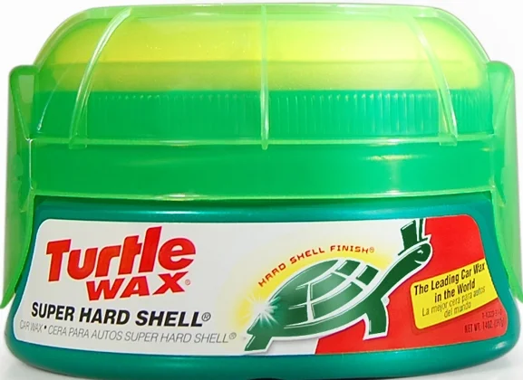
Case in point: The overcap. That's the plastic top that holds the sponge in place. Or, more accurately, that is supposed to hold the sponge in place. It had been a thermoformed piece. But it didn't always do what it was intended to do. For example, sometimes, it would, well, fall off, and leave the sponge separated from the container in retail establishments as well as in garages. Or, sometimes when a person about to wax her or his car removed the overcap, not only would it come off, but the lid on the polypropylene jar containing the wax would come off right along with it, and this could lead to a messy situation.
Case in point: The positioning of the jar in retail establishments. “One of the issues that they and other manufacturers who have products in round containers that are stacked on shelves is that they pay agencies hundreds of thousands of dollars to research your brand and develop your product and then they rely on a 16-year-old stocking clerk at Wal-Mart to make it look good on a shelf,” Jost says, adding, “Generally they don't have the same level of interest that our clients do.” So the products are stocked on the shelf with the front facing to this side or that, sometimes facing front, sometimes facing back.
They worked to make these things better.
But an important point about this: The designers at Studio One Eleven knew first hand that these were problems.
Jost explains: “The design process started with what we call a 'brand audit.'” So they did a significant amount of research over a period of about six weeks. They observed people shopping for the product. They observed people using the product. They researched what the brand meant. They bought competitive products.
And they were designers. This was before they “even thought about a design sketch on the back of a notebook,” he says. And he explains why: “Design is the process of understanding the user and the brand and understanding the problem, then responding to it creatively.”
“If you don't have a good grasp of the end user and the attributes they value and the characteristics of the packaging that they appreciate and don't appreciate, then you're just an artist, someone proposing random shapes in the hope that something sticks. That's the antithesis of what we do.”
Deep understanding is important before the development of the packaging begins.
Then they set about to do the “creative,” post-informed research. They tried a number of different shapes and forms; they looked at different types of materials. So while a square or an oval might have been interesting, they determined that they needed to maintain “core equity,” and the Super Hard Shell container had to be a cylinder, as it always had been.
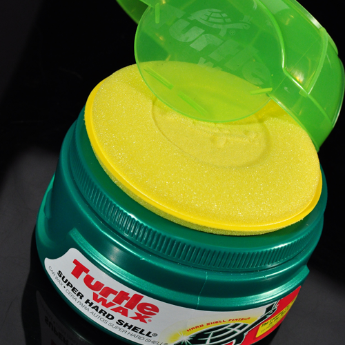
They moved onto the functionality. They decided that it would be better to replace the thermoformed cap with an injection molded overcap because they determined that it was “more controllable and robust.” Based on a user interaction map–watching how someone with a container would actually handle it–they designed the top so that it is intuitive to use: there are two embossments that tell you to “twist to open.”
The primary cap–the one that is above the wax in the container–was redesigned. A 107-mm continuous threaded cap is used in place of the pry-off cap. The one that facilitated spillage.
The jar itself is different, too. The previous had been an injection molding. The new one is a blow-molded polypropylene.
“The big innovation on the jar,” Jost says, “is on the bottom, which is called the 'push-up.'” Jost explains that oftentimes, the bottom of a container is “an engineering afterthought.” Or, “Sort of like the junk you push under the bed.” But in this case, they designed it specifically so that when the containers are stacked there is a “one right-way application.” The push-up is designed so that there is an indexing system that mates with the ribs on the overcap (which mimic the form of a turtle shell). So when the 16-year-old is stacking, he'll either get it exactly right or will be way wrong.
The project took about six months from research to tooling. The designers created several photorealistic models, and then when the final design was selected, they made rapid prototypes of the parts with an Objet 3D printer (“We also have a fused-deposition modeler in-house,” Jost says.). Speaking of the 3D printing, he says that it is very beneficial to have the equipment on hand: “Rather than waiting until the end, the designers can use it as a real-time development tool. The old school way was you'd get all the way to the end and then make a big investment in prototyping.” Change was undoubtedly more soul-searching than when you have a model made out of a starch-like material and realize that there needs to be a tweak here or there. And while they certainly use CADD (computer-aided design and drafting) as a design tool, “You can't check comfort on a CADD terminal,” Jost says.