Golden Lubricants’ objective was to create an iconic custom package and label design for its MorGas line that would be immediately recognizable. The package needed to stand out on the shelf and communicate the brand values, both visually and ergonomically, of performance and quality.
As a newcomer to the industry, MorGas needed to quickly differentiate itself from the competition. As an international brand, MorGas would compete with scores of SKUs across America, Europe, the Middle East, Africa, and Asia. The look and feel of the packaging had to not only be unique, but also correctly communicate the innovation, quality and performance of MorGas in many countries and across diverse cultures.
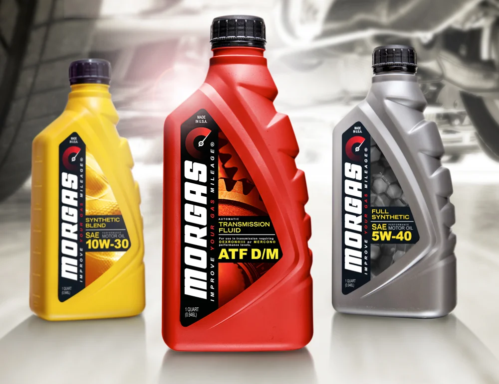
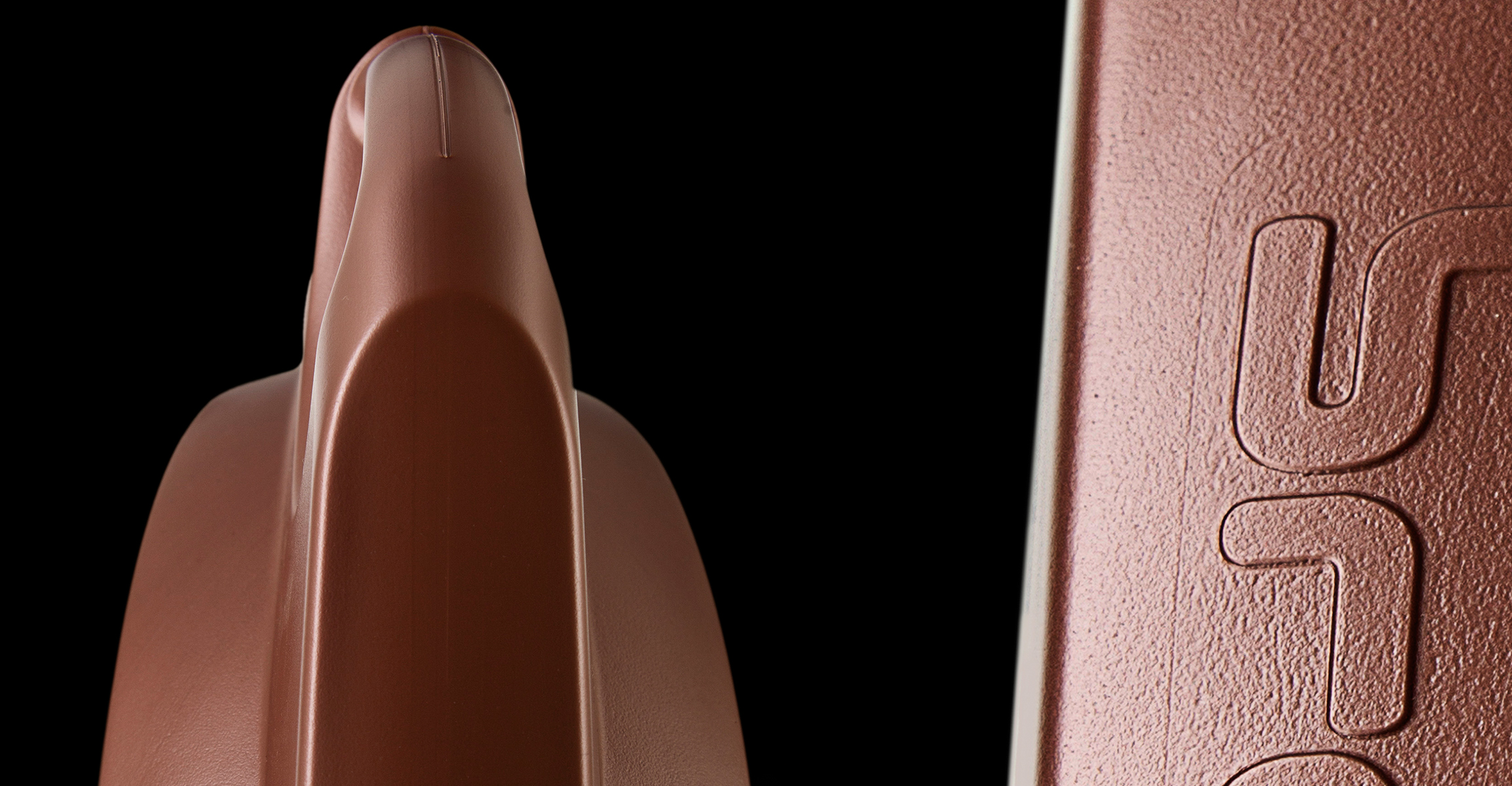
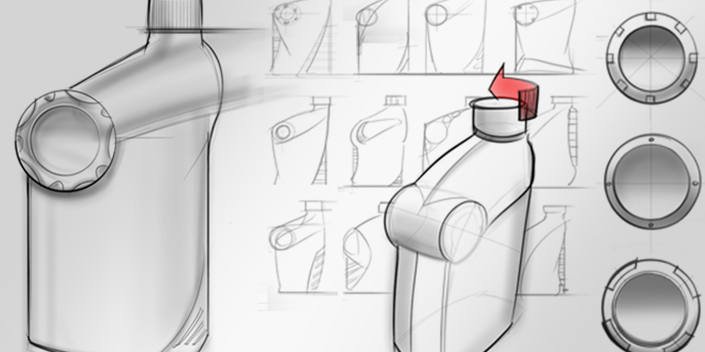
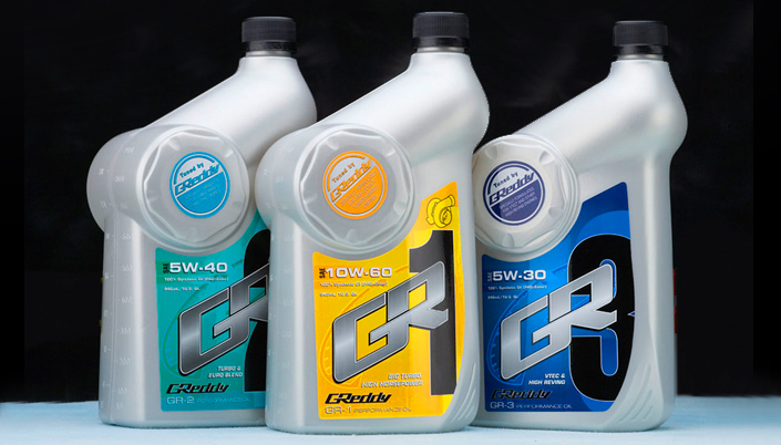
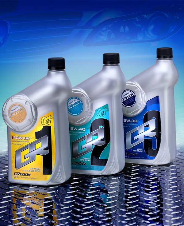
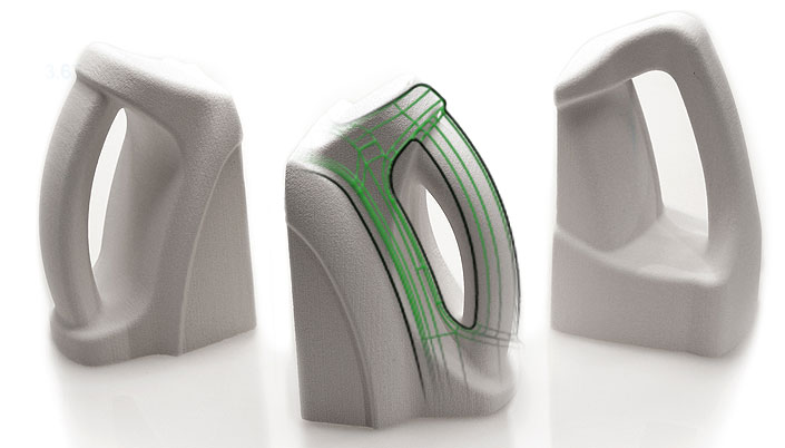
Studio One Eleven proposed a custom line of high density polyethylene bottles that are distinguished in multiple ways to create a unique brand personality for MorGas. The most notable feature is the bottle silhouette that features a notched edge on one side; the notches, inspired by tire treads, not only communicate automotive sports performance, but also provide ergonomic benefit through easier hand gripping.
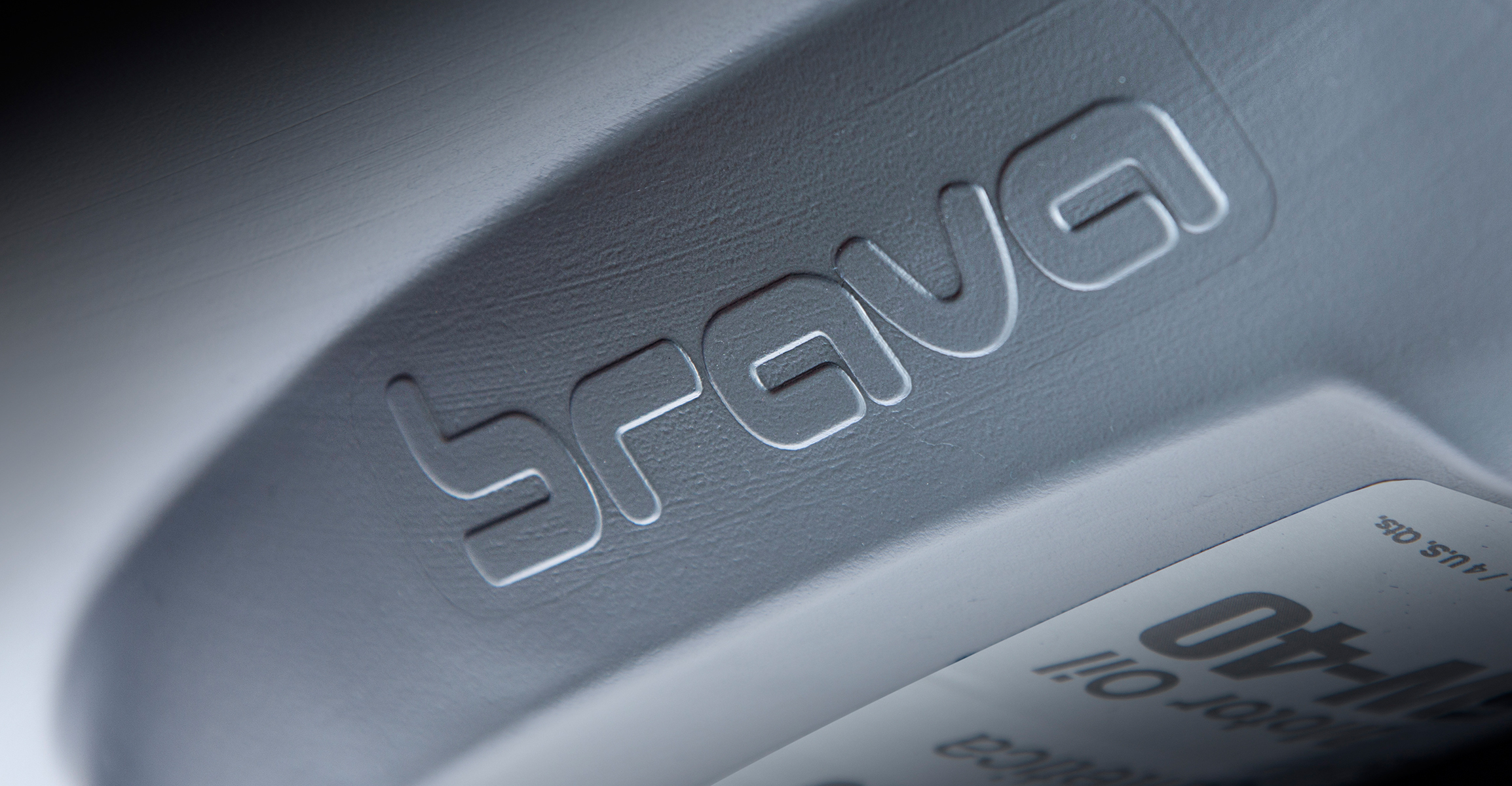
The one-quart MorGas package is presented in three colors: bright yellow for the synthetic blend product, steel grey for the full synthetic, and performance red for transmission fluid. The front label on all three products is framed by a stylized, indented surface in a delta shape that follows the label contours.
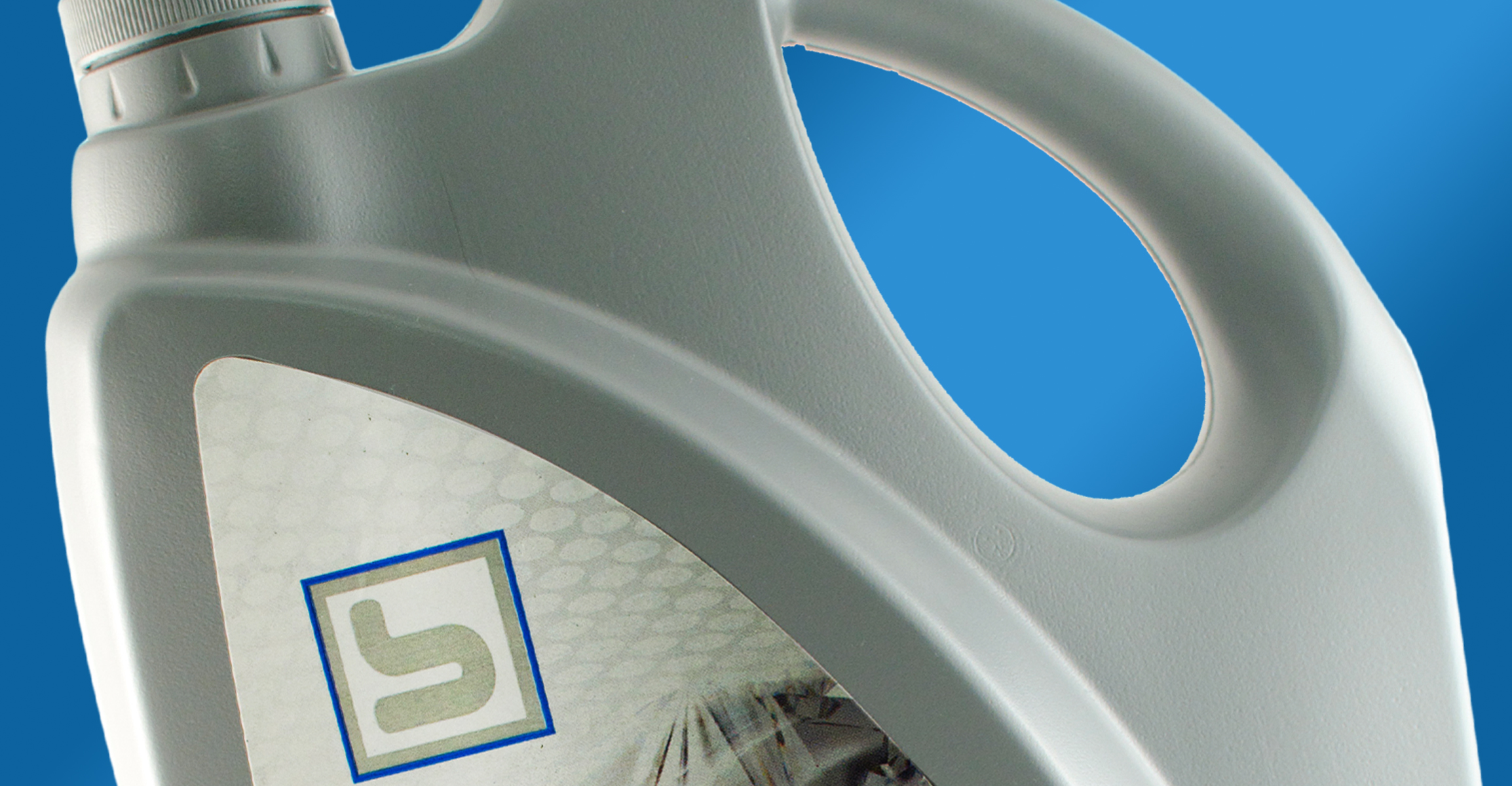
The label, also designed by Studio One Eleven, greatly strengthens the brand image through a larger and more contemporary logotype; the logo is paired with a tachometer graphic and laid over abstracted petrochemical images in a palette that complements each bottle color.
The end result clearly differentiates the product through a custom package design. In the motor oil segment, packaging is the most visible way to establish brand personality and attract attention. The MorGas package, with its bold, aggressive silhouette and graphics, instantly conveys performance, strength, innovation, and quality.

