Berlin Packaging Wins Editors Choice Award for Patricks Brand – Brand Packaging

← Back to the headlines

Berlin Packaging Wins Editors Choice Award For Patricks Brand - Brand Packaging

Berlin Packaging and Studio One Eleven wins editor’s choice award for the Patricks brand at the annual Packaging that Sells Conference, held at the Drake Hotel in Chicago!

Editor's Award

These packages were picked by BRANDPACKAGING for accomplishing the brands' purposes.

Winner: Patricks by Berlin Packaging

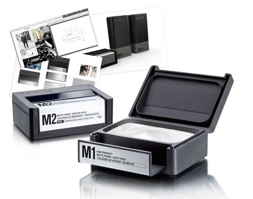
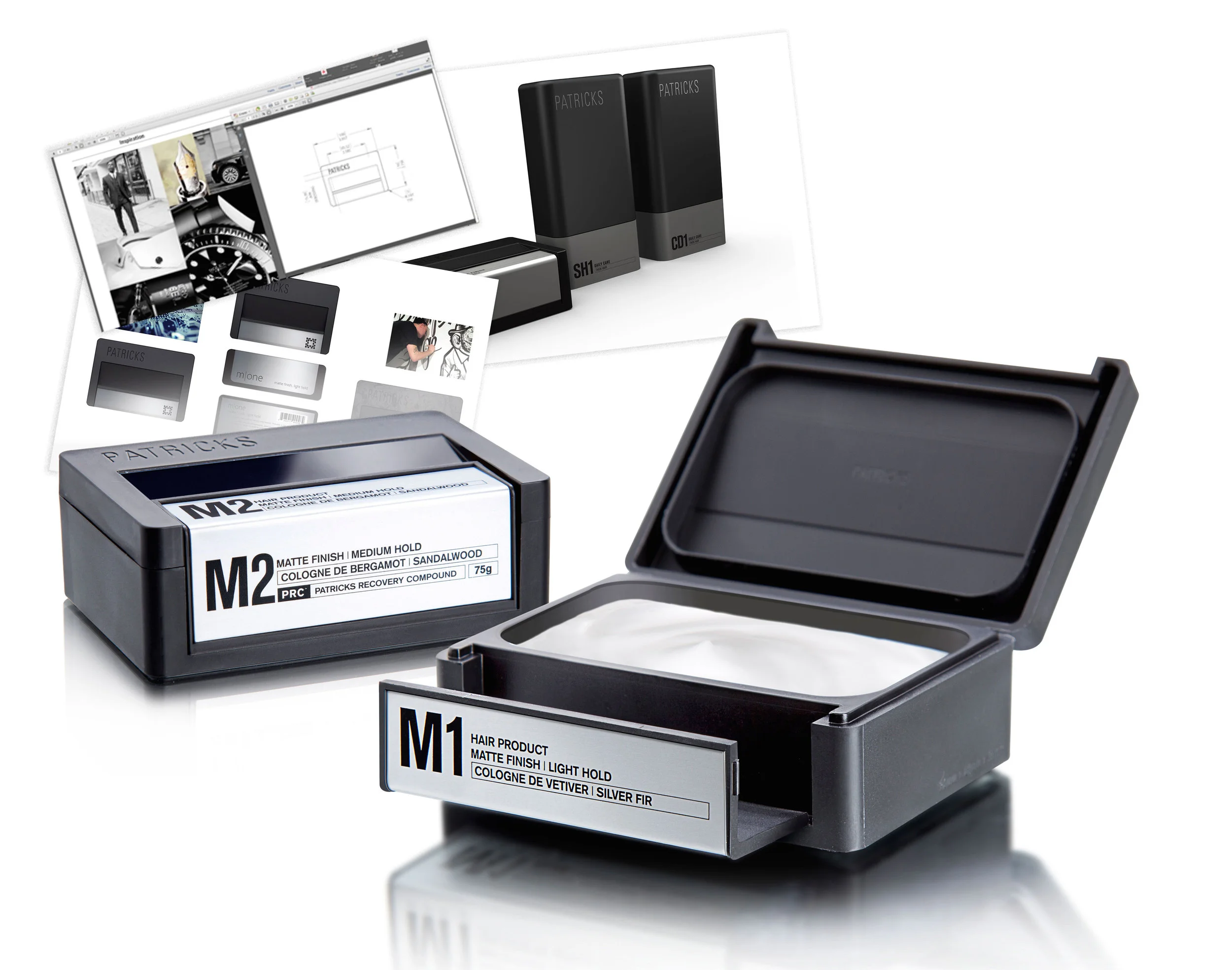
From the brand's inception, each of Patricks’ products have been designed with performance and luxury as top priorities. The package is created as a beautiful little object with a look and feel befitting a durable good. The truly original design elevates Patricks’ products to the level of prestige symbol, in keeping with uber-premium >$60 price points. The package is opening doors and getting placement for the brand in some of the world’s top luxury retailers including Neiman Marcus and Mr. Porter, as well as write-ups in GQ magazine and many others. Labels are silk-screened onto the inset plate aluminum surfaces. The leading edge functions as the locking latch, swinging forward to free the lid and reveal the well-sealed product inside, while a double-lock system ensures the package will not inadvertently open during storage or transit. A rubber gasket seamlessly integrates into the aluminum base to create an audible solidity when putting the package down as well as to prevent slippage in wet areas and protect bathroom surfaces. The Studio One Eleven-designed visual branding reinforces the upscale appearance with a minimalist Patricks brandmark debossed on the cover, a sophisticated communication architecture system with abbreviated product descriptors, and a tie back to a ‘Patricks Product Matrix’ that guides men to the SKU best suited to their hair and styling types.

Food Packaging: Feeling Fresh – Food Engineering

← Back to the headlines

Food Packaging: Feeling Fresh – Food Engineering

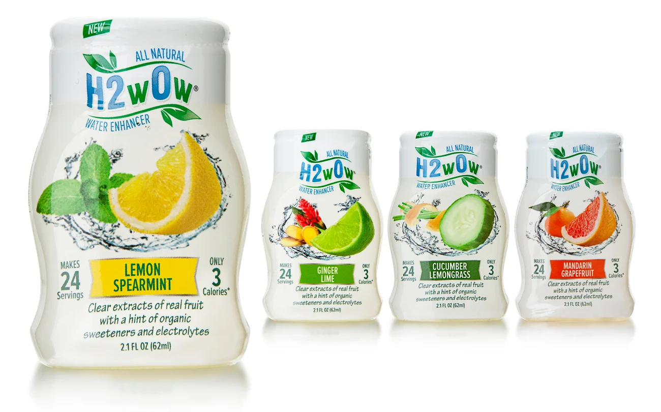
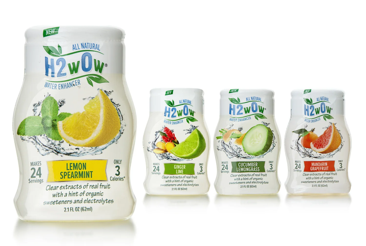
Liquid water enhancers allow consumers to flavor their water using a concentrated formula. The category is only four years old, but it is quickly becoming crowded and competitive. That is why Brite Idea Foods wanted a unique package—squeezeable with one hand and offering no-drip dispensing—for its all-natural H2wOw water enhancer.

Company Co-founder Tim Welch told Berlin Packaging and its Studio One Eleven design agency that the packaging needed to have a “fresh fruit feeling” to communicate H2wOw’s category-first use of real fruit extracts and other natural ingredients. The final design—small enough to throw into a purse or a gym bag—marries a curvy 2.1-fl.-oz. HDPE monolayer bottle manufactured from a custom Berlin Packaging mold with an Aptar Group stock flip-top Mini Sense PP closure and a full-body, tamper-evident shrink sleeve decorated to showcase the fresh message.

The bottle is palm-sized and features a pinched waist, giving H2wOw a distinctive shape. The closure incorporates an Aptar SimpliSqueeze silicone flow control valve to deliver spill-proof use and protect against leakage, even when the cap is left open.

The bottle and closure are sourced and supplied by Berlin Packaging. The label is supplied by Century Labels of Bowling Green, OH.

Preserving Roots While Refreshing a Heritage Brand - Packaging World Magazine

← Back to the headlines

Preserving roots while refreshing a heritage brand - Packaging World Magazine

A producer of jarred apple slices, preserves, sauces, and salsa, Grandma Hoerner's seeks to simplify and modernize its packaging while staying true to its handcrafted roots.

Packaging food products that are based on heritage recipes can be a tricky proposition. Put the product in a vintage-style container, and it can look stodgy. Update it, and you risk losing the handcrafted, good-for-you image. That was the challenge faced by Grandma Hoerner's Foods, Inc. of Alma, KS, when it decided to refresh the packaging for its natural and organic Big Slice kettle-cooked apple slices, fruit preserves, pie fillings, and assorted salsa, sauce, and relish products.
Its existing Big Slice packaging consisted of a 26-oz glass mason jar with a gold lid and a three-side wraparound label that featured a small portrait sketch of the brand's namesake, Grandma Hoerner, as a young woman. "The labels had an old-fashioned air to them that was consistent with the picture of Grandma," says company Vice President Regina McCoy. "While we wanted to stay true to our roots, we knew that today's consumers have smaller families, and the large jar sizes we packaged our Big Slice apples in were just too big for them."

Knowing that its Big Slice product line was also set to debut nationwide in retail stores such as Target in a 4.5-oz flexible pouch with modern graphics in vibrant colors, Grandma Hoerner's also wanted to update its jars to ensure consistent branding of its products.

McCoy admits that the refresh was long overdue: "We had heard feedback for years at trade shows about the look and feel of our products. While we were being authentic to our roots, we had a 'Cracker Barrel'-type feel, and we heard from our customers that they were looking for something more modern."
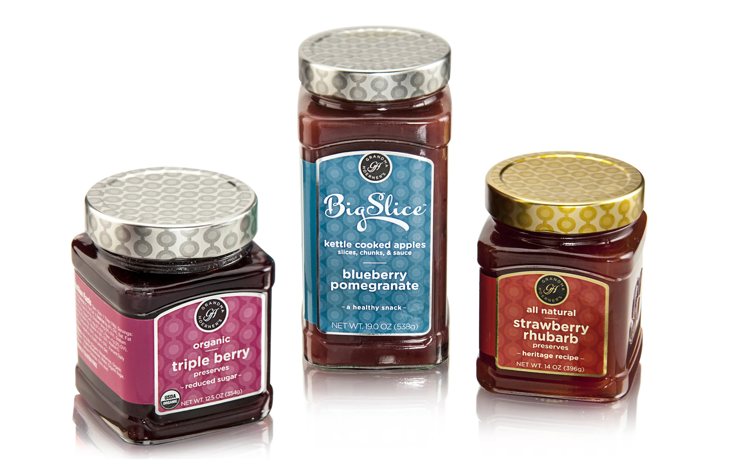
The new package, facilitated by Berlin Packaging's Studio One Eleven design division, starts with a custom rectangular 19-oz glass jar with pedestal-like detailing at the shoulder and base—a noticeable difference on-shelf from the round bottles that dominate the category. A 14-oz and a 12.5-oz square version is used for preserves. The straight-walled jar also allows for more packages per pallet, reducing international shipping costs.
A three-sided, wraparound label, positioned in a recessed area on the container's front, back, and side, decorates the jar, while brand embossing decorates the fourth side, bolstering the impression of a product with a special provenance. Label graphics align with those used on the pouch and include a contemporary single-color polka dot-patterned background—with color dependent on variety. Silver or gold lids repeat the pattern. Replacing Grandma Hoerner's likeness on the label is a seal-like logo bearing the letters "GH" in an elegant, modern script, along with the brand name. Says McCoy, "Overall, we wanted to simplify, modernize, and be ready to go global with our branding."
The new packaging launched in early 2015 in 5,000-plus stores nationwide, and is being used for Grandma Hoerner's Big Slice apples and fruit preserves, and its new 19-5.oz Gourmet Ready to Go! sauces. McCoy says the company is currently working to move all of its products to the new design.

The Rugged Luxury Trend Reaches Dizzying Heights - Package Design

← Back to the headlines

The Rugged Luxury Trend Reaches Dizzying Heights As The Beauty Of Imperfection Takes Hold Of Consumers’ Desire - Package Design

By definition, rugged luxury implies a discerning level of sophistication, taste and class. Often, brands in this marketspace are embraced by consumers and their wallets for a sense of authenticity and craftsmanship, both in the U.S. and abroad, and spans many categories.

“Rugged luxury caters to those who live well and can afford fabulous goods but don’t necessarily seek the expected polished perfection that goes along with it,” Lisa Landers, director of client services and strategic development for Smith Design, says. “Rugged luxury enthusiasts breathe a rarefied air, and the brands they covet often signify the best of the best and unlock portals to aspirational lifestyles. Rugged luxury appeals to a psychographic of consumers more so than a consumer demographic, although the more affluent consumers can indulge in it a bit more.”

Better with wear

Gareth Everard, co-founder of Rockwell Razors, home of the Rockwell 6S stainless steel razor, says when designing packaging for the product, he envisioned packaging that would match the rugged feeling without compromising the high-end feeling of shaving with a classic razor.

“In World War II, American soldiers were equipped with shaving kits in tin cases. We saw a picture and thought it looked extremely badass and different than any razor packaging around today,” he says. “Our product is made in America, so this throwback was important to us. Keeping a high-end appearance thrown in with some classic America-centric nostalgia in our design resulted in packaging we’re big fans of.”

The final case for the Rockwell 6S can get dropped, scratched and dented, and only looks better for the wear and tear.

“Talking with our backers and customers has shown us that our users are interested in a high-end, improved shave, but also are men looking for a rugged tool in their washroom,” Everard says. “Keeping our product and packaging in line with this customer feedback has been extremely important to us.”

Taking luxury on the road

Eric Steigelman, founder of Bonfire Wines, positions his brand as high-end wine offered in rugged practical packaging, with soft sleek pouches perfect to pack in weekend getaway totes to enjoy no matter where the location or circumstance.

“We took a 30,000-foot view of the wine category and analyzed price points and label designs and who these lines were being targeted to; an overall assessment of materials and designs used,” he says. “We wanted to understand where there was an opportunity for value add.” An analysis of consumers showed Millennial consumers are more open to forms of wine packaging other than a bottle and different wine drinking experiences. “We are open to new and exciting and innovative things,” Steigelman says.

By packaging his wines in flexible pouches, Steigelman is enabling Millennial and Generation X consumers to enjoy the premium varietals in a variety of settings, such as around a campfire, on a boat, and many other outdoor settings.

Handcraft lends imperfect appeal

The rugged luxury trend is also loosely tethered to the artisanal movement on some level; things that look handmade or handcrafted or authentically imperfect appeal to consumers who shun cookie-cutter, mass-commodity driven goods and seek brands that offer something out of the norm.

Scott Jost, VP of innovation and design at Studio One Eleven, part of Berlin Packaging, Chicago, Ill., says when he thinks of rugged luxury, he thinks of kraft paper and the more natural materials being utilized in designs.

“When we think about rugged luxury products, people want things that are pure and understand where ingredients come from and anything that you can do to build on that such as using natural materials will go a long way to building a brand,” he says. “At the beginning of 2014, you started to see reverse corrugate with exposed corrugate edges being used as a design element. The notion of building in more ruggedness, has been seen more just in the last few months.”

Paper and paperboard often are used to convey the message of handcrafted and handmade.

Carrying that commitment through

When designing for her brand, Kara Brook, creative director for Waxing Kara, first created a very rudimentary one-page business strategy document in which she wrote down her mission, who her audience would be, what she intended to accomplish by launching the brand and who her “pie in the sky” wholesale customers would be.

Brook then purposely went out and found a package designer, whose focus was working with small indie American made brands because she wanted to draw on a designer up with the times to help her shape the visual brand.

“I prepared for the project by creating ‘Image Attributes,’ a series of five words that evoke the essence of the Waxing Kara brand. This process took me several tries and I involved friends, family and former colleagues,” Brook says. “Later, when reviewing designs, I revisited the document and weighed each design against the established image attributes to compare the words with the designs. This drove my final choices.”

She also prepared a photo essay on the Eastern Shore to give the designer a real feel for the region—including pictures of her with the bees and bottling, and the beautiful waterfront views.

The resulting brand identity has one foot rooted in a nostalgic past and the other pointed toward an adventurous future. In its package design, the brand identity is often executed with biobased materials such as paper labels and tags.

“We are committed to high quality hand craftsmanship and innovative design where form follows function,” Brook says. “We believe that nature can inspire and be a healing force that allows us to grow without limits.”

The need for well-thought-out design and packaging and the investment in professional help is directly related to the impression Brook hoped to make on her prospective customers.

“For anyone serious about selling product, if you’re going to make the emotional, physical and financial investment required to produce that product, it is my belief you must be prepared to carry through that same level of commitment to marketing—a key element of which is stellar design and packaging,” she says. “It just so happened that our look and feel reflects premium handcraft goods. We were not striving to follow a trend, or create one. We followed our hearts to get where we are.”

All-Natural Water Enhancer 'Skyrockets' to Success with Supplier Help - Packaging World

← Back to the headlines

All-Natural Water Enhancer 'Skyrockets' to Success with Supplier Help - Packaging World

Berlin Packaging and an outside co-packer help Brite Idea Foods' all-natural product and innovative package top Amazon's Hot New Release list.

The liquid water enhancer market is only four years old, but this highly competitive category has become crowded with palm-sized packages that let consumers flavor their water, typically using squeezable rigid containers to squirt flavorings. Brite Idea Foods’ H2wOw sought to enter the category with what it believed to be the first all-natural water enhancer late last year. The company needed not only a unique package to establish a strong brand identity but a package design that allowed easy one-handed use and maximum label space to tell the product story. Company co-founder Tim Welch, a 25-year consumer packaged goods industry veteran whose achievements include major expansions of the Emergen-C vitamin C drink mix and Promax energy bar brands, turned to Berlin Packaging and its Studio One Eleven design agency for help. Among his directives: Give the packaging a “fresh fruit feeling” to convey the idea that H2wOw is flavored with real fruit extracts rather than the artificial ingredients used by competitors.

Packaging is done by a (yet) undisclosed contract packaging service. 

The company reports that within six weeks after launch last December, H2wOw had skyrocketed to #1 in its category on Amazon’s Hot New Release list aided by positive reviews as well as strong packaging.

Three Packages Designed by Studio One Eleven Team Selected by Editors for 44 Best Package Designs - Packaging World

← Back to the headlines

Three Packages Designed by Studio One Eleven Team Selected by Editors of 44 Best Package Designs - Packaging World

Three packages designed by Studio One Eleven division of Berlin Packaging, a leading full-service supplier of plastic, glass, and metal containers and closures, have been recognized in the 44 Best Package Designs - 2015 report just released by Packaging World magazine. All three were selected by the publication’s editors for outstanding structure and branding. The Studio One Eleven honorees were:

View the Armor All case study

View the Armor All case study

Armor All Wash & Wax + Protect – Designed to visually suggest the product’s power to protect vehicles against the elements, this 48 oz, non-handled PET bottle boasts a muscular silhouette with dynamic line work, clear resin that showcases the pearlescent color of the product inside, and an asymmetrical black overcap that seamlessly integrates with the bottle profile. The overcap protects a standard 38-400 CT closure, covers the bottle fill line, and can be used to dose the concentrated formula. The label panel is indented to shift volume to the bottle’s perimeter, boosting the size impression on the shelf. 


View the Fuller Brush Case Study

View the Fuller Brush Case Study

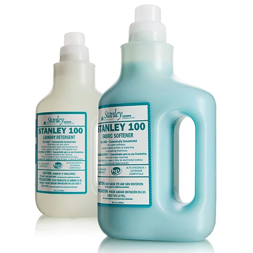
Stanley 100 Laundry Detergent – Fuller Brush owns this brand and wanted a package that evoked the milk jugs that were popular when Fuller Brush was founded over a century ago. The unique structure of this 50 oz transparent HDPE package, which contains 25% post-consumer resin, was designed to help the company penetrate mass market chains as well as appeal to younger consumers with a new concentrated formula delivering 100 loads per bottle. A novel ergonomic handle makes it easy to pour with one hand, a stock 43 mm drain-back closure system prevents leaking, a 1 oz dosing cap measures each load, and the bottle structure instantly distinguishes the product from competitors. 

View the Morton Salt Grinder Case Study

View the Morton Salt Grinder Case Study

Morton Salt & Pepper Grinders – In a first for grocery-store salt and pepper grinders, these custom glass packages are designed to sit on the dinner table like upscale giftware with no conspicuous brand label. The Morton Grinder branding on the full-body shrink sleeve completely disappears when the sleeve is removed, leaving a clear glass bottle with a custom white or black snap-on overcap embossed with the Morton name and logo. A non-removable grinder beneath the overcap is kept in place by interlocking ratchet-like lugs built into both the grinder and bottle, thwarting refills so that consumers will restock when the bottles are empty. 


Every project we handle presents unique design challenges, from structure to commercial viability, differentiation on the shelf, and ultimately product sell-through that helps our customers build their bottom lines. These three projects are a small sampling of the creativity and versatility of our designers, the range of customers we work with, and our ability to deliver design concepts that carry over to practical manufacturing solutions.
— Scott Jost, VP of Innovation & Design at Berlin Packaging

Premium Package is Inspired By Luxury Brands - Packaging World Magazine

← Back to the headlines

Premium package is inspired by luxury brands - Packaging World Magazine

Patrick Kidd had a very clear vision of the package design he wanted for his debut line of Patricks premium hair styling products for men—And nothing less would do.

His concept was a sleek and sophisticated container that would provide a luxury look and feel for his $60 product, while offering functional benefits. Among them, a double-locking lid to keep product from leaking, a shape that would aid access to the last bit of product, and a rubber base that would prevent container slippage on wet surfaces.

“It took an incredible four-year cross-collaborative effort between myself, designers, custom tooling specialists, engineers, and the factory to bring my packaging ideas into reality,” he says. “I think I drove everyone crazy with how perfect I needed to get everything, even the sound of the lid clicking closed.”

To design this custom container, Kidd worked with Berlin Packaging’s Studio One Eleven. The end result is a rectangular black matte box made of polypropylene, with an integrated, locking lid, aluminum accents, screen-printed decoration, and a rubber gasket on the base. The container, supplied by Berlin Global Packaging Group, holds 85 g of product and was designed primarily for travel and for portability in gym bags and briefcases. The small size complies with airline regulations for carry-on products, while the double-lock latch keeps product from leaking in transit.

Many of the structural elements of the container were inspired by premium luxury brands, Kidd explains. For example, the “universally beautiful” design of Aston Martin’s One-77 coupe, based around the golden ratio, or Fibonacci sequence, drove the dimensions of the package. The main angle in the jar was inspired by the air vent in the side door of the Lamborghini Aventador luxury vehicle, the matte black finish by the Audi R8 coupe, and the simplicity of the design and the use of aluminum by Apple products.

Among the functional benefits of the structure, rounded corners inside the container make it easy for the consumer to get the last bit of product out—addressing a common complaint, especially with higher-priced products. To prevent slippage, protect bathroom surfaces, and ensure a gentle sound when putting the package down, a thin rubber inlay—inspired by an Apple MacBook Pro that uses rubber around the screen—is integrated under the aluminum base.

An especially important functional feature for Kidd was the sound of the double-locking lid. “We wanted the system to have a definite, strong click so the consumer would know it was securely locked,” he says. “We looked at many different variables to ensure the correct sound. This included plastic thickness, rivet placements, and quantity of rivets.”

Aesthetic touches include aluminum fused into the latch and base plate that provides strength, durability, and beauty. Labels are laser-etched directly onto the aluminum, eliminating the need for paper, stickers, and glue, and the matte finish on the outside of the container is “tactile, practical, and beautiful,” says Kidd.

Getting all these elements right was a painstaking process, for Kidd and Berlin. 

There were many times we had to completely rebuild the tool in order to achieve the quality we were after. Some consumers may never have noticed the tiny sink marks or internal ejector pin marks, but these small details were extremely important to us, and Berlin supported our relentless, perfectionist demands.
— Patrick Kidd

Patricks haircare products for men in four formulations were introduced in November 2014 through online retailer Mr Porter and are now being sold via premium online and brick-and-mortar stores worldwide.

Grandma Hoerner’s Big Slice Kettle Cooked Apples Get a New Look - Food & Beverage Packaging Magazine

← Back to the headlines

Grandma Hoerner’s Big Slice Kettle Cooked Apples Get a New Look - Food & Beverage Packaging Magazine

Packaging food products based on heritage recipes can be a tricky proposition. Put the product in a vintage-style container, and it can look stodgy. Update it, and you risk losing the handcrafted, good-for-you image. That was the challenge faced by Grandma Hoerner’s, a line of Big Slice Kettle Cooked Apples, jams, pie fillings and assorted other fruit- and vegetable-based products, when the company decided that its Mason-type jars and branding were past their prime.

The upgrade – facilitated by Berlin Packaging’s Studio One Eleven design division – modernizes the package without losing the heritage positioning. Features include:

  • Custom square and rectangular bottle structures with pedestal-like detailing at the shoulder and base, marking a strong differentiation from the round bottles that dominate the category while also minimizing shipping costs from China by enabling more bottles to fit on a pallet.
  • Extra-large brand embossments on one side of each jar, bolstering the impression of a product with a special provenance.
  • A three-sided wraparound label that delivers the real estate required to tell the product story. The recessed label panel area created by the slight broadening of the jar at the top and bottom protects the label from damage as the jar is handled.
  • A custom deep twist closure that matches the dot pattern on the label.

With its premium look, the new package is helping Grandma Hoerner’s increase shelf space in the highly competitive fruit and jelly categories. 

Rocker Cap Speeds Handwash Dispensing - Packaging World Magazine

← Back to the headlines

Rocker Cap Speeds Handwash Dispensing - Packaging World Magazine

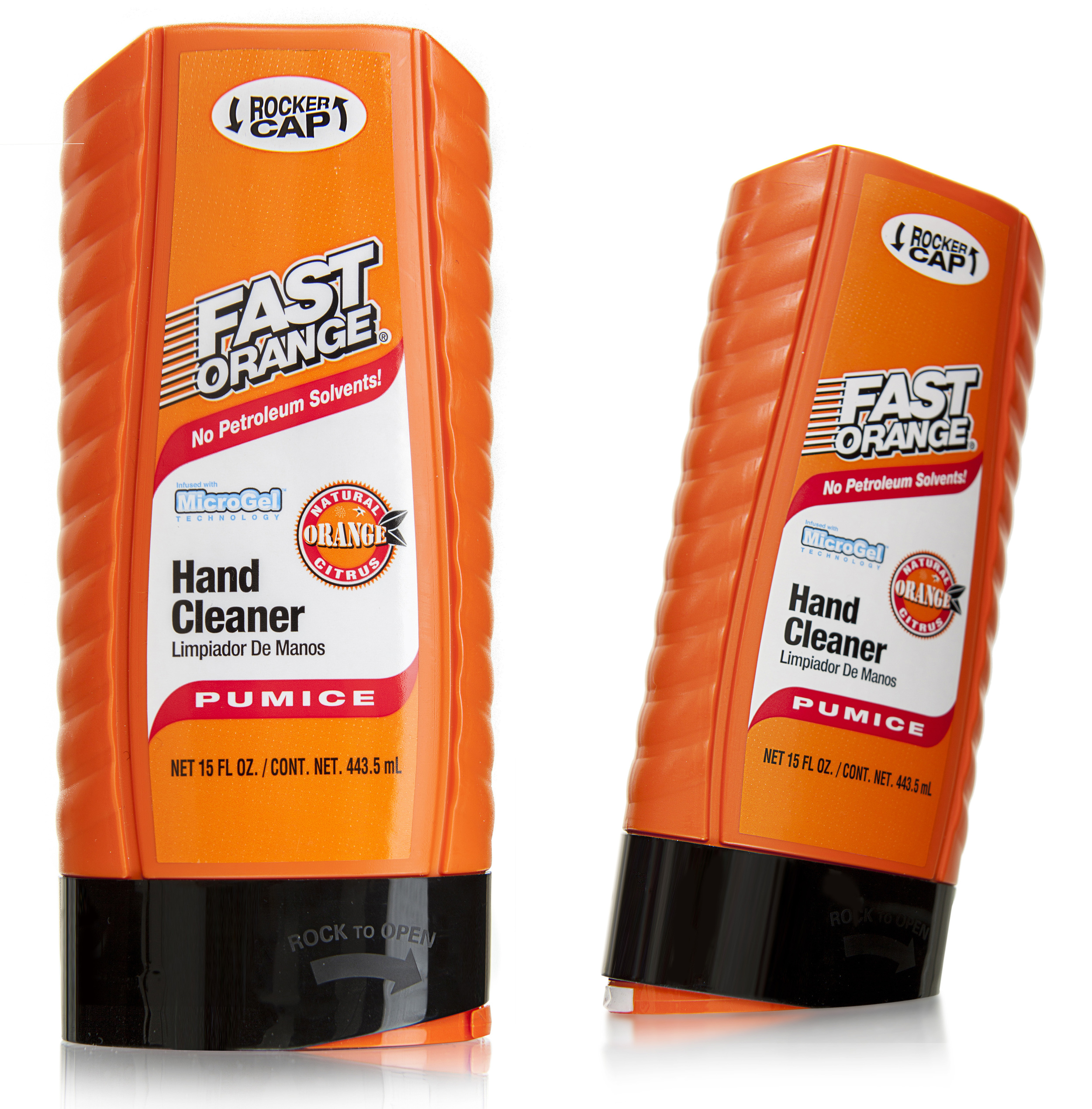
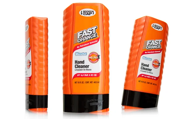
Mechanics and DIYers will appreciate the new disc-top rocker closure used for Fast Orange waterless hand cleaner that allows for one-hand opening and dispensing.

Permatex, an automotive repair and maintenance products company, has tipped the waterless hand cleaner segment in its favor with a clever new disc-top closure. Permatex’s Fast Orange is the number one-selling waterless hand cleaner. Recently, the company joined with Berlin Packaging’s Studio One Eleven to refresh the package design for the product. After extensive research, Studio One Eleven determined that Permatex’s customer base, comprised primarily of mechanics and DIYers, preferred one-handed cleaner dispensing while washing their hands.

Using this knowledge, designers came up with a unique rocker design that places the disc top on the package bottom. With this design, users can simply tap the bottle on its bottom corner to open the spout and dispense, then tap the spout again to close.

Making the new design practical, however, required extensive engineering, particularly for the Pumice variety. Repeated testing and multiple design iterations were necessary to ensure not only easy-squeeze dispensing of the product, but also a clean, clog-free closure with a simple tap of the rocker closure on any flat surface, all with one hand.

Fast Orange, now sporting cutting-edge, eye-catching packaging, has reinvigorated Permatex’s 60-year history in hand cleaners and has strengthened its lead in the category. Promoted by the company through a YouTube video, the innovation has also formed the cornerstone of the brand’s recent marketing efforts.


Watch the Rocker Cap in action:


Studio One Eleven touts freedom, 'real-time awareness' in industrial design - Chicago Tribune

← Back to the headlines

Chicago Tribune: Blue Sky Originals
Studio One Eleven touts freedom, 'real-time awareness' in industrial design - Chicago Tribune

Designers at Studio 111, a unit of Chicago-based container manufacturing giant Berlin Packaging, work on packaging designs for clients such as Procter & Gamble, Walgreens and Coca-Cola. If a client likes the design or product, Berlin Packaging produces it for that client and reaps the revenue.

If a client doesn’t like the design, Studio 111 retains the intellectual property with the hope of selling it to another client, and no money changes hands.
“I waive hundreds of thousands of dollars of fees per job, in some cases, in exchange for the ability to supply the components that we’re working on,” said Scott Jost, vice president of innovation and design and the head of Studio 111.

Studio 111 has 20 team members who work mainly as industrial and graphic designers and market researchers. They’re all Berlin Packaging employees.

Jost, who started the studio in 2003, said he agreed to take on the project because the company would allow him to run it like a design studio.

He said Berlin Packaging, which Oak Hill Capital Partners acquired for $1.4 billion in late 2014, places no limits on what Studio 111 designers create because the company isn’t restricted by machinery.

“Berlin doesn’t make things,” Jost said. “We don’t own a single piece of injection molding equipment. We don’t own a single blow molding facility. We contract everything.”

He thereby describes Studio 111’s model as an “unlimited machine platform,” thanks to Berlin’s relationships with more than 700 suppliers. Jost said that frees designers to pursue what’s best for the brand or the end user rather than the manufacturer.

He said Studio 111 has reinvented packaging for Mel-O Honey, the brand that introduced the famous bear-shaped dispenser; created a patented device for measuring the correct amount of concentrated cleaner solution for Libman; and designed high-end packaging with aluminum accents for Patricks, a men’s grooming company.

Jost said he makes Studio 111 designers aware of the division’s budget and that they manage their design portfolios like investment portfolios, taking into account risk and opportunities for returns.

“They’re all managing their own portfolio and apportioning their time based upon that real-time awareness of what’s going on and all the moving pieces,” he said.

Some might liken Studio 111’s model to what is known in the creative world as designing on spec. For many independent firms or designers, it’s a tricky proposition because it can involve a major time commitment without guaranteed payment.

Ric Grefé, CEO of professional design association AIGA, said the unpredictable nature of traditional spec work breeds fast designing and prevents designers from working closely with clients.

Yet at Studio 111, Jost said, the design process is “time intensive,” sometimes stretching months.

“That element of it is respectful of design, the fact that designers are being paid to work with the client to develop an appropriate response over time,” Grefé said.

Richard Shear, a Connecticut-based chief creative officer of independent design firm Invok Brands, said it’s common for manufacturers and advertising agencies to have their own design studios. Yet he said the Berlin-Studio 111 model is a “lose-lose” for the design industry wherein independents must compete on whether they’ll work on spec, rather than on their portfolios, relationships or price.

“One way to look at it is that Berlin Packaging’s revenue comes from selling millions and millions of cans or bottles for revenue,” Shear said. “They use design as a sales tool to sell cans and bottles.”

Shear acknowledged that the model makes sense for Berlin and companies like it, but he warned that consumer packaged-goods companies are realizing that their model of shipping identical products across the world may be less attractive to future generations that crave more variety.

Nevertheless, Jost said he’s focused on doing design work that will drive manufacturing contracts to Berlin, and he said Studio 111 designs products with the assumption that Berlin will produce them.

He sees that time and work as an investment.

“It is absolutely not about getting somebody to pay for my design service,” he said.

Berlin Packaging Continues Its Unbroken Gold Streak at 2015 NACD Packaging Awards

← Back to the headlines

Berlin Packaging Continues Its Unbroken Gold Streak at 2015 NACD Packaging Awards

Packaging Leader Recognized with Medals in Six of Nine Categories Including Two Gold; Company Chairman and CEO Andrew T. Berlin Inducted into NACD Hall of Fame.

Berlin Packaging, the only Hybrid Packaging Supplier of plastic, glass, and metal containers and closures, today announced its continued prominence at the NACD (National Association of Container Distributors) Packaging Awards. At the 2015 show, Berlin received seven medals spanning six of the nine competitive categories, including Gold medals for Walgreens Good & Delish Nuts and Permatex Fast Orange hand cleaner.

Also at this year’s ceremony, Andrew T. Berlin, Chairman and CEO of Berlin Packaging, was recognized as the 2015 inductee into the NACD Hall of Fame for his many contributions to the packaging industry. Under Mr. Berlin’s leadership, Berlin Packaging has grown to be one of the largest and most dynamic suppliers of packaging products and services in North America.

2015 marks the fifth consecutive year Berlin Packaging has been awarded Gold medals at the NACD show. Its consistent record of excellence places the company among the most honored packaging suppliers in the industry.

The NACD Packaging Awards is a national competition recognizing compelling packaging released during the previous year. In addition to its two Gold awards, Berlin Packaging also received three Silver medals and two Bronze. Specific results included:


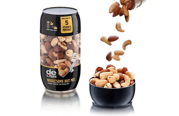
Walgreens Good & Delish Nuts (Gold, Food) is a clever combination of utility, user delight and effective merchandising. Realized in two cupholder-friendly sizes, the packages feature a shared screw-off closure that doubles as a single-serving bowl. Reflecting the trend insight that people often eat nuts in small portions as a “bridge snack” between meals, the palm-sized cap/cup makes snacking a neat and convenient experience. Tapered at the top and bottom to create visual interest, the packages are engineered for secure stacking on Walgreens’ shelves.


Permatex Fast Orange (Gold, Household Chemical & Automotive), a revolutionary packaging innovation for the #1 selling waterless hand cleaner, introduces a proprietary “rocker” closure. The disc-top, placed on the inverted package’s bottom, gives users a one-handed solution during hand washing. Users simply tap the bottle on its bottom corner to open the spout and dispense the cleaner, then tap again to close. The novel closure design, since promoted by Permatex via a YouTube video, has become the cornerstone of the brand’s most recent marketing efforts.


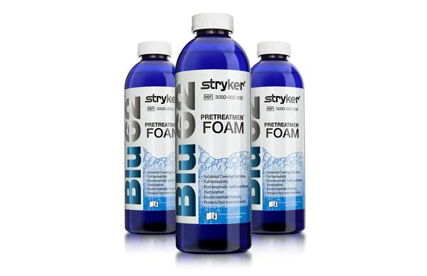
Haviland Stryker (Silver, General Industrial) proves that packaging for medical equipment cleaning products needn’t be boring. Taking its cue from Stryker’s Blu62 brand name, the new package features a stock cobalt blue bottle that instantly distinguishes the product from competitors. The trigger sprayer, selected after testing more than 25 options, delivers a foaming spray pattern that avoids atomization in the operating room and ensures that application is focused on the intended medical and surgical instruments.


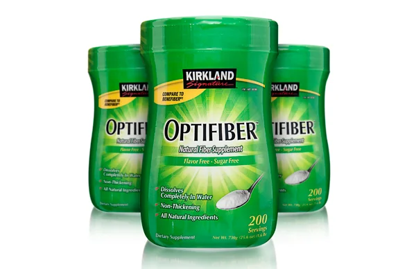
Kirkland Optifiber (Silver, Drug & Pharmaceutical) is a package refresh for Costco’s private label signature fiber supplement. The new package structure replaces a wide-mouthed cylinder HDPE container similar to that used by competitors with a unique, pinched-waist silhouette that adds ergonomic benefits. A full-body shrink sleeve covers the 120mm megaflap closure to eliminate the visual break between bottle and cap.


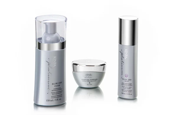
Kenra Hair Care (Silver, Cosmetic & Personal Care) encompasses several package innovations for the brand’s Platinum haircare line sold in salons and upscale cosmetic retail chains. Kenra’s Blow-Dry Foam includes a custom oblong bottle with reverse taper, stock applicator and clear polypropylene cap with chrome neck finish. Kenra’s Texture Powder, a second product, employs a custom polyethylene oval bottle—the first in the category to depart from a stock round solution.


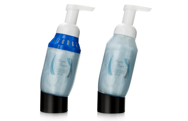
Celeste Airline Hand Soap (Bronze, General Industrial) features a scent-impregnated collar allowing the package to double as a soap dispenser and air freshener. Along with reducing bottle weight by more than 10%, the custom three-SKU refresh improves the appearance of the company’s airline lavatory soap bottles without requiring a change to the soap “pucks” already installed on airplane sinks. By creating a scented SKU, airlines can replace lavatory soap and air freshener simultaneously without replenishing air fresheners typically hung on the back of lavatory doors.


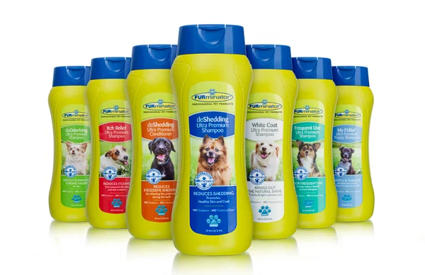
United Pet Group/FURminator (Bronze, Pet & Vet) creates competitive advantage via a slender-waisted bottle with pinch grip and scored texture finish that allows home and professional groomers to grab, open and apply the product easily with one hand. The custom HDPE and stock polypropylene closure, matched to the distinctive FURminator brand colors, not only created higher placement with virtually every retail chain, but also exceeded sales projections by 80%.


“Berlin’s winning entries in this year’s NACD Packaging Awards prove once again that excellent design can—and should—have a major impact on a customer’s bottom line profitability,” stated Andrew T. Berlin, Chairman and CEO of Berlin Packaging. “Each of these winners solves real business problems and creates tangible competitive advantage. I’m proud of the efforts our employees make to uncover exceptional, innovative solutions for our customers, and to turn these solutions into reality with our unwavering focus on supply chain efficiency, operational excellence and customer thrill.”

Five Pitfalls to Avoid During Package Design

← Back to the headlines

Five Pitfalls to Avoid During Package Design

Studio One Eleven Shares Proven Approach, Expertise with Launch of New Website

Designing a package seems to be a straightforward process. Unfortunately when companies embrace this notion, they compromise their brand, their supply chain, and even their financials.

The professionals at Studio One Eleven, the design and innovation division of Berlin Packaging, have more than 150 years of combined experience creating successful packaging across all markets. Here are common pitfalls they see—as well as tips for avoiding them:

  • Jumping into ideation without a solid foundation. Brand positioning, consumer insights, competitors’ strengths and weaknesses, market trends—these factors and many others are the building blocks of a proper design process. But many agencies overlook or simply don’t seek out these critical inputs. Designing great packaging requires a full and accurate analysis of where, how, and for whom a package must perform, addressing factors from costs to merchandising to sustainability.
  • Designing without regard for the rest of the supply chain. A good package solution is much more than a compelling visual; it’s a well-reasoned response to a commercial opportunity that can be manufactured efficiently and flow smoothly through the whole supply chain
  • Thinking too narrowly. It’s important to appreciate the visual vernacular of the product category in which you’re competing, but groundbreaking solutions also take cues from outside the category and challenge conventions in ways that consumers appreciate.
  • Designing for the sake of design. Properly framed, design is the creative means to a commercial end. Marketers and brand owners want to engage partners and advocates who pursue a common-sense goal of building a successful brand.
  • Accepting misaligned incentives. Agencies that sell their time are, by definition, driven to take more of it, sometimes placing their financial incentives at odds with their client’s need for speed and efficiency. On the other hand, package manufacturers are incented to fill machine capacity, so their decisions aren’t driven by the best solution for the brand, but rather the best solution that they can manufacture. You should pay only for real performance and ensure that your interests and those of your partners are aligned.

“There are lots of players in the market today that say they’re qualified to develop a product or package. Very few, however, have the skills, the tools, the aligned incentives, and a certified process to do so properly,” said Scott Jost, Vice President of Innovation & Design at Studio One Eleven. “With all that is at stake, companies are wise to work with a team that is well-versed in every aspect of developing this critical business asset.”

Studio One Eleven’s newly-refreshed website, www.studio111design.com, features a huge array of content that informs package and product design decision-makers. The site includes information about the Studio One Eleven team, an overview of their practice areas and ISO-certified design process, examples of their work, white papers, and more insight on what sets Studio One Eleven apart.

“With hundreds of custom components developed every year, we offer our world-class services at no charge in exchange for the client’s packaging business. Packaging is the currency we use, which makes perfect sense given Berlin Packaging’s packaging expertise and entrepreneurial approach to doing whatever it takes to increase our customers’ bottom lines,” Jost noted. “We want to help our customers package more profit.

Scientific Bottle Theme Creates Chemistry for Micro-Distillery Customers

← Back to the headlines

Scientific Bottle Theme Creates Chemistry for Micro-Distillery Customers

Chicago’s first micro-distillery, CH Distillery, built its personality early on with the theme, “The Science of Alcohol.” It played out the theme in its downtown Chicago cocktail bar-cum-restaurant through a chic laboratory vibe complete with polished chrome pipes, a bar with steel detailing, and muted industrial lighting.

Establishing the same clean, scientific look in CH Distillery product packaging, however, took the skills of Berlin Packaging and its Studio One Eleven design group. Months before the club opened, Berlin began working with the client to create an innovative packaging concept that would span all 11 spirits in the CH Distillery line.

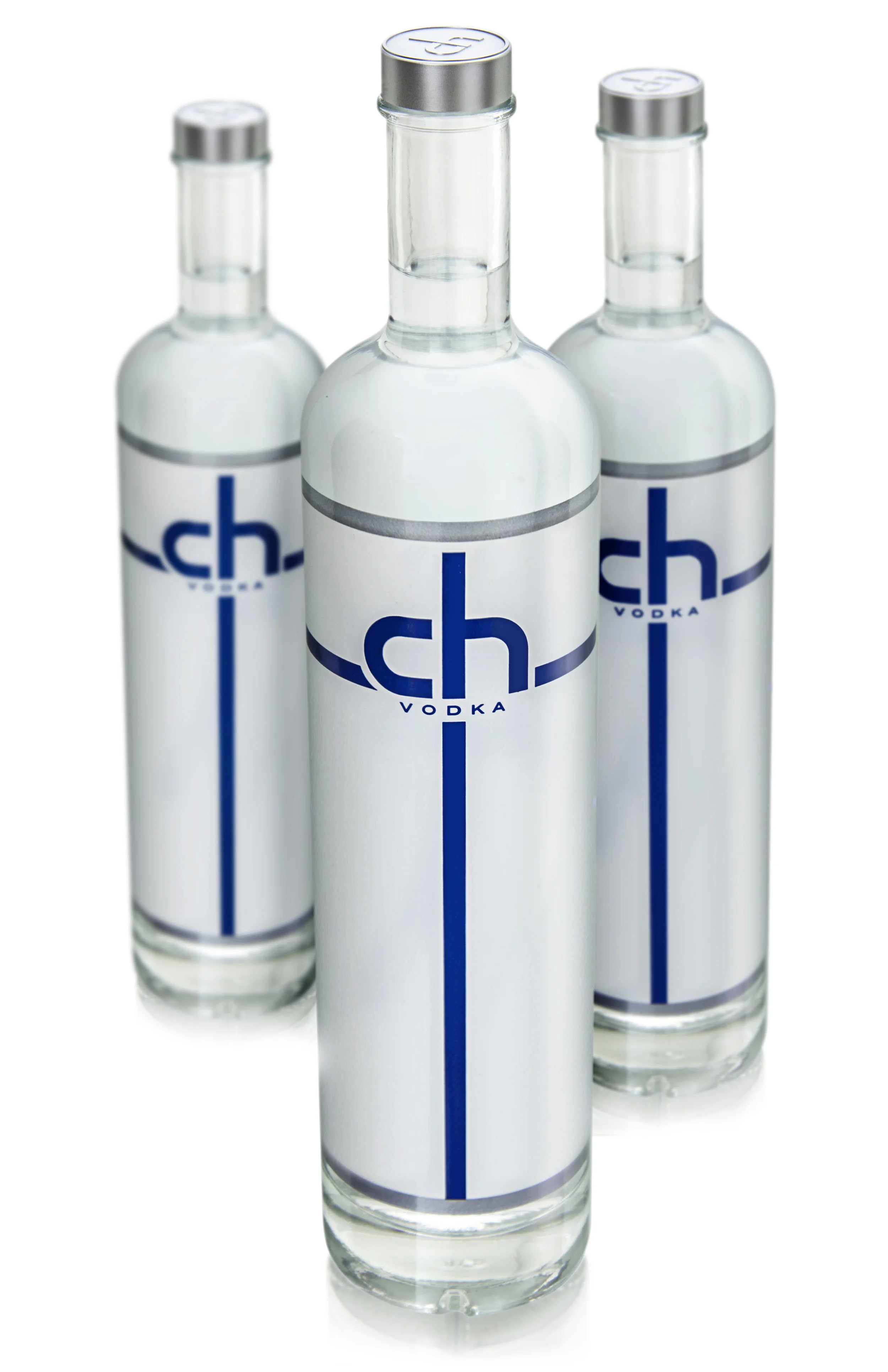
The resulting custom 750 ml 28/400 clear glass bottle features a thick bottom for an enriched, specialty look, while the long body and short neck creates an aesthetically taller appearance that also functions easily in the bartenders’ well. Making a clean break from see-through Grey Goose wannabes, CH Distillery bottles take an opposite approach via an opaque, blanketed label. The solution starts with a sprayed-on coating followed by four-pass silkscreening for the pearlized background, grey text, and a logo color-coded for each spirit. Silver bands at the top and bottom of the label soften the edges while the matching silver butylstyrene cap, sourced from France, displays an embossed CH logo.

In addition to serving as design consultant, Berlin functions as CH Distillery’s supply chain manager, warehousing the packaging for on-demand delivery. Launching just 10 months after initial meeting, the packaging is a hit with aficionados and a breakthrough for “The Science of Alcohol.” 

Using Color Psychology to Differentiate Packaging

← Back to the headlines

Using Color Psychology to Differentiate Packaging

Color is a differentiator on the retail shelf, but the absence of it can sometimes be a better choice. A white bottle can serve as a neutral backdrop for color-coded labels and closures. It can send a subliminal message of purity, wholesomeness and cleanliness. It can stand out amid a sea of brightly colored competitors and convey a premium image that instantly separates a brand from everything else in the category.

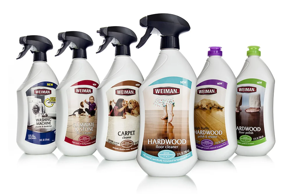
One company that has discovered the might of white is household cleaning products manufacturer Weiman Products. In the first 12 months after switching its floor cleaning SKUs from lime-green PET tapered bottles to a curvy custom 27oz white HDPE package — and simultaneously expanding the number of SKUs from two to five — Weiman tripled sales of the line and secured new placements in major chains like Walmart.

The new bottle was designed, engineered and sourced by the Studio One Eleven design division of Berlin Packaging. All design services were supplied at no charge in exchange for Weiman’s purchase of all containers and closures from Berlin Packaging.

The Studio One Eleven team recommended the use of a white bottle for Weiman’s floor care line after category analysis and requests by the client for a new pack with more room for artwork and product positioning. Designers also proposed a benefit-driven communication architecture that worked in conjunction with the white motif to transform the original pedestrian-looking bottle into an elegant, upscale package that shines on the shelf while communicating key product qualities.

Founded in 1941, Weiman Products sells products such as bathroom, furniture and stainless steel cleaners to some of the top mass market retailers, supermarkets, hardware stores and home improvement centers in North America. The company expanded into the floor cleaner category in 2008 with vibrant green bottles selected to send a “green” message about the products’ eco-friendly formula. 

By 2011, however, it became clear that the Weiman Floor Cleaner and Floor Polish products were underperforming. The company decided to replace those two all-purpose products with five SKUs segmented for use with hardwood, carpet and laminate/stone floors. They also elected to simultaneously relaunch the line with a completely new packaging aesthetic.

“Our product formulation was better than that of our competitors, but our market share wasn’t growing at the rate we wanted,” says Prachi Junnarkar, program director, Weiman. “We did a lot of internal marketing analysis and consumer surveys, and we determined that one of the stumbling blocks was our packaging and labeling. We weren’t communicating our brand quality, telling our product story clearly or differentiating ourselves from the competition. We needed a total package makeover to accomplish those goals.”

The Studio One Eleven team began by visiting stores to examine competitive products’ packaging, document merchandising standards and interview store employees about their perceptions of the Weiman product. After analyzing its findings, the team concluded that the bottle structure needed to be both modernized and feminized to pump up the shelf appeal. It also needed a communication architecture that focused less on cleaning power and more on the non-toxic formula that it is safe to use around children and pets.

The Studio then developed initial package concepts that used white bottles and aligned with the white bottle/black closure brand structure used with most other Weiman products.

The final design features an offset shoulder, curves and a tapered base that contribute to the softened profile. The narrow neck also enables ergonomic handling.

The shape of the shoulder was moderated during the prototype stage to allow the same bottle to be manufactured with both 28/400 and 28mm ratchet neck finishes for use with different SKUs requiring flip tops and trigger sprayers, respectively, saving Weiman the cost of building two different bottle molds. The shoulder modifications also ensured that the trigger would not cause trouble on the filling line by overhanging the base. Stock black trigger sprayers are used on the trigger bottles, and off-the-shelf flip-top caps color-coded to match product labels are used on the squeeze bottles.

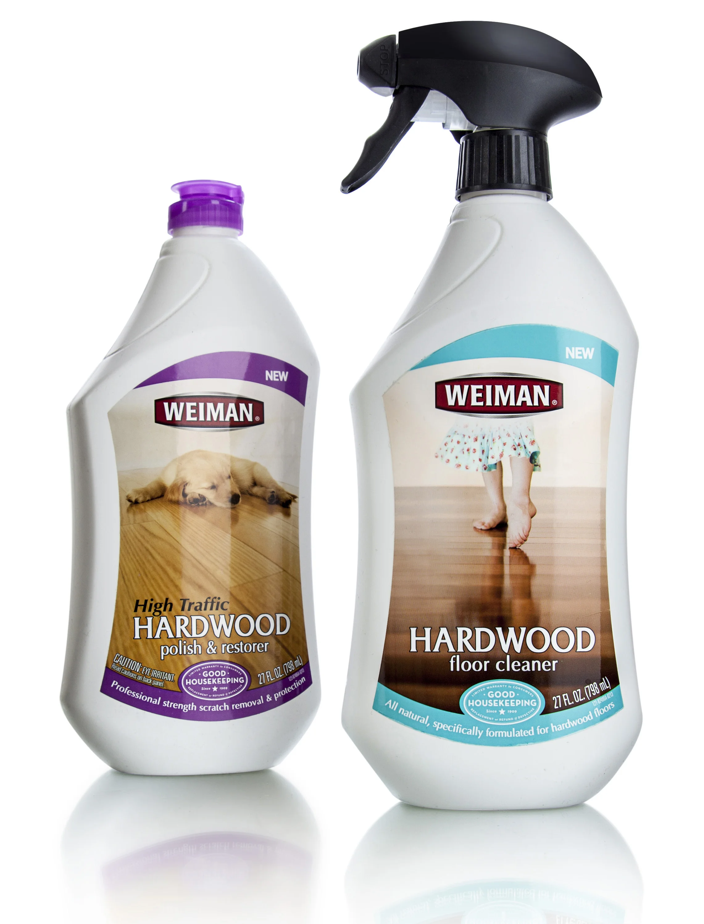
The label panel covers most of the real estate on both the front and back of the package, accommodating pressure-sensitive labels that are die-cut to mirror the panel shape. The visual architecture, inspired by the Studio’s branding strategy and developed by Weiman Art Director Rhonda Fonk, is dominated by images of kids and pets on the floor surface corresponding to the relevant SKU.

Shortly before all design components were finalized, Weiman faced a critical deadline to present the relaunched line to Walmart. Berlin Packaging consultant Ann Fisher arranged to expedite production of starch models for the meeting, picked up the finished models and hand delivered them to Weiman in time for the presentation. Weiman managers walked away from the meeting with an order and barely two months to ship product — even though the production molds had not yet been built. 

Still, six weeks later, Weiman had the finished bottles in hand and met Walmart’s timeline.

“Our bottle is our No. 1 salesman, and our old package wasn’t doing the job. The growth in our floor cleaner line proves that the new bottle is sending the right message to shoppers,” says Junnarkar. “People may think of white as being a conservative package choice, but in our case, it really raised the bar. With a green package, consumers didn’t seem to take us seriously or even notice us on the shelf. Now we turn heads, and that drives sales.” 

New Floor Cleaning Bottle Triples Weiman's Sales - Packaging World

← Back to the headlines

New Floor Cleaning Bottle Triples Weiman's Sales - Packaging World

Replacing a lime-green oblong bottle with a clean, soft-edged, ergonomic container that clearly communicates the product’s use, Weiman’s new floor cleaner bottle triples sales.

By Anne Marie Mohan, Senior Editor

Color can be a great differentiator for product packaging. But in categories cluttered with a rainbow of bright bottles, sometimes a lack of color can be even more effective. In mid-2013, Weiman Products, LLC of Gurnee, IL, launched a reformulated line of five floor cleaning products, replacing its previous lime-green bottle with a clean, white custom container. In addition, lackluster label graphics were supplanted with bright, engaging images and copy. The result: Weiman nearly tripled its sales of the product in the first month after introduction.

But the redesign was not just cosmetic; Weiman was also looking for greater functionality and flexibility. “They needed to add sprayer bottles to the original squeeze bottles to accommodate the new formulations added as part of the floor cleaner line relaunch,” explains Ann Fisher, Senior Account Executive for Berlin Packaging. Berlin worked with Weiman to develop the new package structure and supply the components.

Modernizing and softening Weiman’s original oblong-shaped PET bottle, Berlin designed a new high-density polyethylene structure with an offset shoulder, gentle curves, a slightly pinched waist, and a tapered base, “all marking a sharp contrast to the straight sides of the outgoing package,” says Fisher. The narrow neck of the bottle also enables easy ergonomic handling, with grip indicators cuing consumers where to place their fingers. Berlin specified Poly Blow Moulding, Inc. to supply the bottle.

As Fisher relates, one manufacturing challenge associated with the new design was in adjusting the shape of the shoulder to ensure that the trigger sprayer would not overhang the base and cause problems on the filling line. “The original design was modified to ensure that the sprayer stayed within the width of the bottle,” she explains.

To accommodate two closure types—an Opus trigger sprayer from AFA Polytek, and a Simplicity Snap flip-top cap from Aptar—the bottle mold does not include a neck finish. The required configuration is dialed in on the assembly line to match the closure, using metrics supplied by each closure manufacturer.

Decorating the new bottle is a four-color flexo-printed pressure-sensitive film label converted byOrion Labels. Weiman’s in-house art director, Rhonda Fonk, designed the label graphics for the products, which include hardwood, carpet, laminate, and stone floor cleaners. Based on initial concepts and strategic direction from Berlin Packaging’s Studio One Eleven, Fonk created bright designs that clearly communicate the specific product application. In contrast to the copy-heavy design of the previous packaging label, the new label is dominated by images of the floor surfaces, on which children and pets play, emphasizing the non-toxic nature of the formulas.

In addition to tripling Weiman’s sales of the floor cleaner line, the new package also has significantly reduced its unit costs, as it no longer must pay for colorants for its bottles, and has helped expand its distribution into key outlets, including Walmart.

East Meets West in Bruce Lee Tea challenge - Package Design

← Back to the headlines

East meets west in Bruce Lee tea challenge

BruceTea.jpg

Agility and resourcefulness were attributes Bruce Lee not only greatly admired, but totally embodied. When Lee’s daughter, Shannon, initiated a line of flavored teas based on her father’s personal recipes, those traits were called for again to make Bruce Tea a reality.

Beverage manufacturer Splash Beverage Group, Shannon Lee’s partner in the new venture, realized that only a highly experienced, global packaging company could source and furnish the line’s glass bottles and closures. Working from Shannon’s own designs, Berlin Packaging met the challenge with a multi-national sourcing solution.

Beginning with the glass bottle, Berlin Global, the company’s sourcing division, identified a Chinese supplier that could meet the demand. Very few stock alternatives exist for 15.2 oz glass containers; to solve the problem, Studio One Eleven engineered a custom mold. It also converted the client’s logo graphics for the custom-imprinted, 38 mm silver lug cap sourced in the United States by Berlin Global.

From design to initial production, Studio One Eleven served as liaison between client and supplier to ensure all specifications were met. Berlin continues to drive efficiency for Splash and Bruce Tea by warehousing the packaging for on-demand delivery to the filler.

Bruce Tea debuted successfully and the line is already into its second production run.


Fuller Brush Brand Boasts a New Look - Packaging World

← Back to the headlines

Berlin Packaging in Packaging World Magazine

The 108-year-old Fuller Brush brand is sporting a new look for its Stanley 100 detergent.

Best known for its original door-to-door sales force, Fuller Brush had already expanded into catalog distribution and a handful of online and retail channels. But it needed a makeover to penetrate mass market chains as well as appeal to younger consumers.

In 2014, as part of that strategy, new owners Victory Park Capital decided to replace separate 130-oz liquid and 10-lb powdered laundry detergents with a single reformulated liquid product that would be more concentrated to fit in a smaller container for easier merchandising as well as easier handling. Then they took a step they knew could make or break the initiative: creating a custom package for its new Stanley 100 detergent.

The result, designed by Berlin Packaging’s Studio One Eleven, is a custom 50-oz HDPE 25% PCR bottle that helped get the company’s foot in the door with top brick-and-mortar retailers and set the stage for a major new market presence in 2015. The package contain [New package boasts 25% recycled content.] s enough detergent for 100 loads of laundry and features:

  • A milk-jug-inspired transparent bottle that pays homage to the company’s long history in the marketplace
  • A novel ergonomic handle that makes it easy to pour with one hand
  • A stock 43-mm drain back closure system sourced from India that prevents leaking during shipment
  • A 0.5-oz dosing cap that measures one load – no measurement lines are required inside the cap
  • Environmentally friendly packaging made from 25% recycled materials

Berlin Packaging Wins 3rd WorldStar Award for Innovative Floor Cleaner Package

← Back to the headlines

Berlin Packaging Wins 3rd WorldStar Award

~Square_Libman2.png

Unique ‘Squeeze & Measure’ Bottle for The Libman Company Honored in Global Competition

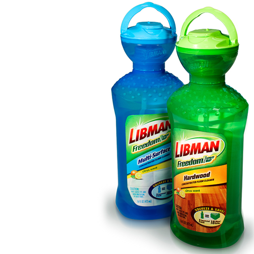
Berlin Packaging, a leading full-service supplier of plastic, glass, and metal containers and closures, announced today that its custom package for The Libman Company’s Freedom! Hardwood Floor Cleaner has been honored with a 2015 WorldStar Packaging Award. The squeeze-activated bottle with a patented pre-measured dosing mechanism was one of only 21 U.S. packages and 148 worldwide to earn the commendation, which recognizes the best packaging from around the globe.

The award marks Berlin Packaging’s third appearance on the prestigious WorldStar list in four years. The company was previously honored for its frog-shaped Pampers Kandoo hand soap package, designed for easy do-it-yourself dispensing by children, and for its work on Mission Athletecare’s Court Grip shoe traction product, featuring an extreme 45-degree neck architecture for athletes’ fast, one-handed application to sneaker soles during games.

The Libman project previously won a Gold Award in the 2014 National Association of Container Distributors (NACD) packaging competition in the U.S. It was created by Berlin Packaging’s Studio One Eleven innovation division with all components sourced and supplied by Berlin Packaging.

“The challenge in this project was to allow consumers to consistently and accurately meter a one-fluid-ounce dose of Libman Freedom! Concentrate and transfer it to Libman’s spray mop without spillage,” said Scott Jost, Berlin Packaging’s Vice President of Innovation and Design. “Awards from the NACD and now the World Packaging Organisation recognize our success in not only meeting that challenge, but in helping Libman deliver category-busting innovation in the household cleaning space.”

Berlin’s dosing package design features a translucent bowl-shaped measuring chamber that screws onto a squeezable PET bottle via a standard threaded finish. When users squeeze the bottle, they can watch as the dosing chamber fills and as excess product returns to the bottle to avoid over-dispensing. When the proper one-ounce dose is ready, users flip the cap open (where it stays due to a ‘lock back’ tab) and pour the concentrate into the Freedom mop reservoir for dilution with water.

The patented system eliminates an eight-pump process that would have been required with stock high-output pumps and the need for a removable dosing cap that could easily be lost. The bottle requires no custom preforms or fitments because the dosing system utilizes a standard neck finish, dramatically reducing total package costs. In addition, because the ‘stick goods’ planogram typically lacks shelves, the Studio design team integrated a hook into the dispensing closure to enable the bottle to be hung and merchandised alongside other Libman products.

The 2015 WorldStar winners were announced this month. Winners will be formally honored at a ceremony in Milan, Italy, in May 2015.


Berlin Packaging to Add 100 Employees in 25 Cities in 2015

← Back to the headlines

Berlin Packaging to Add 100 Employees in 25 Cities in 2015

Initiative Will Expand Sales Force 40% and Advance Company’s Industry-Leading Growth Rate

Our expanded team will be able to reach even more packaging buyers and help them be more successful with our broad, cost-effective offering and suite of services.

Berlin Packaging, a leading full-service supplier of plastic, glass, and metal containers and closures, today announced a significant hiring initiative that will add 100 employees to existing offices in 25 metropolitan areas in the U.S. by the end of 2015. Half of the new hires will be sales consultants, increasing the company’s current 120-person sales force by 40%. The other half will include support staff such as customer service specialists, buyers, warehousing personnel and package designers.

The initiative marks the company’s fourth and largest mass hiring program in the last five years. It is designed to take advantage of major opportunities in the $50 billion U.S. rigid packaging market by leveraging the unique business model that has built Berlin Packaging into a ‘one call does it all’ supplier with annual revenues approaching $900 million. That includes revenue growth over the past decade that is eight times higher than the overall packaging market and organic growth that is more than four times that of the market.

The company’s package design, sourcing, inventory management, logistics, profit consulting and capital financing portfolio of services has fueled that growth by enabling packaging buyers to streamline their supply chains and expand their bottom lines. Over the last three years alone, according to calculations required by Berlin Packaging’s ISO certification, customers generated more than $215 million of incremental profit as a unique consequence of working with Berlin.

Those factors as well as the ability to provide service levels such as 125 consecutive months of 99+% on-time delivery have yielded customer satisfaction ratings, as measured by the Net Promoter Score, that lead the packaging industry and are three times higher than the packaging industry as a whole.

The company’s performance also led Oak Hill Capital Partners to acquire a majority stake in Berlin Packaging in October for $1.43 billion. Oak Hill invested in partnership with Berlin Packaging’s management team to help drive the next stage of the company’s growth.

“We started hiring new personnel en masse in 2009 to accelerate our growth and increase our market share. This recruitment strategy, which we call Wolfpack, has already almost doubled the size of our sales force in five years and has made a major contribution to our growth since we initiated it,” said Chairman and CEO, Andrew Berlin. “Our representatives in Washington have had a hard time reinvigorating the economy. So we are investing in our own company and sponsoring our own ‘jobs bill.’ Our new resources will be a win-win-win – for our customers, our suppliers, and Berlin Packaging overall.”

“This new Wolfpack will take us to the next level,” noted Rick Brandt, Executive Vice President of Sales. “Our expanded team will be able to reach even more packaging buyers and help them be more successful with our broad, cost-effective offering and suite of services.”

Hiring has already begun and will continue through 2015. For sales representatives, the company is seeking smart, creative, driven people with sales experience and a demonstrated track record of landing new customers. For inside support positions, the company seeks smart multi-taskers with a strong customer-service mindset.

Once this new group of employees has been hired and trained, the company expects to launch a follow-on initiative to hire even more employees.

Postings for open positions are on BerlinPackaging.com and the company’s page on LinkedIn.


Oak Hill Capital Partners Completes Acquisition of Berlin Packaging

← Back to the headlines

Company Ready to Accelerate Already-Strong Growth Momentum

Oak Hill Capital Partners Completes Acquisition of Berlin Packaging

Berlin Packaging is a best-in-class business in a very attractive market with significant growth avenues.
— Managing Partner, Oak Hill Capital Partners

Oak Hill Capital Partners (“Oak Hill”), a leading private equity firm, announced today that it has completed the previously announced acquisition of Berlin Packaging LLC (“Berlin Packaging”), a leading supplier of rigid packaging products and services in North America, from Investcorp. Oak Hill invested in partnership with Berlin Packaging’s current management team, led by Chairman and CEO Andrew Berlin, who retains a significant ownership position. Mr. Berlin and the current management team will continue to manage the business.

Founded in 1898 and guided by a company culture focused on growing the bottom lines of its customers, Berlin Packaging combines the best attributes of manufacturers, distributors, and income-adding service providers for thousands of customers, with an unparalleled track record of 99% on-time delivery, quantified results for customers, and industry-leading customer thrill. Berlin Packaging’s end-to‐end operations across the supply chain provide customers of all sizes in all industries with a one-stop shop for their packaging needs. Berlin Packaging’s broad offering of services includes structural and brand design, worldwide sourcing, warehousing and logistics, and capital financing.

oakhill.gif

Tyler Wolfram, Managing Partner at Oak Hill, said, “We are delighted to have completed this acquisition. The investment in Berlin Packaging is representative of Oak Hill’s theme-based investment strategy and specifically aligns with one of our core themes targeting industry-leading, value-added strategic suppliers. Berlin Packaging is a best-in-class business in a very attractive market with significant growth avenues. We are excited to execute Berlin Packaging’s strategy in partnership with Andrew and his outstanding team.”

Andrew Berlin said, “The Berlin Packaging team is highly enthusiastic to take our business to the next level. Berlin Packaging’s customers, suppliers, and employees alike can look forward to new opportunities and enhanced growth. Importantly, as we pursue these opportunities, it’s business as usual. This means we will continue to offer the same outstanding products, solutions, and service levels, and there will be no changes to the team our customers and suppliers work with. Our new partnership with Oak Hill will create wins for all of the company’s stakeholders.”

In connection with the closing of the acquisition, Berlin Packaging also closed its previously announced first and second lien financing in addition to a revolving credit facility.