Premium package is inspired by luxury brands - Packaging World Magazine
Contact Us | 1.800.2.BERLIN
Patrick Kidd had a very clear vision of the package design he wanted for his debut line of Patricks premium hair styling products for men—And nothing less would do.
His concept was a sleek and sophisticated container that would provide a luxury look and feel for his $60 product, while offering functional benefits. Among them, a double-locking lid to keep product from leaking, a shape that would aid access to the last bit of product, and a rubber base that would prevent container slippage on wet surfaces.
“It took an incredible four-year cross-collaborative effort between myself, designers, custom tooling specialists, engineers, and the factory to bring my packaging ideas into reality,” he says. “I think I drove everyone crazy with how perfect I needed to get everything, even the sound of the lid clicking closed.”
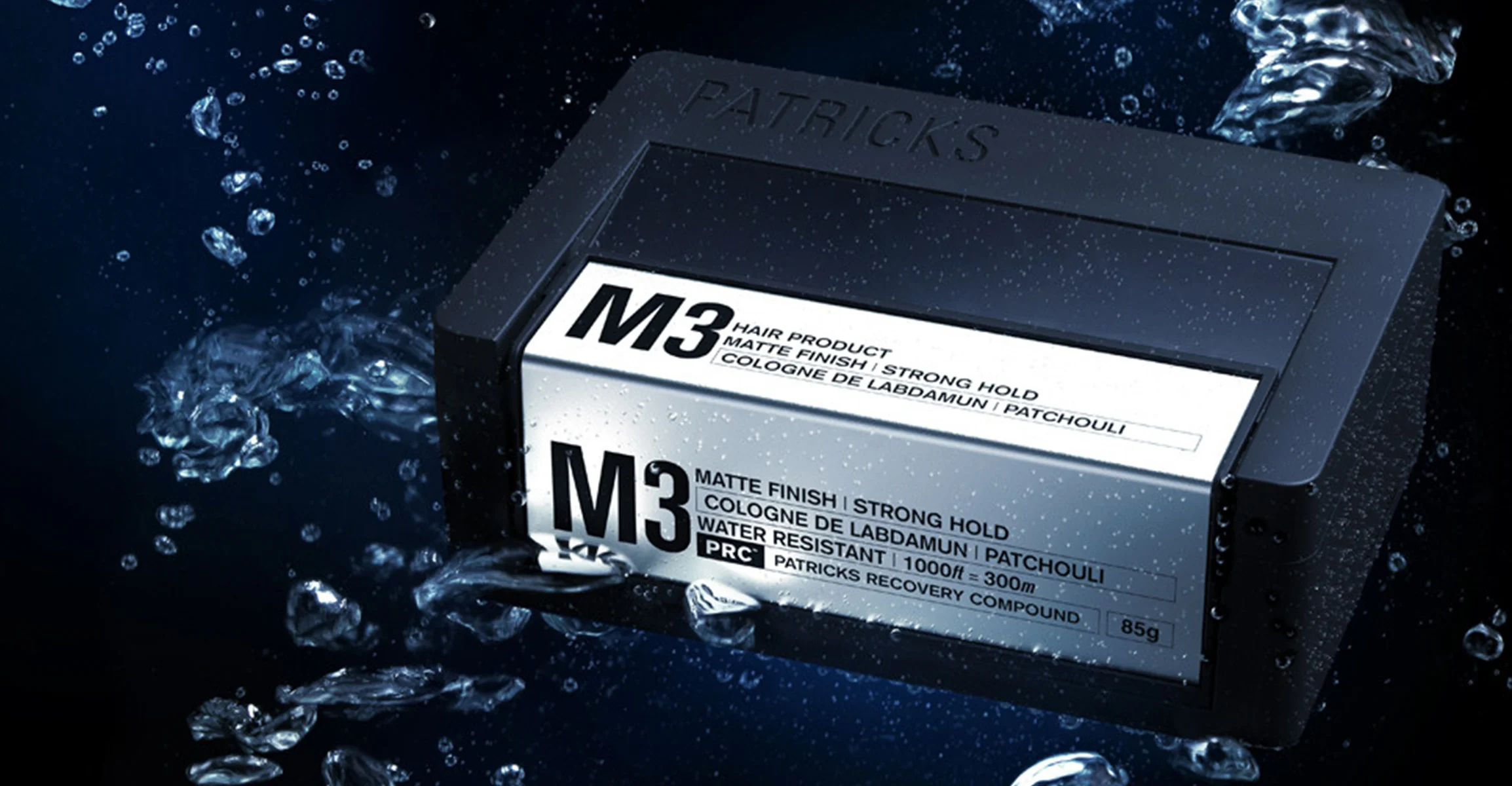
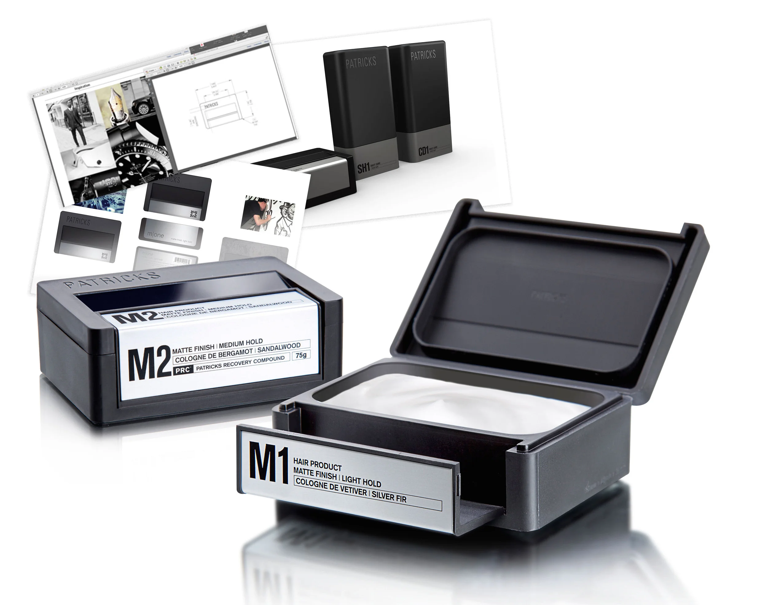
To design this custom container, Kidd worked with Berlin Packaging’s Studio One Eleven. The end result is a rectangular black matte box made of polypropylene, with an integrated, locking lid, aluminum accents, screen-printed decoration, and a rubber gasket on the base. The container, supplied by Berlin Global Packaging Group, holds 85 g of product and was designed primarily for travel and for portability in gym bags and briefcases. The small size complies with airline regulations for carry-on products, while the double-lock latch keeps product from leaking in transit.
Many of the structural elements of the container were inspired by premium luxury brands, Kidd explains. For example, the “universally beautiful” design of Aston Martin’s One-77 coupe, based around the golden ratio, or Fibonacci sequence, drove the dimensions of the package. The main angle in the jar was inspired by the air vent in the side door of the Lamborghini Aventador luxury vehicle, the matte black finish by the Audi R8 coupe, and the simplicity of the design and the use of aluminum by Apple products.
Among the functional benefits of the structure, rounded corners inside the container make it easy for the consumer to get the last bit of product out—addressing a common complaint, especially with higher-priced products. To prevent slippage, protect bathroom surfaces, and ensure a gentle sound when putting the package down, a thin rubber inlay—inspired by an Apple MacBook Pro that uses rubber around the screen—is integrated under the aluminum base.
An especially important functional feature for Kidd was the sound of the double-locking lid. “We wanted the system to have a definite, strong click so the consumer would know it was securely locked,” he says. “We looked at many different variables to ensure the correct sound. This included plastic thickness, rivet placements, and quantity of rivets.”
Aesthetic touches include aluminum fused into the latch and base plate that provides strength, durability, and beauty. Labels are laser-etched directly onto the aluminum, eliminating the need for paper, stickers, and glue, and the matte finish on the outside of the container is “tactile, practical, and beautiful,” says Kidd.
Getting all these elements right was a painstaking process, for Kidd and Berlin.
“There were many times we had to completely rebuild the tool in order to achieve the quality we were after. Some consumers may never have noticed the tiny sink marks or internal ejector pin marks, but these small details were extremely important to us, and Berlin supported our relentless, perfectionist demands.”
Patricks haircare products for men in four formulations were introduced in November 2014 through online retailer Mr Porter and are now being sold via premium online and brick-and-mortar stores worldwide.


