Contact Us | 1.800.2.BERLIN
New Floor Cleaning Bottle Triples Weiman's Sales - Packaging World
Replacing a lime-green oblong bottle with a clean, soft-edged, ergonomic container that clearly communicates the product’s use, Weiman’s new floor cleaner bottle triples sales.
By Anne Marie Mohan, Senior Editor
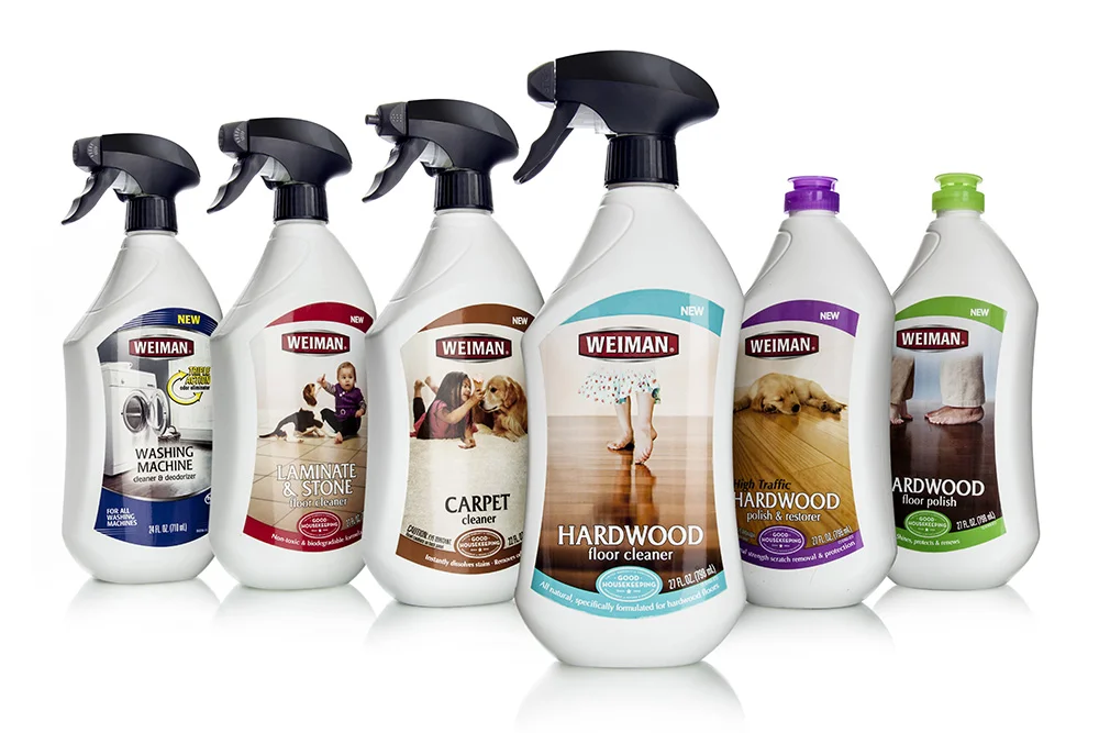
Color can be a great differentiator for product packaging. But in categories cluttered with a rainbow of bright bottles, sometimes a lack of color can be even more effective. In mid-2013, Weiman Products, LLC of Gurnee, IL, launched a reformulated line of five floor cleaning products, replacing its previous lime-green bottle with a clean, white custom container. In addition, lackluster label graphics were supplanted with bright, engaging images and copy. The result: Weiman nearly tripled its sales of the product in the first month after introduction.
But the redesign was not just cosmetic; Weiman was also looking for greater functionality and flexibility. “They needed to add sprayer bottles to the original squeeze bottles to accommodate the new formulations added as part of the floor cleaner line relaunch,” explains Ann Fisher, Senior Account Executive for Berlin Packaging. Berlin worked with Weiman to develop the new package structure and supply the components.
Modernizing and softening Weiman’s original oblong-shaped PET bottle, Berlin designed a new high-density polyethylene structure with an offset shoulder, gentle curves, a slightly pinched waist, and a tapered base, “all marking a sharp contrast to the straight sides of the outgoing package,” says Fisher. The narrow neck of the bottle also enables easy ergonomic handling, with grip indicators cuing consumers where to place their fingers. Berlin specified Poly Blow Moulding, Inc. to supply the bottle.
As Fisher relates, one manufacturing challenge associated with the new design was in adjusting the shape of the shoulder to ensure that the trigger sprayer would not overhang the base and cause problems on the filling line. “The original design was modified to ensure that the sprayer stayed within the width of the bottle,” she explains.
To accommodate two closure types—an Opus trigger sprayer from AFA Polytek, and a Simplicity Snap flip-top cap from Aptar—the bottle mold does not include a neck finish. The required configuration is dialed in on the assembly line to match the closure, using metrics supplied by each closure manufacturer.
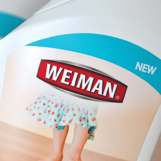
Decorating the new bottle is a four-color flexo-printed pressure-sensitive film label converted byOrion Labels. Weiman’s in-house art director, Rhonda Fonk, designed the label graphics for the products, which include hardwood, carpet, laminate, and stone floor cleaners. Based on initial concepts and strategic direction from Berlin Packaging’s Studio One Eleven, Fonk created bright designs that clearly communicate the specific product application. In contrast to the copy-heavy design of the previous packaging label, the new label is dominated by images of the floor surfaces, on which children and pets play, emphasizing the non-toxic nature of the formulas.
In addition to tripling Weiman’s sales of the floor cleaner line, the new package also has significantly reduced its unit costs, as it no longer must pay for colorants for its bottles, and has helped expand its distribution into key outlets, including Walmart.


