Contact Us | 1.800.2.BERLIN
Changing Snacking – Package Design Magazine
Walgreens gives its store brand a fresh new look.
For the Good & Delish refresh, Walgreens reached out to Berlin Packaging’s Studio One Eleven to redevelop its package design for the nut category of the premium brand.
“They came to us with a few design objectives,” says Liam Hawry, director of industrial design, packaging with Berlin Packaging’s Studio One Eleven. “They wanted to move to the rigid container with visual simplicity and wanted us to look at dispensing.”
At the time, the Good & Delish nuts were in pouches and small canisters.
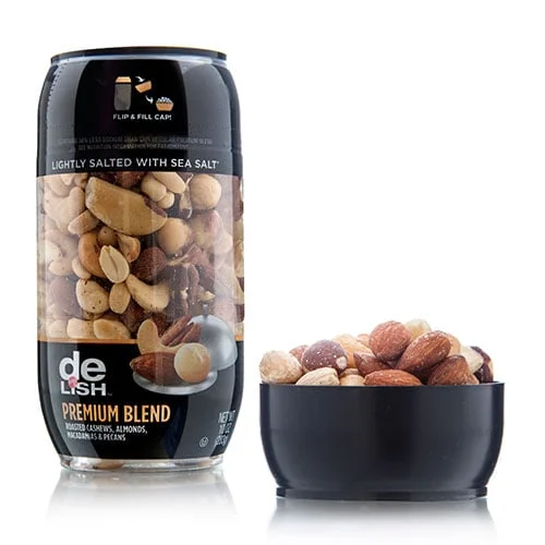
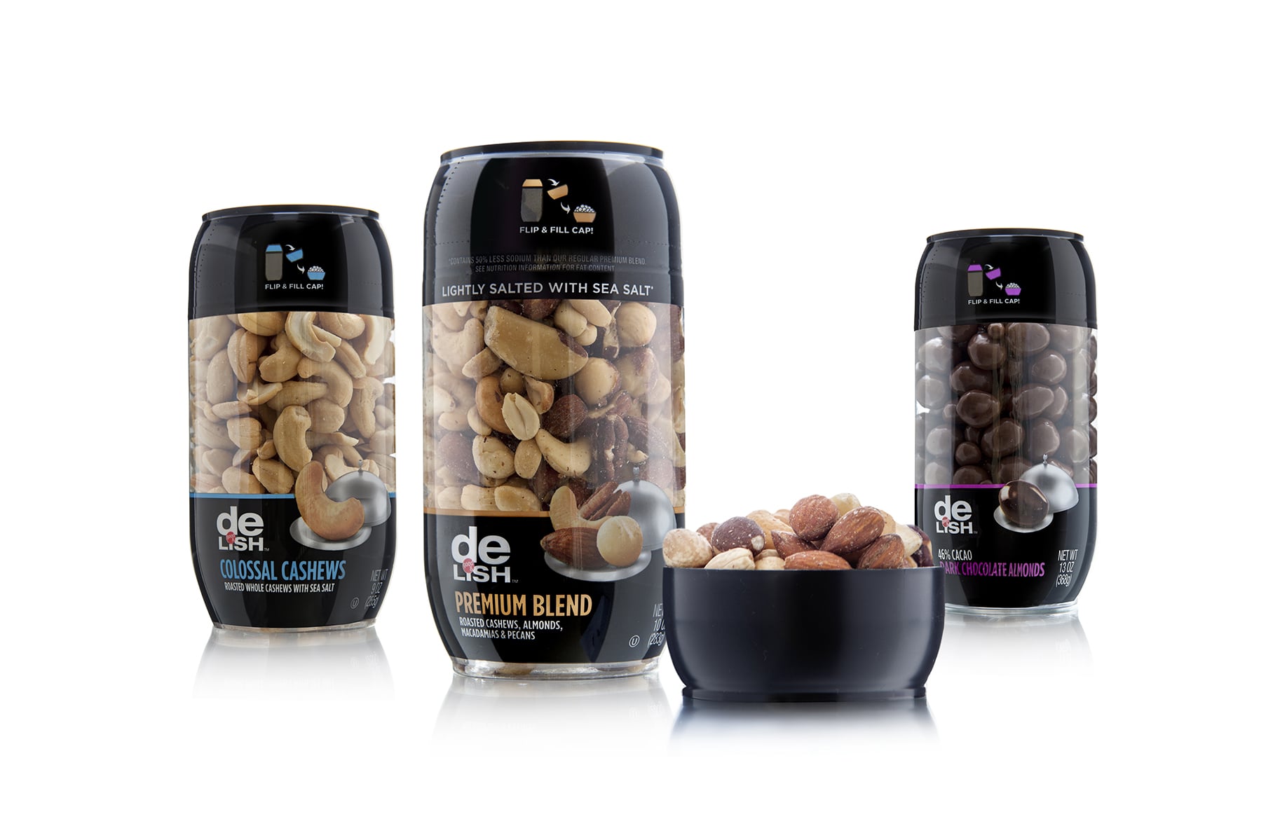
Studio One Eleven came up with a 3-in. PET container, tapered at the top and bottom, and shrink-wrapped with material that’s clear in the middle so the consumer can see the product.
Walgreen’s delighted in the fact that Studio One Eleven came up with a screw-off PP lid that doubles as a bowl for easier snacking on the go. “It offers a really unique innovation to the package,” says Jodi Kier, brand manager of Owned Brands Walgreens Co. “[It] gives the consumer convenience and portably access.”
The Good & Delish nuts come in two sizes and are available at any Walgreens around the country.


