Contact Us | 1.800.2.BERLIN
Chic Meets Cheek – Brand Packaging Magazine
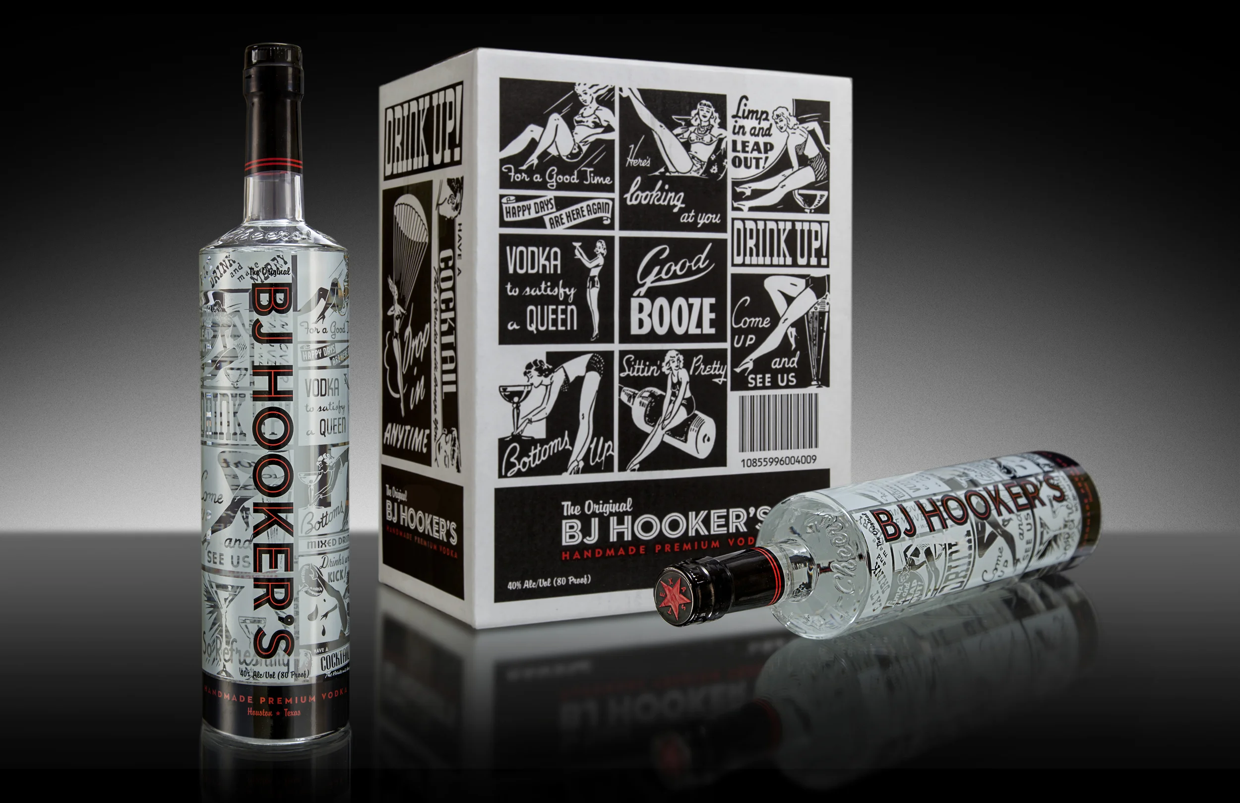
Vodka Bottle Design Uses Retro Bar Imagery
BRANDPACKAGING says: The spirits category heavily relies on packaging to catch patrons' eyes as well as get bartenders' approval. It has to be intriguing to customers, stand out behind the counter, and be easy to grab and pour.
Vodka brand BJ Hooker's was founded in 2012. An interview with www.khou.com reveals the brand's origins: "Brothers Wade and Stuart Jones started making vodka a few years ago after learning how to do it on Google. They named their product after their dad, B.J., with whom they also like to fish, thus the name BJ Hooker."
As you can see, nostalgia played an important part in the brand's name, and the brand tells a backstory to set the tone:
"The History of BJ Hooker’s Premium Vodka began with the first Hooker born in the States, William J. Hooker. OI’ Hooker was a fun loving and free spirited farmer who took great pride in his southern heritage, his freedom, and especially his booze. During those times an overreaching government would not allow a man to enjoy the libation brought forth by Hooker’s American Wheat, so he took it upon himself to produce a liquor of the finest quality for his own medical purposes, and those of his friends of course. It was this fine recipe that enabled BJ Hooker’s to be one of the most sought after beverages in all of the south. Today, we take great care to assure that every bottle matches the supreme quality and is just as smooth, attractive and easy to swallow as the people who drink it.”
The spirits company turned to Berlin Packaging and its design house Studio One Eleven for an interesting design using a special labeling process. Read on for the original story.
Vodka manufacturers typically try to outdo each other with ever-loftier bottle creations that convey the finesse of their product. BJ Hooker’s, a Houston, Texas-based vodka distillery with roots reaching back to Prohibition, took a different approach: a strong bottle design that features 1950’s bar advertising applied with a cutting-edge ceramic labeling process.
BJ Hooker’s is all about fun and Americana. The goal of its new bottle was to retain this playful personality using retro cocktail ads—a BJ Hooker’s signature—and present them in a way that captures the vodka’s handmade, premium quality.
To accomplish the task, Berlin Packaging and its Studio One Eleven design division created a custom glass container that sports the word “Cheers” and a silhouette of the state of Texas prominently embossed on the raised shoulder, along with another Texas logo deeply-debossed atop the bottle backside.
The company’s retro imagery was applied using ACL (Applied Ceramic Labeling), a specialized technique in which ceramic inks are fused to the bottle in a conveyor oven. The process outperforms screen printing by delivering perfect registration quality, even in the 360-degree application used for BJ Hooker’s. The finished bottle, presenting an elegant 3D effect thanks to the four-color ACL process, boldly sets BJ Hooker’s apart in a crowded product category.
BJ Hooker’s has applied the new look to all five of its package sizes. The company is also adapting the design for its new line of flavored vodkas.


