Contact Us | 1.800.2.BERLIN
SolScents featured in Packaging World
Launched in May 2013, the product line was conceived as an everyday alternative to conventional, coconut-infused sunscreens.
“When sunscreen was introduced to the masses, the product was only used for the beach/pool, and thus the consumer wanted a beach-inspired scent, hence the coconut essences,” says SolScents co-founder Maxim Weitzman. “Sunscreen is now an essential part of the everyday lifestyle—regardless of the season and setting. By offering a variety of light fragrances, consumers are able to protect their skin all day, without the scent of a traditional sunscreen.”
In 2011, Weitzman and Daniel Bittner (both of whom now hold the title of Managing Director) purchased scented bath and body products company Concept II Cosmetics, spinning off sister company SolScents in 2012 to develop the light, scented sun-care lotions. The pair then engaged Berlin Packaging and Studio One Eleven to create packaging that would differentiate the product on shelf. Among SolScents directives, the packaging had to have an “American look” to appeal to both the U.S. market and to overseas consumers who like U.S.-made products.
“During the design process, the Studio One Eleven branding and structure teams did an in-depth analysis of what Americana meant in personal care and adjacent categories,” says Berlin Packaging Senior Account Executive Jeremy Oxer. “The final concept took influences from themes in classic American cosmetic and perfume packaging, giving it a distinctly American feel.
“The final concept took influences from themes in classic American cosmetic and perfume packaging.”
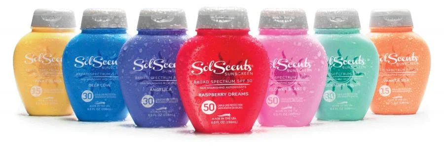
“The heart-shaped bottle structure, with a height that is shorter than most competing products by nearly three inches, and a rainbow-like custom color palette inspired by the fragrances themselves, instantly set SolScents apart from the established sunscreen crowd.”
The sun-care container is an 8-oz, high-density polyethylene bottle topped with a stock pearl-white, flip-top cap that is said to complement the brandmark and help create a family look across the seven SKU colors. Berlin Global Packaging Group handled all aspects of the manufacturing of the bottles, providing SolScents with actual colored bottles to approve prior to commercial production. “This ensured that the exact colors used in the design process were duplicated for production,” says Oxer.
Among the vibrant custom colors used are red for Raspberry Dream, pink for Flower Blast, and Teal for Cucumber Melon, among others.
Prominent on the face of the bottle is the SolScents logo, in what is described by Studio One Eleven as a “sassy” font, printed over a monochromatic sun icon several shades deeper than each SKU color, using two-color screen printing to deliver a tone-on-tone brandmark. On the front of the bottle, bold SPF indicators from 15 to 50 help shoppers find the appropriate level of skin protection, while a stylized American flag icon and the copy “Made in America” deliver the U.S.-made message.
Priced at $14.95/bottle, the SolScents product line is available in a range of U.S. pharmacy, grocery, and online outlets as well as at spa and surf-shop locations, and some prestige hotels. Says Bittner, “The product is also being introduced in overseas markets such as New Zealand, where the distributor is so enthusiastic that he upped the initial order 60 percent just one week after receiving the first shipment.”


