Contact Us | 1.800.2.BERLIN
Scientific Bottle Theme Creates Chemistry for Micro-Distillery Customers
Chicago’s first micro-distillery, CH Distillery, built its personality early on with the theme, “The Science of Alcohol.” It played out the theme in its downtown Chicago cocktail bar-cum-restaurant through a chic laboratory vibe complete with polished chrome pipes, a bar with steel detailing, and muted industrial lighting.
Establishing the same clean, scientific look in CH Distillery product packaging, however, took the skills of Berlin Packaging and its Studio One Eleven design group. Months before the club opened, Berlin began working with the client to create an innovative packaging concept that would span all 11 spirits in the CH Distillery line.
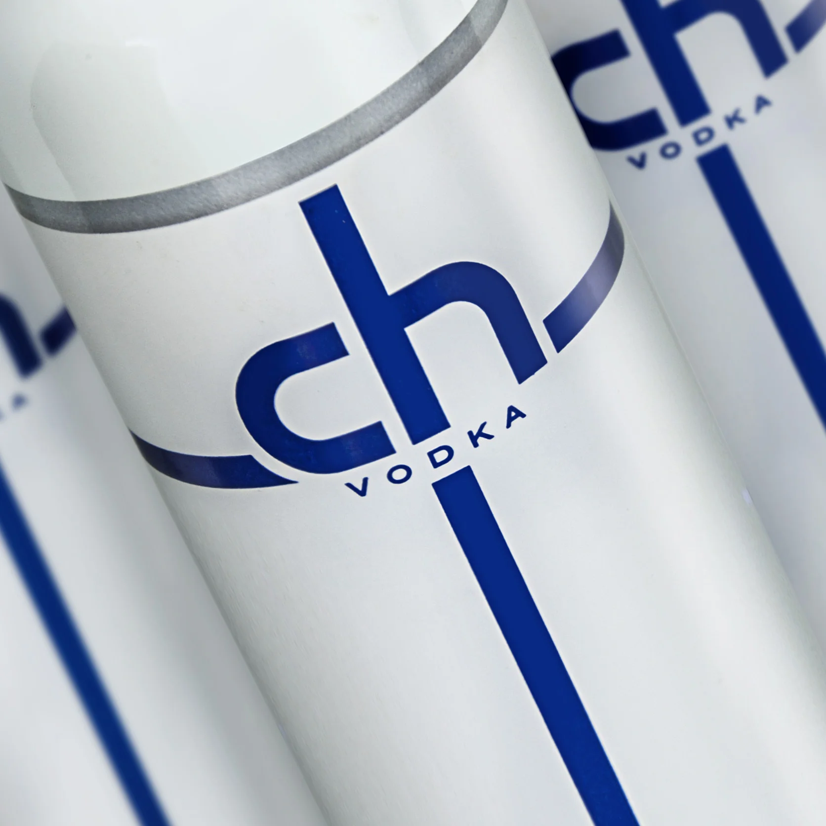
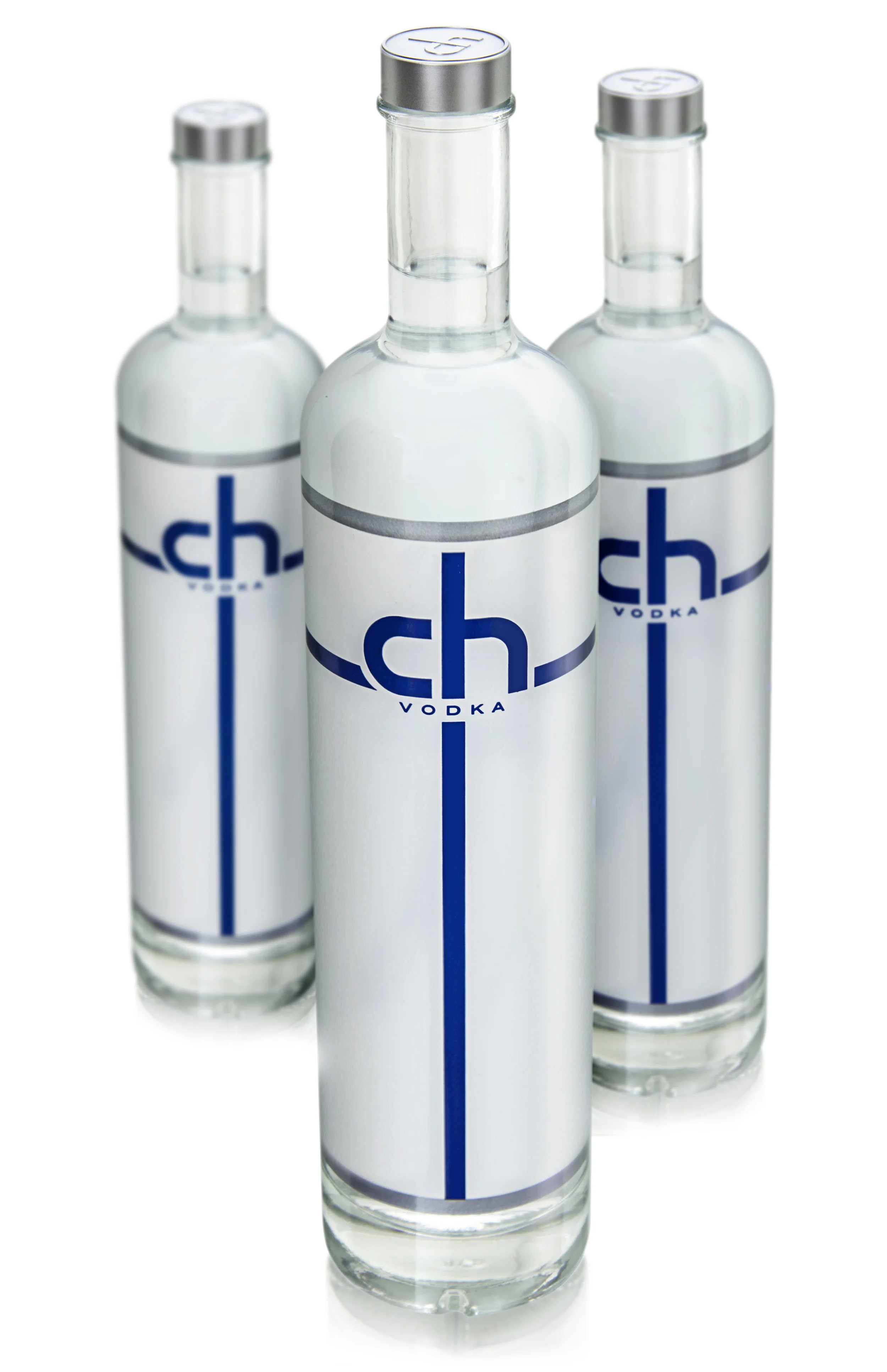
The resulting custom 750 ml 28/400 clear glass bottle features a thick bottom for an enriched, specialty look, while the long body and short neck creates an aesthetically taller appearance that also functions easily in the bartenders’ well. Making a clean break from see-through Grey Goose wannabes, CH Distillery bottles take an opposite approach via an opaque, blanketed label. The solution starts with a sprayed-on coating followed by four-pass silkscreening for the pearlized background, grey text, and a logo color-coded for each spirit. Silver bands at the top and bottom of the label soften the edges while the matching silver butylstyrene cap, sourced from France, displays an embossed CH logo.
In addition to serving as design consultant, Berlin functions as CH Distillery’s supply chain manager, warehousing the packaging for on-demand delivery. Launching just 10 months after initial meeting, the packaging is a hit with aficionados and a breakthrough for “The Science of Alcohol.”